
The Advanced Query Loop Block provides a variety of filtering options through the Query Loop Filter Blocks. For an enhanced user experience, consider placing these filters inside a Modal Block to create an off-canvas filter menu. This approach works well for both desktop and/or tablet/mobile users.
Using the Modal Block
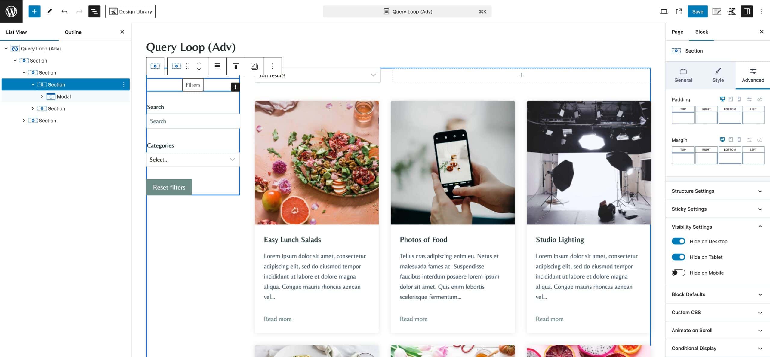
To get started, create a new Query Loop or edit an existing one. Inside the Main Query Loop Block, you can add a Modal Block within a Section Block. The Modal Block must be placed inside a Section Block, whether it is a stand-alone Section Block or a nested Section Block within a Row Layout Block. The Modal Block will not be available if placed outside of a Section Block or outside of the Main Query Loop (Adv) Block.
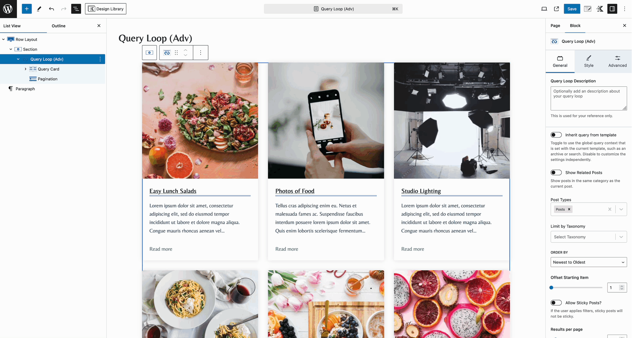
Once the Modal Block is added to the Query, use the Modal Block Settings to customize and style your Modal. Click here to learn more about customizing the Modal Block.
Once the Modal is styled, click the Show Modal Content button to open the Modal within the Editor. Here, you can add the Filtering Blocks you want to display in the Modal popup.
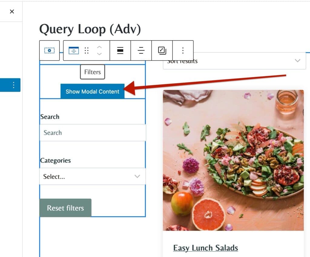
Additionally, you can add other blocks, such as Advanced Text and Advanced Image Blocks to further customize your Modal Contents.
Using Normal Filters for Dekstop and Modal Filters on Mobile
One of the primary uses of Off Canvas Modal Filtering is to provide a user-friendly experience, especially on mobile devices. For example, if you use a Sidebar Filtering Layout with many filters, it may not be ideal for mobile users due to limited screen space. In such cases, using a Modal Button to open a Modal Filter List can significantly improve the overall user experience.
This can easily be done using a Query Loop (Adv) Sidebar Layout and making a few customizations. You can also start from a different initial layout or a blank template if preferred.
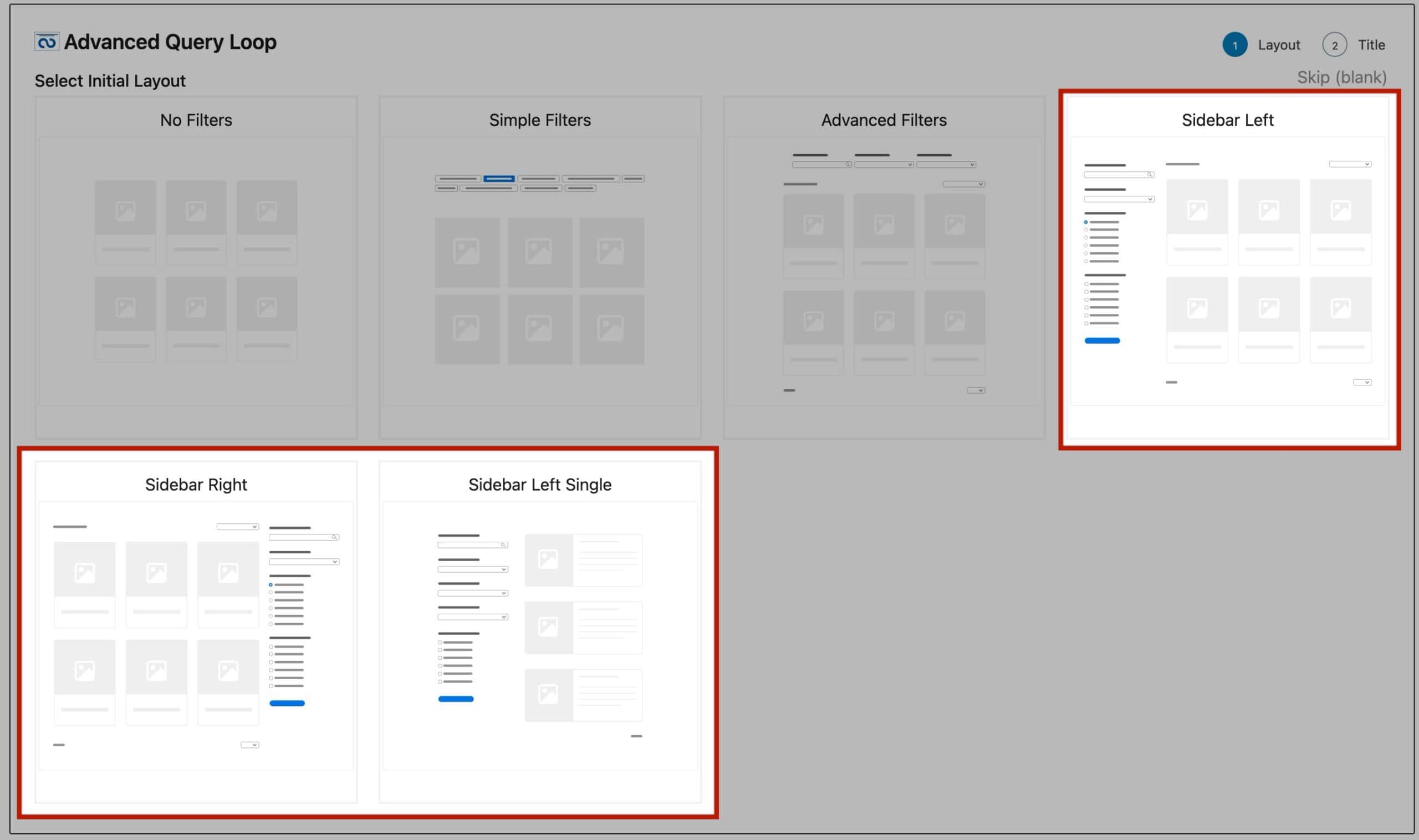
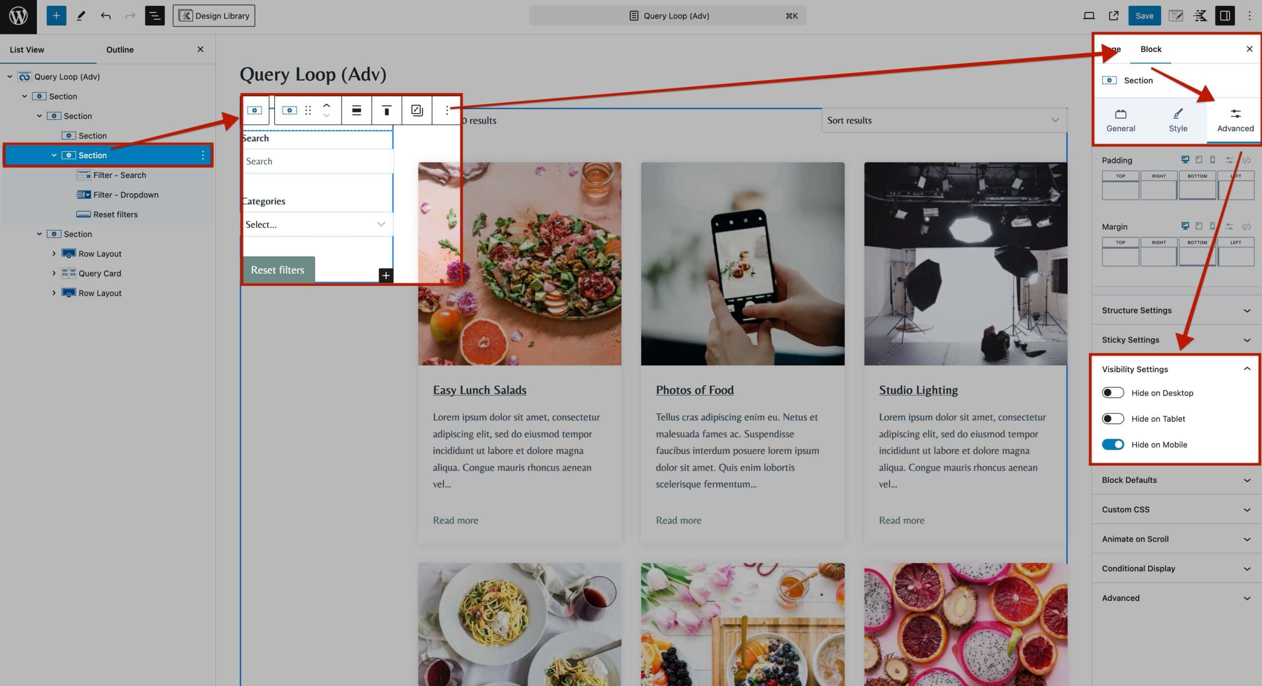
In this example, the Sidebar Left Layout was selected. The first step will be to add two Sections above the original Filter Blocks. The first Section will be for mobile devices and the second Section for desktop devices.
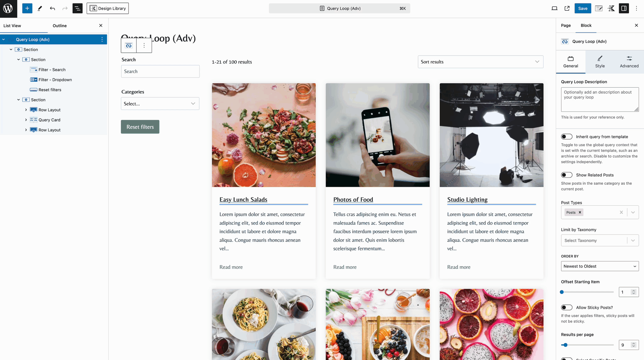
Afterward, move the Filter Blocks to the inside of the Second Section that was just added above the Filter Blocks.
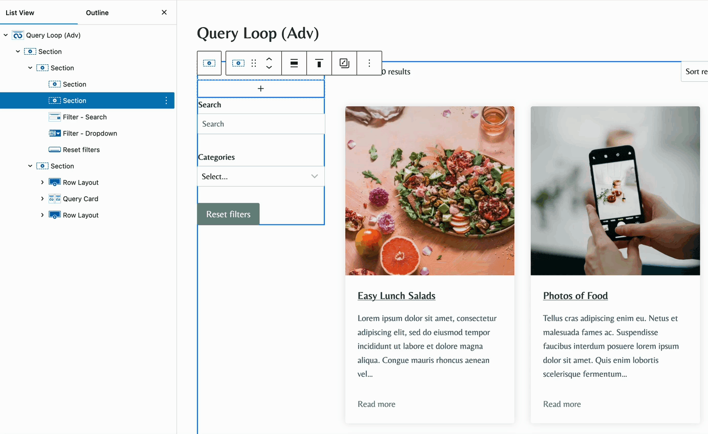
Select the second Section, then go to the Block Settings > Advanced Tab and expand the Visibility Settings. Here, you can control which device types can view this Section. To hide the filters on mobile devices, enable the option labeled Hide On Mobile.
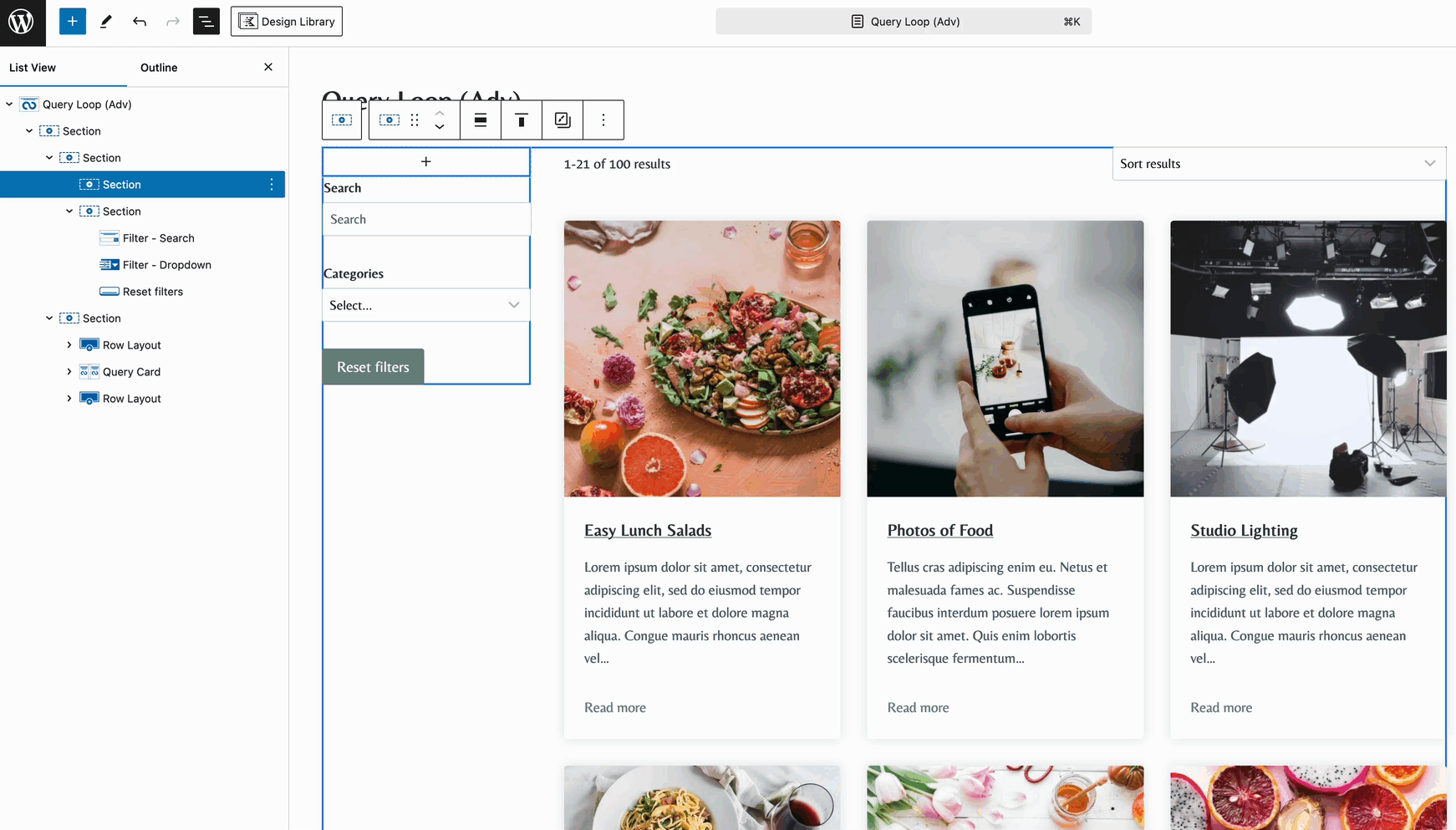
Then, inside the First Section, add a new Modal Block.
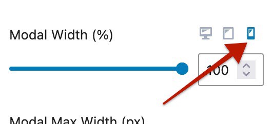
Use the Modal Block Settings to fully style your Modal Popup and Button Styles. Click here to learn more about customizing the Modal Block. When customizing the Modal Block Settings, ensure you modify the Mobile Responsive Settings.
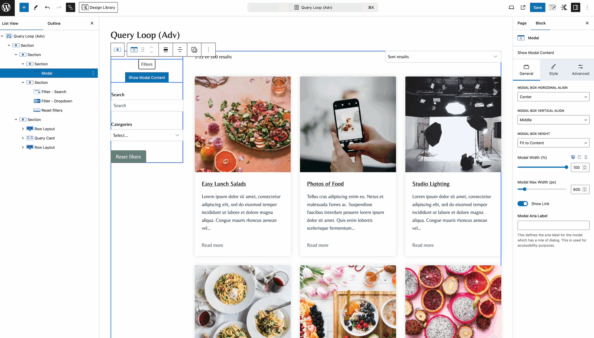
Below the Modal Block, click the View Modal Content button. Here, you can add the Filter Blocks specifically for mobile devices.
Once finished, select the Section with the Modal Block, go to the Visibility Settings, and enable the option to Hide on Tablet and Hide on Desktop.
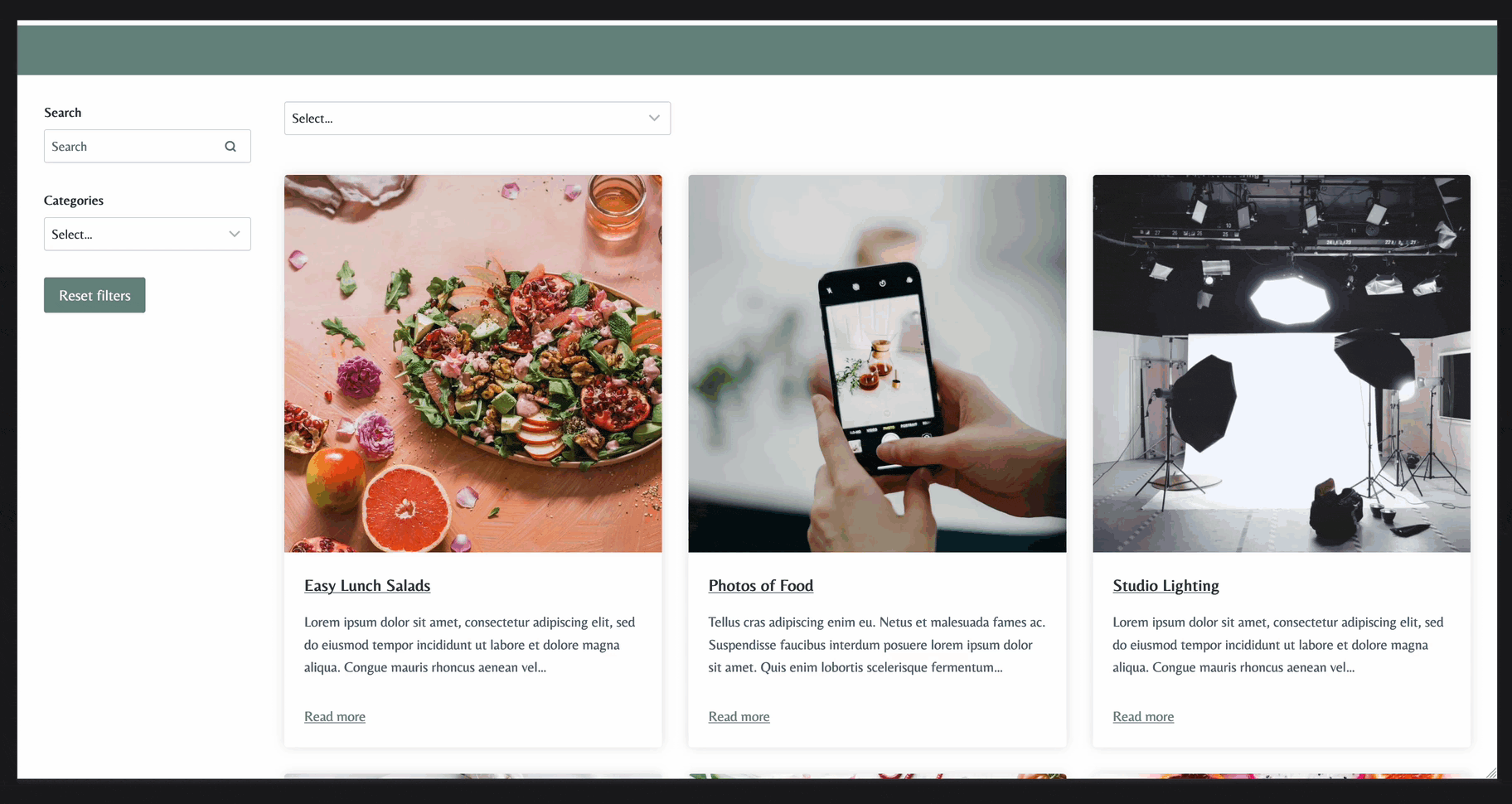
As a finished result, the Modal will show on Mobile Devices, while the Sidebar Filtering System will show up on Desktop and Tablet Devices.
