
With the Advanced Buttons block, you can create custom buttons that stand out from the rest. This block offers a wide range of customization options, allowing you to choose from various styles, colors, and designs. You can add single or multiple buttons to your page or post, and each button can have its own unique style. Whether you want a simple button or a more elaborate one with icons and animations, the Advanced Buttons block can help you achieve your desired look. With this block, you can enhance the user experience and make your website more interactive and engaging.
Getting Started
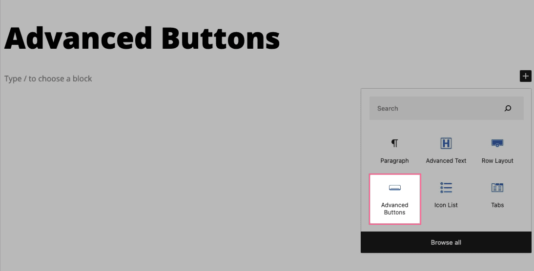
You can begin by selecting the Advanced Buttons Block from the Add Block menu.
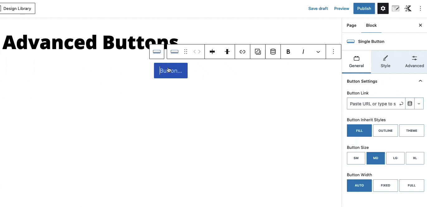
To customize the text displayed, select any button and enter the text you wish to use.
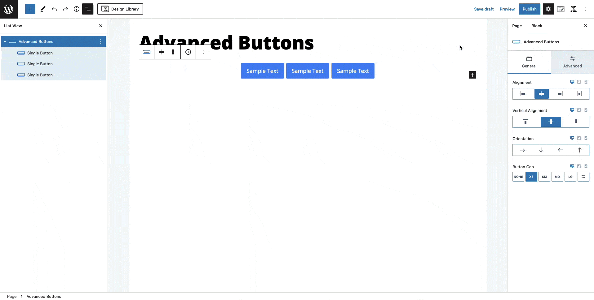
In the Advanced Buttons block, you have the option to add multiple buttons. These buttons will be displayed as Single Button blocks within the Advanced Buttons block. To add a button, simply select the Advanced Buttons block and click on the plus icon in the toolbar. This will add a new button, duplicating your previous button.
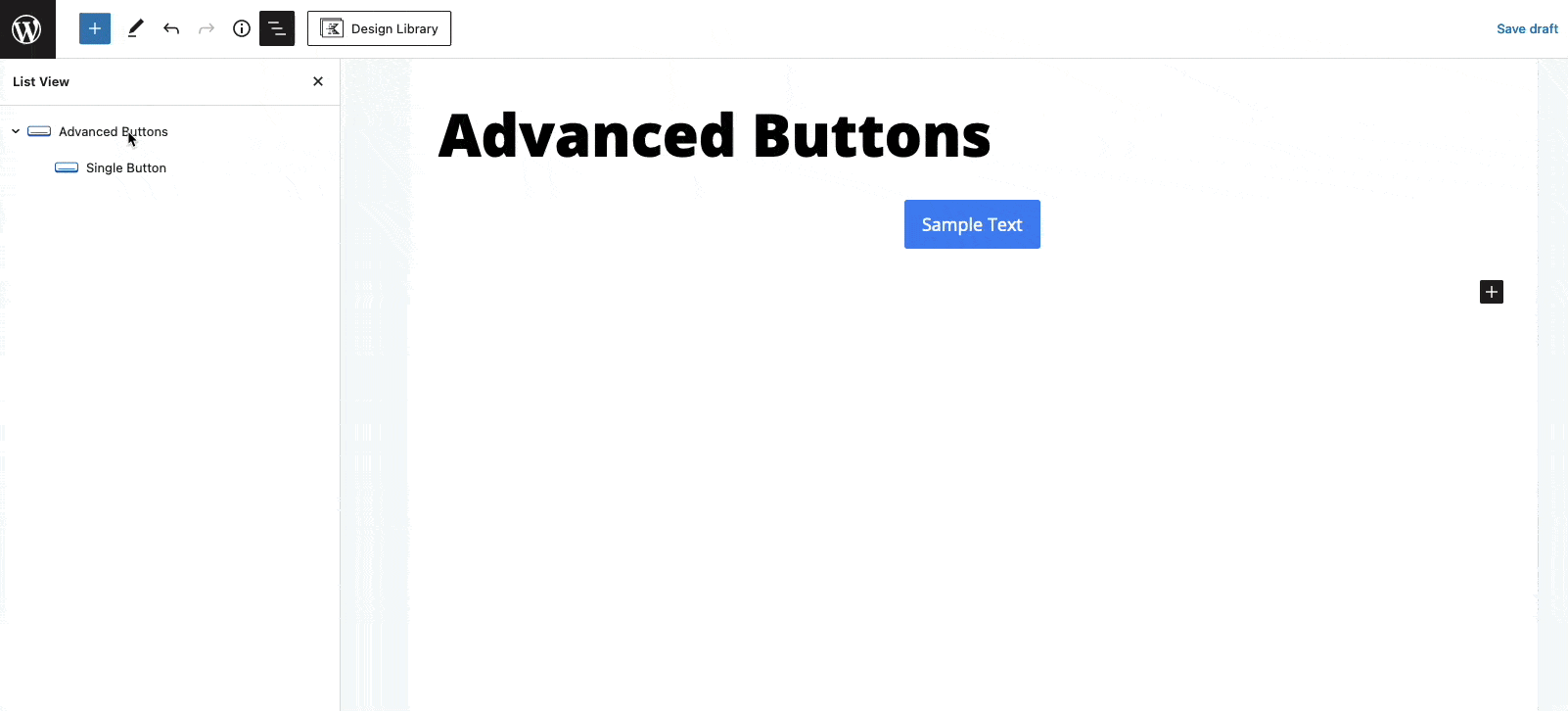
You can select each Single Button individually and style them using the Block Settings.
Advance Buttons Block Settings
You can style your Advanced Buttons using the Block Settings.
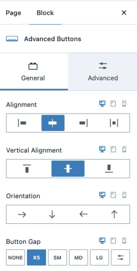
General Settings
The General Settings allow you to set the alignment, vertical alignment, orientation, and button gap for mobile, tablet, and desktop devices.
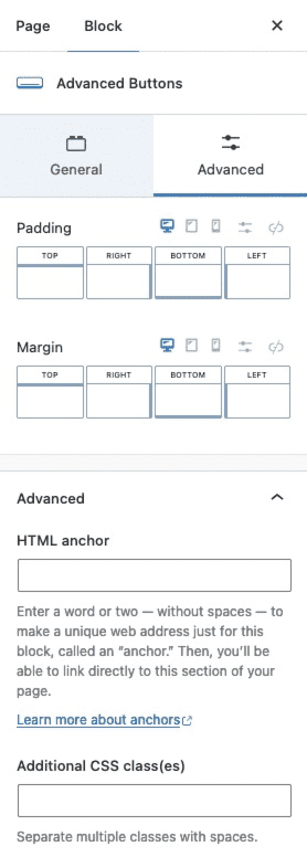
Advanced Settings
The Advanced Settings allow you to customize the padding and margin for mobile, tablet, and desktop devices.
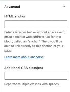
You can expand the Advanced Tab to add an HTML anchor or additional CSS class(es) to your block.
Single Button Block Settings
Inside the Advanced Buttons block, you will find Single Button blocks nested. Each Single Button block can be customized using the Block Settings.
General Settings
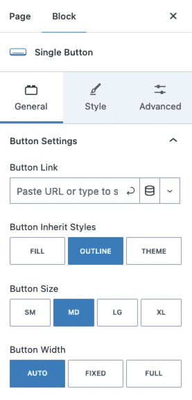
The General Settings allow you to add a button link, set the button inherit styles, set the button size, and set the button width.
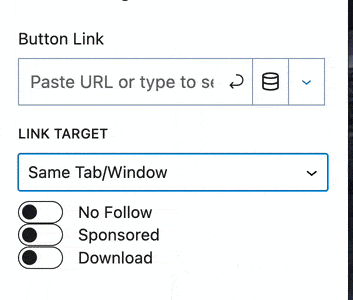
When setting a link to a button, you can click on the Down Arrow Icon for more options, such as opening the link in the same tab, opening the link in a new tab, or opening the link in a Video Popup modal. You can also set the link as a No Follow, Sponsored, or Download.
Making a Video Popup Modal with a Button Link
You can also open Video Links from YouTube and Vimeo in a Pop-Out Modal using the Video Popup Link Setting
Sample Video Popup Button Link:
Style Settings
The Style Settings allow you to adjust the button styles, icon settings, and typography settings.
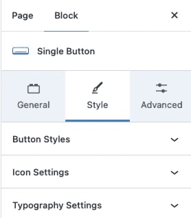
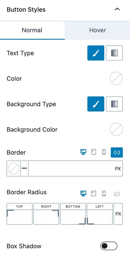
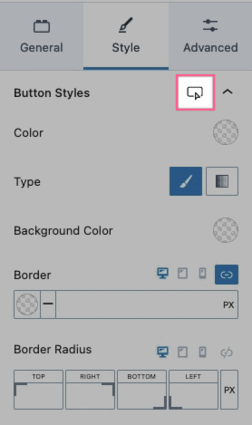
The Button Styles allow you to change the color, background color, and border settings.
Use a Solid or Gradient Color for the Button Text and Background.
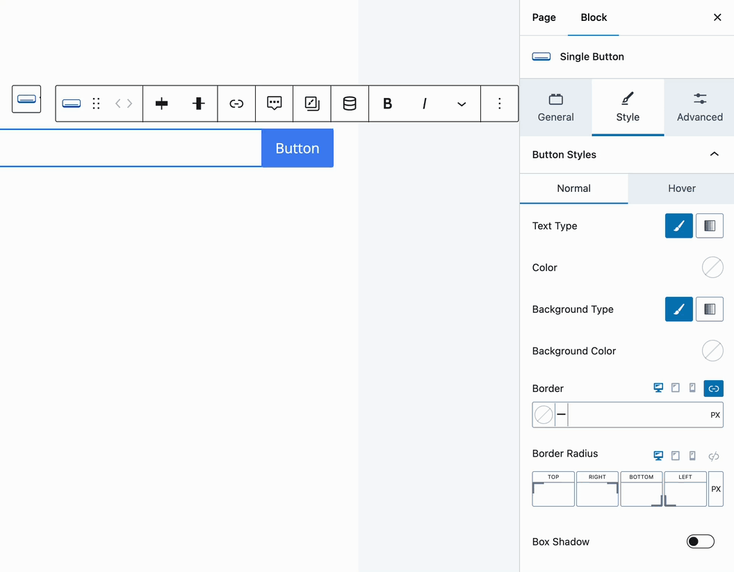
Use the Border settings to add a Border, set a Border Color, and assign a Border Radius to the button.
You can also enable and customize a box shadow.
You can change your Hover Styles by clicking on the Hover Styles icon. Here you can change the hover colors and settings used on the button.
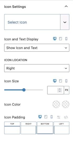
The Icon Settings allow you to use an icon on your button. You can select an icon and set whether you want the icon to display alone or with text. You can set the icon location, size, color, and padding.
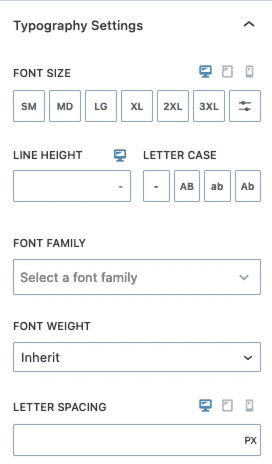
The Typography Settings allow you to customize the typography of your button. You can set the font size, line height, letter case, font family, font weight, and letter spacing for your button.
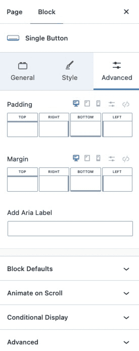
Advanced Settings
The Advanced Settings allow you to add an aria-label to your button and change the padding and margin for mobile, tablet, and desktop devices. You also will be able to change the block defaults, animate on scroll, conditional display, and advanced settings.
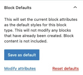
The Block Defaults setting allows you to set the current block attributes as the default styles for this block.
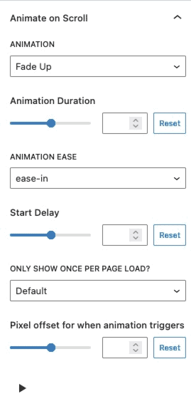
The Animate on Scroll settings allows you to add an animation to your button. You can select an animation duration, ease, and start delay. You can set this animation to show once per page and set a pixel offset for when the animation triggers.
You can press on the play icon at the bottom of the settings to see how your animation looks in the editor.
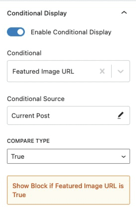
The Conditional Display setting allows you to display the button based on a condition.
You can expand the Advanced Tab to add an HTML anchor or additional CSS class(es) to your button.
