
When creating Advanced Headers, the Visual Builder enables you to add blocks to the header and customize each header row. You can easily modify the Desktop Header, Tablet/Mobile Header, and the Off Canvas area using the Visual Builder and Block Settings.
Accessing the Visual Builder
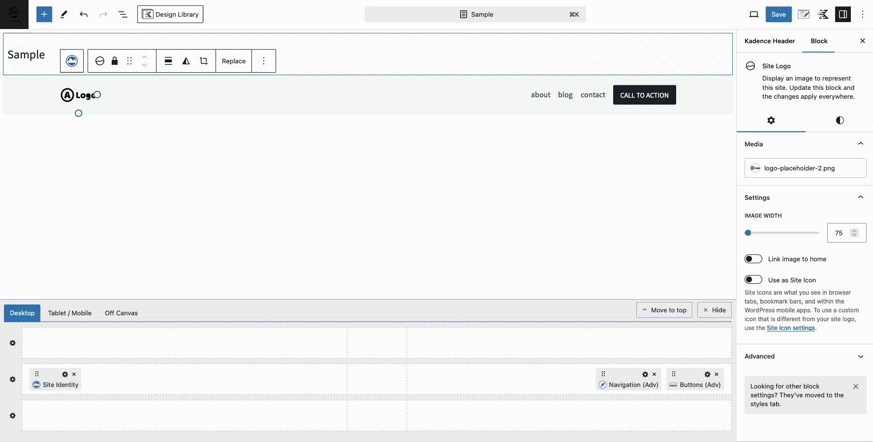
Select the Header (Adv) Block and use the Block Toolbar to toggle the Visual Builder on and off.
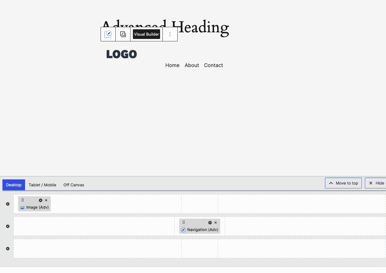
The Visual Builder is displayed at the bottom of the editor. You can use the Move to Top/Bottom button to reposition the Visual Builder as needed. To hide or close the Visual Builder, click the (X) Hide button located next to the Move to Top/Bottom button.
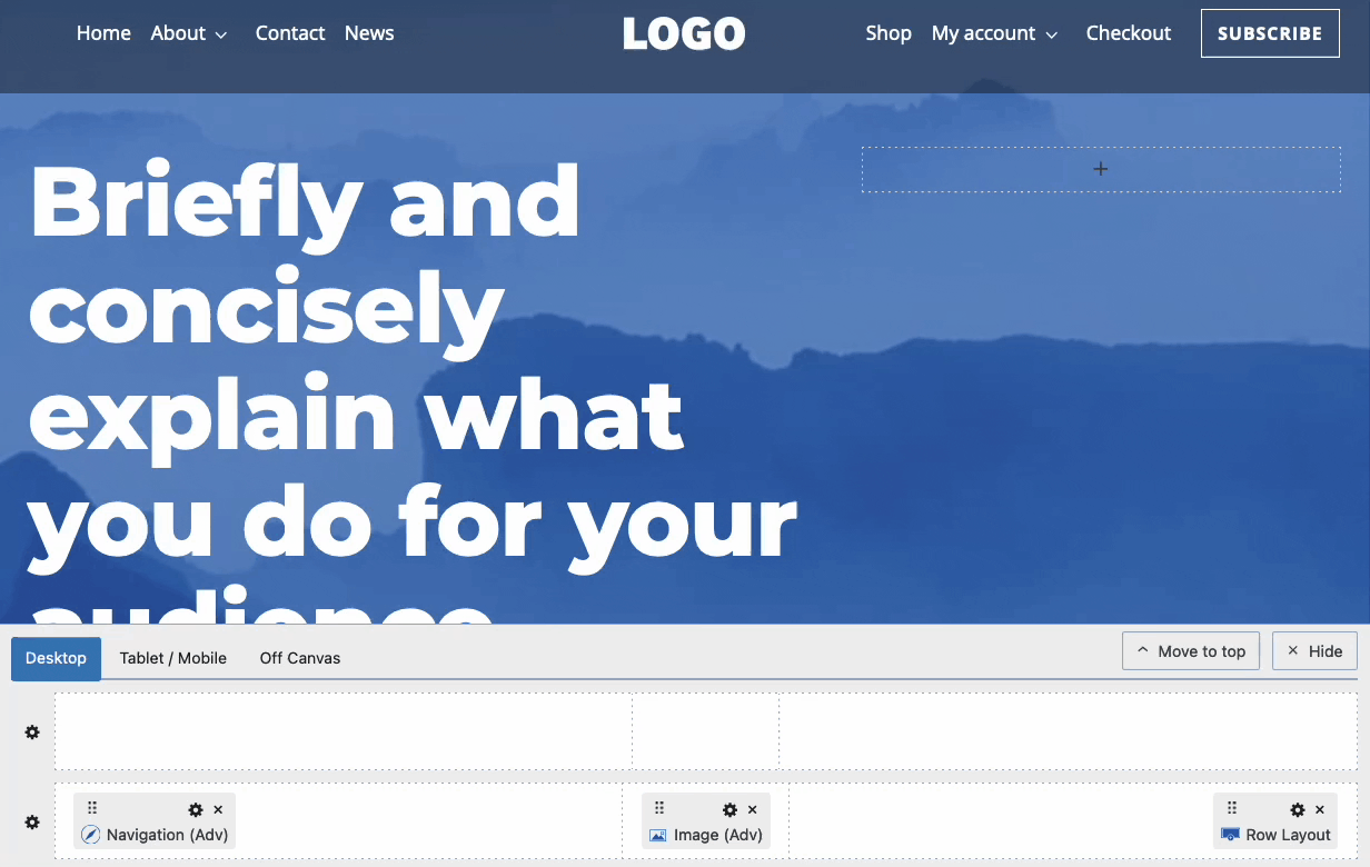
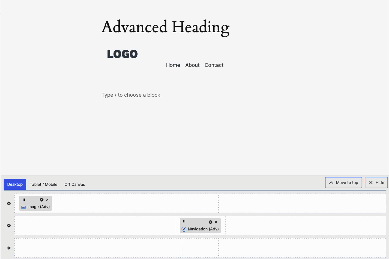
Use the Visual Builder to add blocks to your header. Advanced Header Templates come with Blocks already added to the Header. If starting from a Blank Template, you can start adding Blocks, such as a Navigation (Adv) Block to get started. Hover over any area within the Visual Builder and click on the Plus Icon to start adding a block to that section.
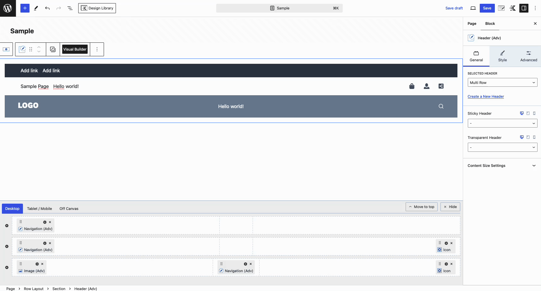
Each row features a Settings Icon on the far left. Click on this icon to access the corresponding Row Block Settings. Each row has unique block settings that enable you to fully customize your entire header, row by row. Learn about all of the available Header Row Block Settings here.
Switch between the Dekstop, Tablet/Mobile, and Off Canvas Tabs to customize each accordingly.
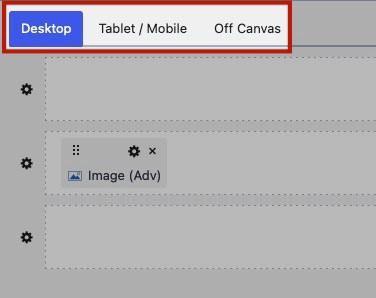
When creating Advanced Headers on your website, it’s important to note that you will be building separate headers for Desktop and Tablet/Mobile devices. You also have the option to customize an Off Canvas Area when using Off Canvas Triggers on one of your header types. You can reuse components, such as Advanced Navigation Blocks across the Desktop, Tablet/Mobile Headers, and the Off Canvas Area. To ensure optimal display, use the Responsive Controls to manage the Block Settings for each device type.
Using Single Container Layouts
Advanced Header Rows are structured with predefined sections, but the Single Container Layout Config block setting provides greater flexibility. By enabling this setting, you gain full control over the Row Container, allowing you to add Row Layout Blocks to customize the Header Row. This opens up endless possibilities for creating multi-row and multi-column headers to fit to your needs.
To use a Single Container Layout on a Header Row, click on the Settings Icon next to the Row, then use the Block Settings to set the Layout Config from Header Row to Single Container.
From there, you can add various Blocks to the Row Layout Block Sections to build your Header with flexibility.
Tablet/Mobile Builder
Use the Tablet/Mobile Button in the Visual Builder to switch to the Tablet/Mobile Header Editor.
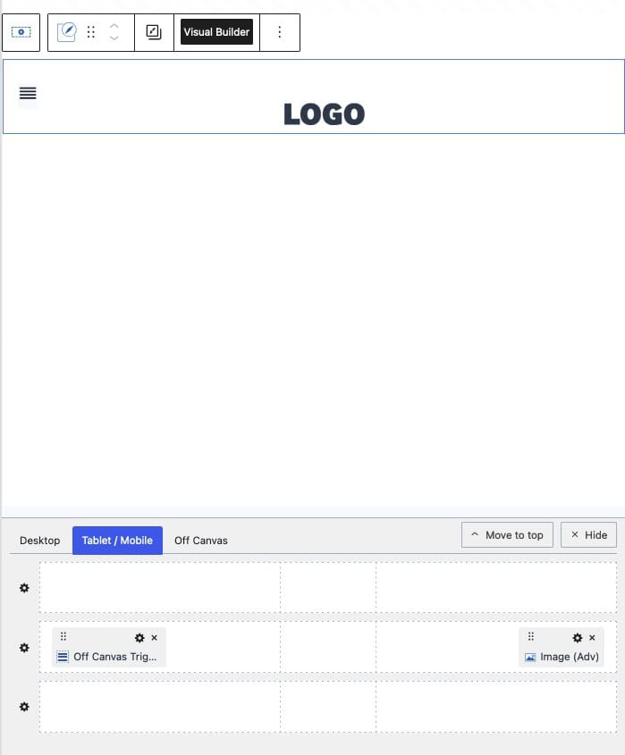
For the Tablet/Mobile Header, it is common to utilize an Off Canvas Trigger. This trigger, when clicked by the end users of your website, will open the Off Canvas Area.
Off Canvas Trigger
Use Off Canvas Triggers to open the Off Canvas Area. Since both the Desktop and Tablet/Mobile Headers share the same Off Canvas Area, you can add a Trigger to either or both headers.
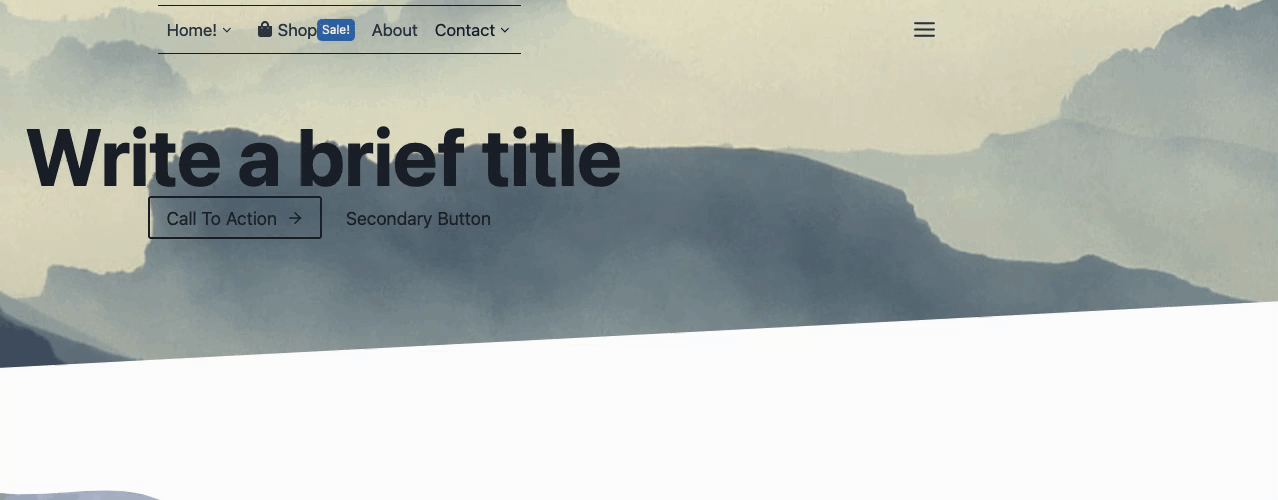
Desktop Trigger Example:
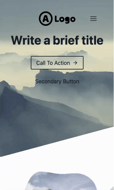
Mobile Trigger Example:
Trigger Block Settings
Customize the Off Canvas Trigger Block using the Block Settings. First, locate the Off Canvas Trigger Block in the Visual Builder. Then, click on the Settings Icon to access the Block Settings.
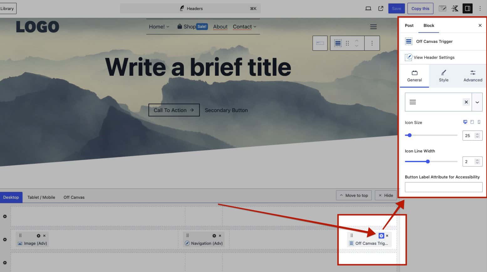
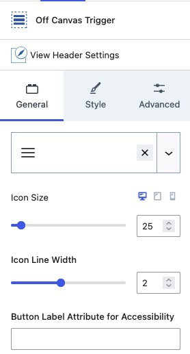
General Settings
Icon: Select and use an Icon for the Off Canvas Trigger. You can choose from a Kadence Provided Icon (Free) or a Custom SVG Icon (Pro).
Icon Size: Set the desired Size for the Icon.
Icon Line Width: Adjust the Line Width of the Icon for more precise control over its display.
Button Label Attribute for Accessibility: Add a Label Attribute to the Icon to enhance accessibility.
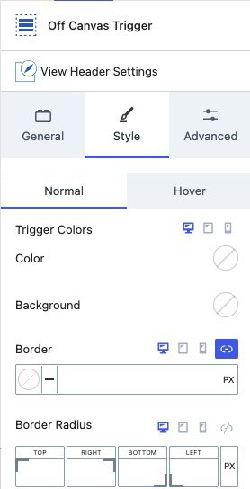
Style Settings
Trigger Colors: Use the Normal and Hover tabs to adjust the Trigger Icon colors and Border settings for both states.
Color: Set the Color of the Trigger Icon.
Background: Choose a Background Color for the Trigger Icon.
Border: Define the Border Color and Size around the Trigger Icon.
Border Radius: Apply a Border Radius to the Trigger Icon Border.
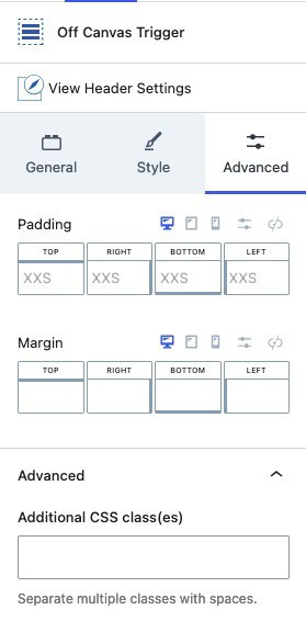
Advanced Settings
Padding and Margin: Add Padd or Margin to your Off Canvas Trigger to increase the space around the Trigger.
Additional CSS Class(es): Add custom CSS class(es) to your Off Canvas Trigger for further customization.
Off Canvas Builder
The Off Canvas Area is available when your header includes an Off Canvas Trigger.
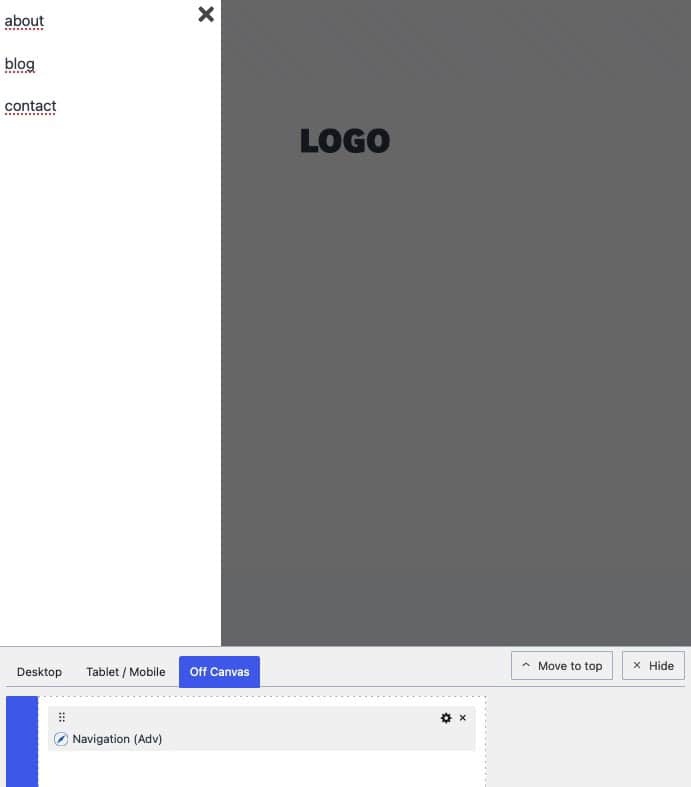
Blocks can be added to the Off Canvas Area, including Navigation (Adv) Blocks to display navigations. Use the Off Canvas Block Settings to customize this area. These settings are accessible by clicking the Off Canvas Button in the Visual Header. (Refer to the Off Canvas section below for more details on these settings.)
Off Canvas Settings
Use the Header Off Canvas Block Settings to control the overall styles of the Off Canvas area.
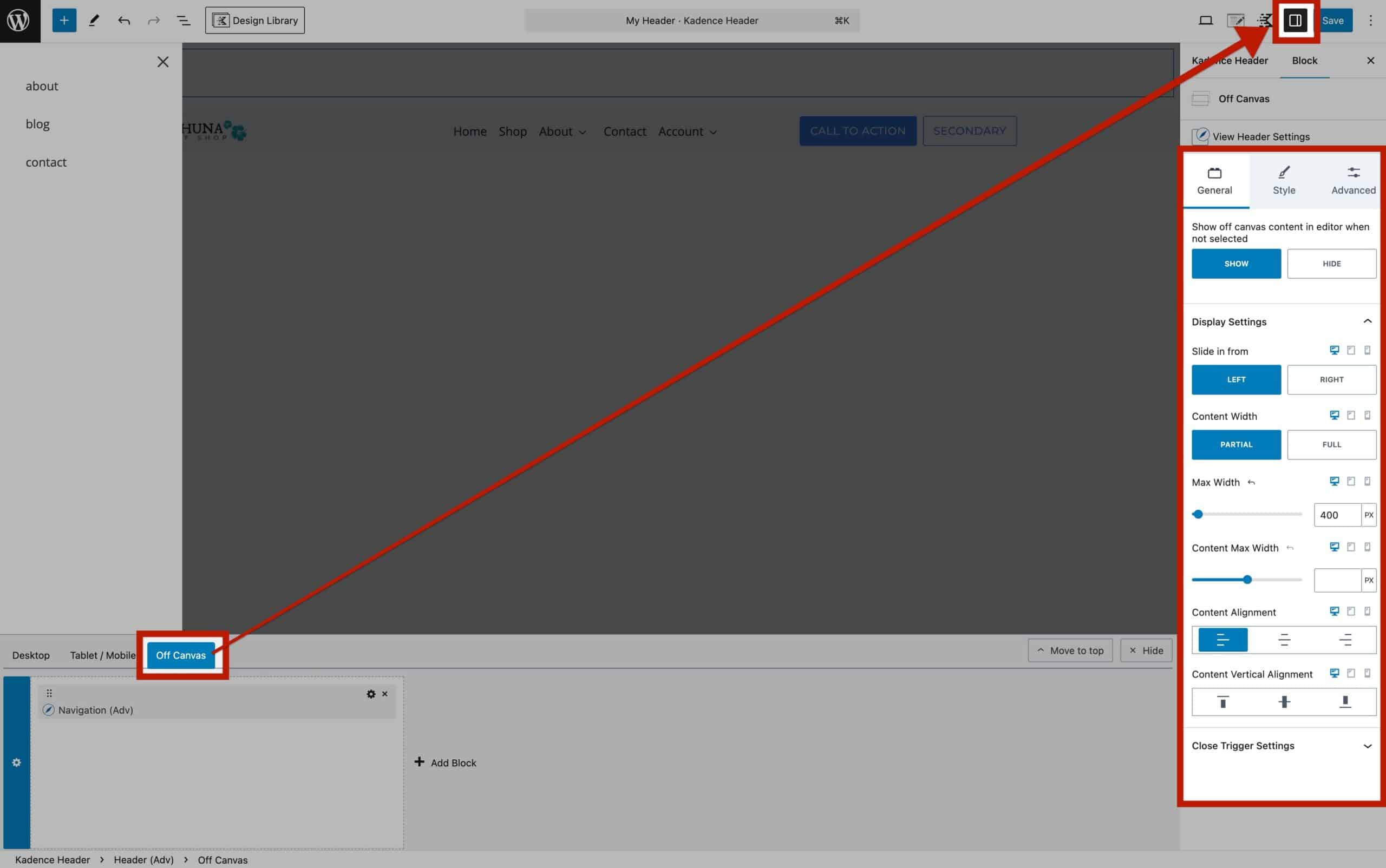
General Settings
Show Off Canvas Content in Editor When Not Selected: This option forces the Off Canvas Area to always remain visible even when other blocks are selected.
The Off Canvas Display Settings are responsive. Allowing you to adjust them for Desktop, Tablet, and Mobile Devices responsively. These options are useful as the Off Canvas Popup is limited to one per header.
Slide In From: Specify which side the Off Canvas Area will slide in from—either the Left or Right side of the screen.
Content Width: Control the width of the Off Canvas Area. Set it to Partial for a portion of the screen or Full to cover the entire width.
Max Width: When a Partial Content Width is selected, set a maximum width for the Off Canvas Area to prevent it from expanding beyond a specific limit.
Content Max Width: This setting controls the maximum width of the content inside the Off Canvas Area, without affecting the width of the Off Canvas Area itself. Use this when you want to ensure that the inner content, such as text or blocks, doesn’t exceed a certain width, even if the Off Canvas Area is wider.
Content Alignment: Align your content to the Left, Center, or Right within the Off Canvas Area.
Content Vertical Alignment: Adjust the vertical alignment of the inner contents to the Top, Center, or Bottom of the Off Canvas Area.
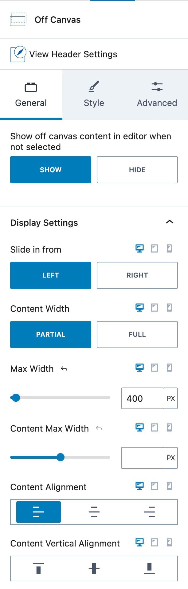
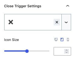
Close Trigger Settings: Select an Icon for the Close Trigger Button. This can be set to a Kadence Provided Icon or a Custom SVG Icon (Pro).
Icon Size: Control the size of the Close Trigger Icon.
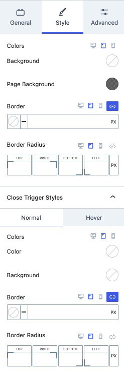
Style Settings
Background: Set a color for the Off Canvas Area to control its background color.
Page Background: When using a Partial Off Canvas Area, the page remains visible with an overlay shade. This can be adjusted using the Page Background setting. Use the opacity slider in the color picker to control the intensity of the overlay on the page.
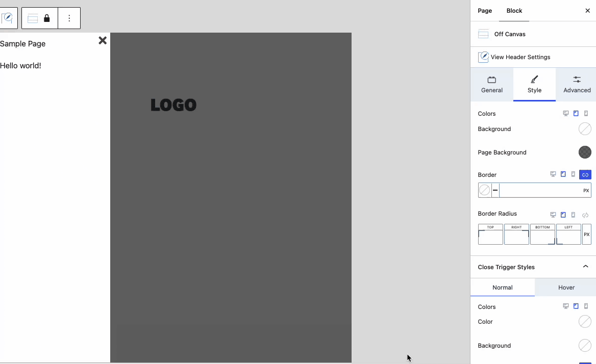
Border & Border Radius: Add a border to your Off Canvas Area. You can set the border color, size, and radius to customize its appearance
Close Trigger Styles: These styles apply to the Close Trigger.
- Colors: Adjust the color of your Close Trigger icon.
- Background: Modify the background color of the Close Trigger icon.
- Border & Border Radius: Add a border to your Close Trigger icon. You can set the border color, size, and radius to customize its appearance.
Advanced Settings
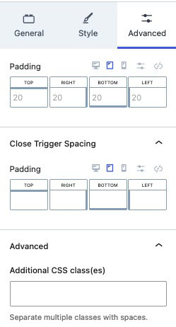
Padding: Add padding to your Off Canvas Area to increase the space around the inner contents.
Close Trigger Spacing: Adjust the spacing around your Close Trigger using the Close Trigger Spacing padding setting.
Additional CSS Class(es): Add custom CSS class(es) to your Off Canvas Area for further customization.
