
Kadence Blocks features the Advanced Header Block, allowing you to create stunning Headers directly from the Block Editor. This block offers a limitless alternative to the Classic Header Builder and unlocks the ability to create Kadence Headers on Full Site Editing (FSE) websites and can also be used with traditional themes, like the Kadence Theme. The Advanced Header Block is designed to enable users to create highly customizable headers directly within the Kadence Blocks environment.
This document focuses on the main Header (Adv) Block. The Advanced Header Block also introduces two additional Header-Related Blocks. These blocks consist of the Navigation (Adv) Block and the Navigation Link Block. Understanding each of these blocks is essential to building great Advanced Headers using Kadence Blocks. Click here for more Advanced Header-Related resources.
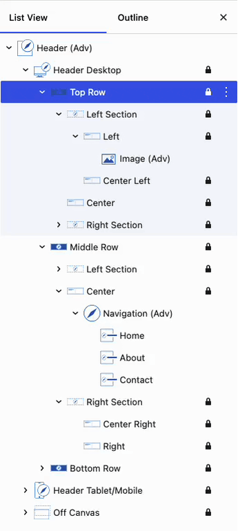
The Advanced Header Row and Section Blocks are locked by default and should not be unlocked or modified directly. Doing so may cause the Advanced Header Block to break. This applies to the Top Row, Middle Row, and Bottom Row Blocks, as well as the nested Left Section, Center Section, and Right Section Blocks within the main Header (Adv) Block.Getting Started
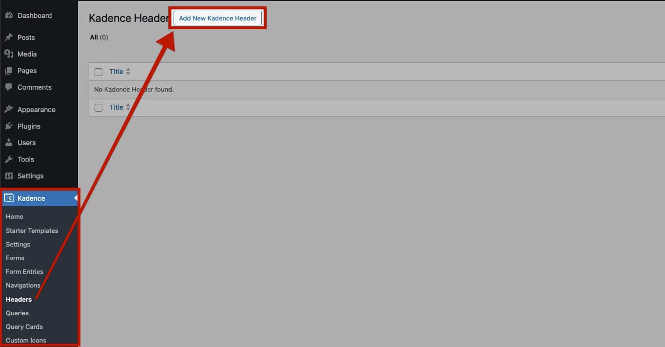
To start with Advanced Headers, navigate to the Kadence -> Advanced Headers page from the WordPress Dashboard. Then, click the Add New Kadence Header button at the top of the page to create a new Advanced Header.
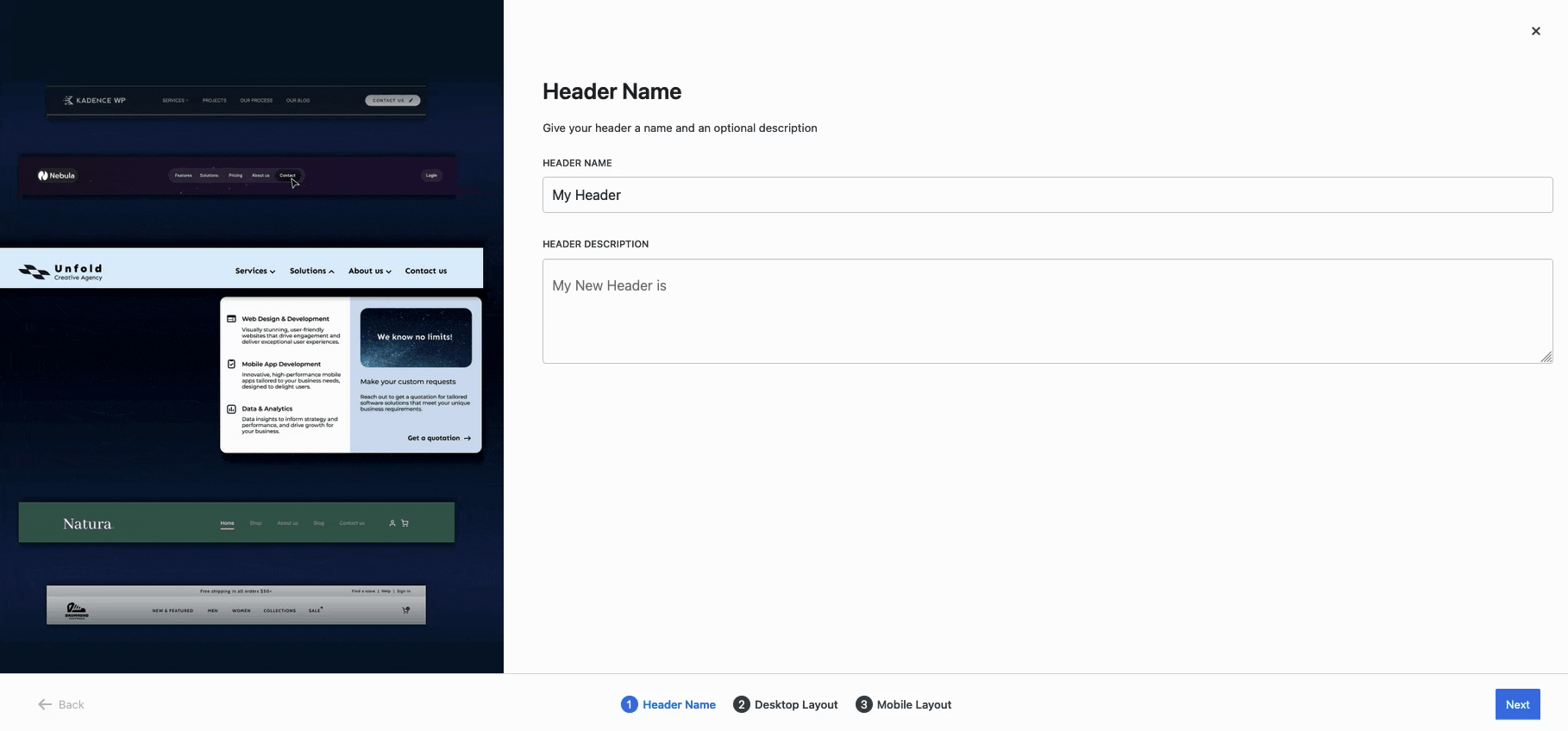
This will prompt the Initial Advanced Header Setup. This initial setup will guide you through configuring your header to meet your specific needs. This includes the option to select a premade Desktop and/or Tablet layout or start from blank headers.
This document specifies the Advanced Header Block and Settings. For an in-depth tutorial on creating Advanced Headers with Advanced Navigations and adding them to your website, refer to the Getting Started With Advanced Headers/Navigations document.
Accessing Header Settings
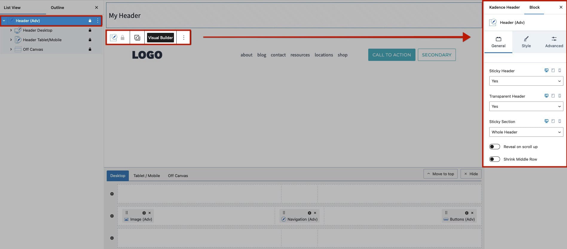
The Advanced Header Block offers a comprehensive set of customization options. Using the Block Settings, you can make global adjustments to the entire header. The individual Row Block Settings (top, main, and bottom) allow you to tailor each section of the header to your preferences. This structure ensures that you can achieve a high level of customization for your website’s header.
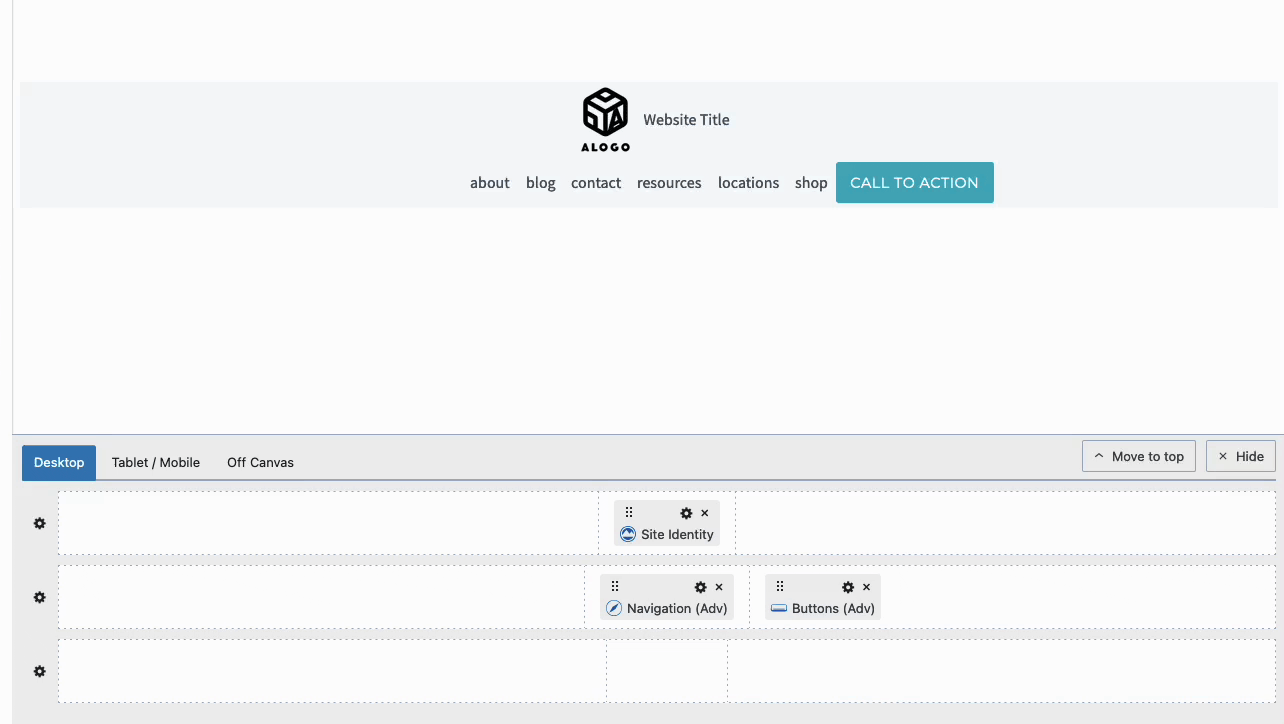
Accessing Advanced Header Block Settings
Accessing Advanced Header Row Settings
Additionally, you can also select respective blocks from the List View to access their Block Settings.
Header (Adv) Block Settings
Use the Header (Adv) Block Settings to control the overall styles of the Advanced Header.
General Settings
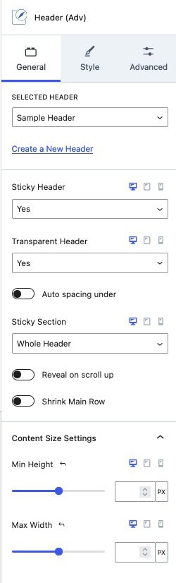
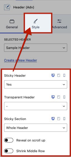
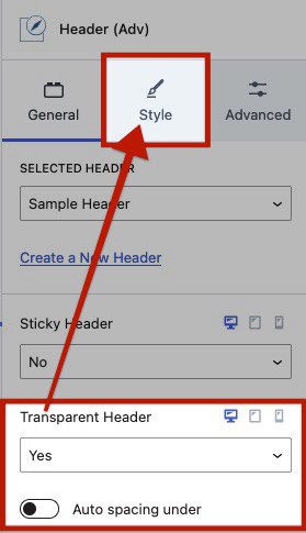
Selected Header: This displays the currently selected Advanced Header. From here, you can choose a different header or create a new one.
Sticky & Transparent Headers: Enable a Sticky and/or Transparent Header to apply these features to your header. These settings can be configured responsively for desktop, tablet, and mobile devices. Enabling these options will also provide additional Background and Border Style Block settings for that header type (e.g., Sticky Background Settings).
Auto Spacing Under (Transparent Header): When using a Transparent Header, it typically overlays the first block on a page. If you want the Transparent Header to appear above the block instead of overlapping it, enable this setting. It automatically adds spacing to achieve the desired positioning.
Sticky Section (Sticky Header): Set the entire header or an individual Header Row to be sticky.
Reveal On Scroll Up (Sticky Header): When using a Sticky Header, enable this option to reveal the sticky header only when scrolling up, instead of keeping it visible at all times.
Shrink Main Row (Sticky Header): Configure the header to shrink when it becomes sticky as the user scrolls down
Min Height: Set a Minimum Height for the entire header.
Max Width: Apply a Maximum Width to your header to limit its width. This will affect/limit the entire Width of the Header.
Style Settings
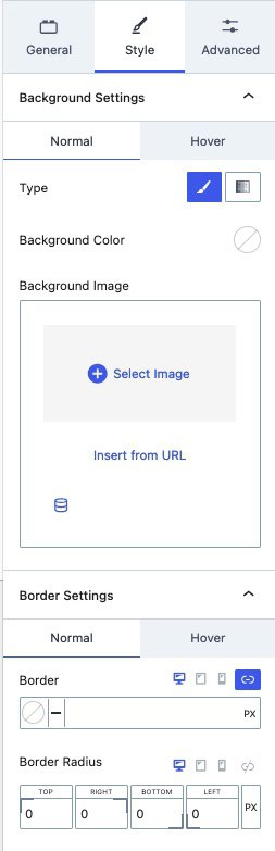
Background Settings: Adjust the Background Settings for both the Normal and Hover States of the Header.
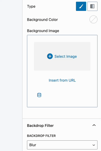
- Type: Choose the Background Type as either a Solid Color or a Gradient.
- Background Image: Set an image as the Advanced Header Background. You can select an image from the Media Library, insert it via a URL, or add it dynamically using Dynamic Content (Pro).
Border Settings: Configure the Border Settings for the Normal and Hover States. If using a Sticky Header or Transparent Header, additional Border Settings groups will be provided for each type.
- Border: Define the Border Color and Border Width.
- Border Radius: Apply a Border Radius to round the edges of your border.
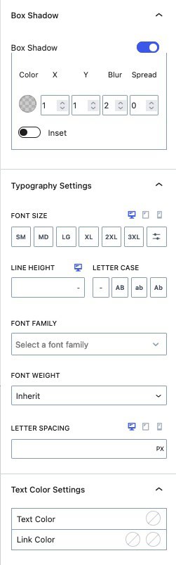
Box Shadow: Enable the Box Shadow using the Box Shadow Toggle. Once enabled, you can adjust the Color, X Offset, Y Offset, Blur, and Spread. Additionally, use the Inset Toggle to apply an Inset Box Shadow.
Typography Settings: Customize the Typography Settings for your Header. These styles will apply to the inner texts unless overridden by specific Typography Settings on an individual block level.
- Font Size: Set the Font Size for inner texts.
- Line Height: Define the Line Height for inner texts.
- Letter Case: Apply a Letter Case to your inner texts.
- Font Family: Choose a Font Family for the inner texts.
- Font Weight: Specify a Font Weight for the inner texts.
- Letter Spacing: Adjust the spacing between letters for your inner texts.
Text Color Settings: Customize the Text Color for the Header. You can also set a Link Color for both the Initial and Hover States of the link text.
Sticky Header Styles
When using a Sticky Header, in the Style Block Settings, there will be additional tabs for the Sticky Header. This includes the Sticky Background Settings and Sticky Border Settings.
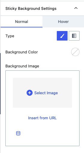
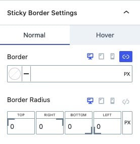
Sticky Background and Border Settings: These settings function the same way as the main Style Background and Border Settings. However, the Sticky Style Settings specifically apply to the Header when it is in the Sticky State.
Transparent Header Styles
When using a Transparent Header, in the Style Block Settings, there will also be additional tabs for the Transparent Header. This includes the Transparent Background Settings and Transparent Border Settings.
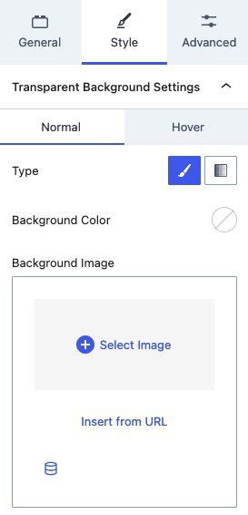
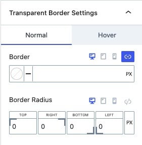
Transparent Background and Border Settings: These settings function the same way as the main Style Background and Border Settings. However, the Transparent Style Settings specifically apply to the Header when it is in the Transparent State.
Backdrop Filter
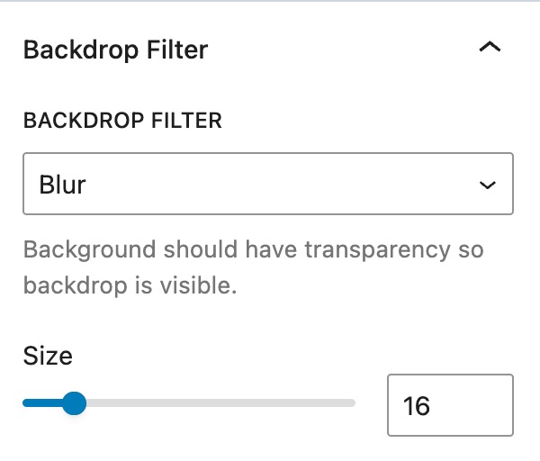
The Backdrop Filter settings are designed for Headers with completely Transparent or Semi-Transparent Background Colors or Gradients. This feature is not compatible with solid colors, gradients, or image-based Header Backgrounds. To enable transparency, use the Opacity Slider in the Color Picker to adjust the Background’s Opacity.
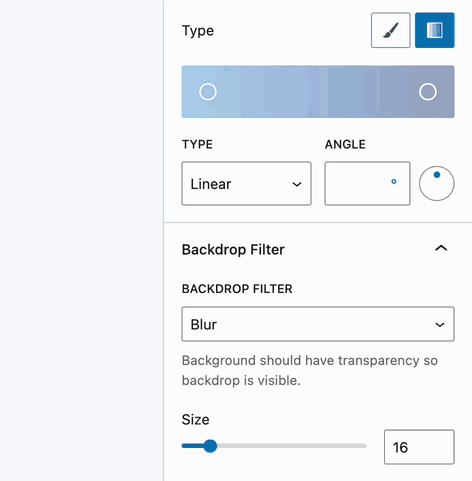
Backdrop Filter: Add a Backdrop Filter to the Background of the entire Header. Use the Size Slider to emphasize how strong you would like the Backdrop Filter to apply.
Available Filters: Blur, Brightness, Contrast, Greyscale, Hue Rotate, Invert, Saturate, or Sepia
Example of a Blur Backdrop Filter.
Advanced Settings
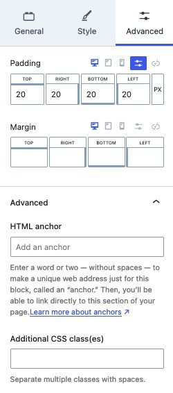
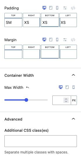
Padding and Margin: Apply Padding or Margin to your Advanced Header to adjust spacing around and within the header.
HTML Anchor: Use this setting to add an Anchor #ID to your Advanced Header for linking and navigation purposes.
Additional CSS Class(es): Assign additional Custom CSS Classes to your Advanced Header for further styling and customization.
Header (Adv) Row Settings
Each Row can be customized individually, giving you complete control over each Header Row.
Using the Visual Builder, you can Drag Blocks from one Header Row Section to another.
To add blocks to Header Rows, hover over a Row Section, click the Plus Icon, and select the desired block.
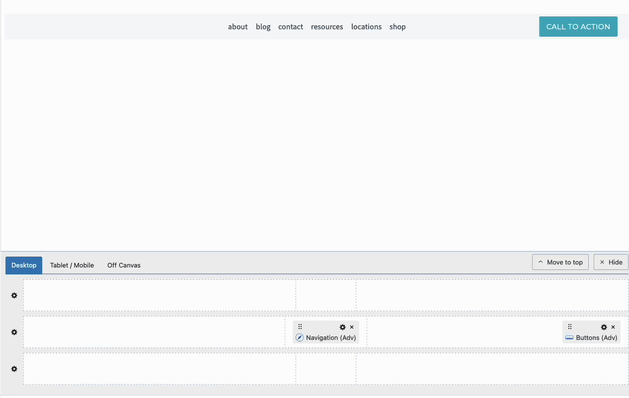
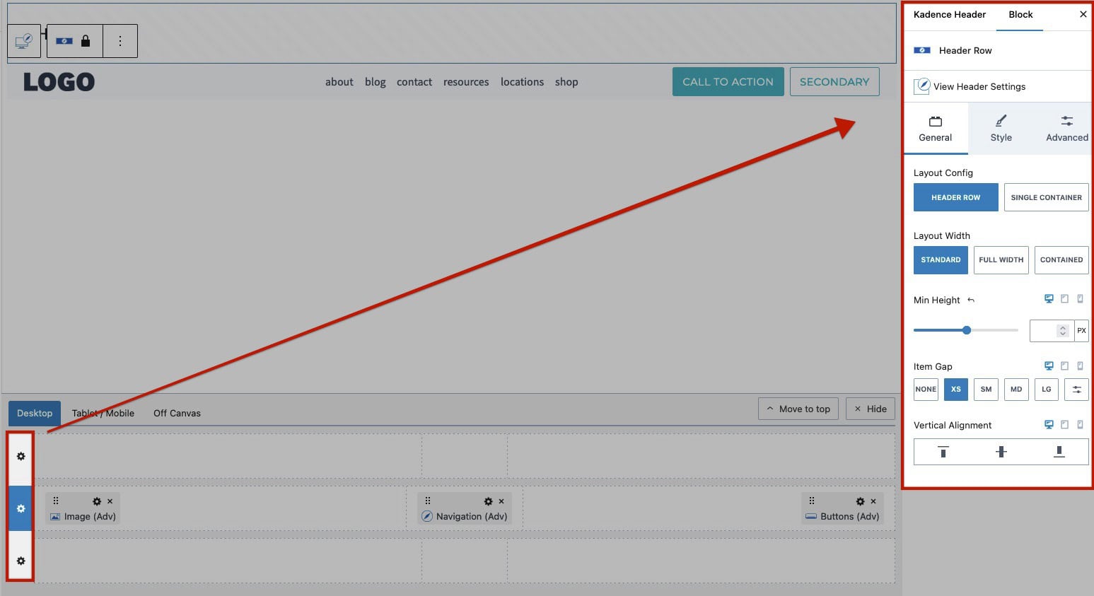
Customize each Header Row individually using the Header Row Block Settings. Access these settings by clicking the Gear Icons next to the respective row in the Visual Builder.
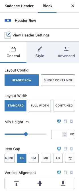
General Settings
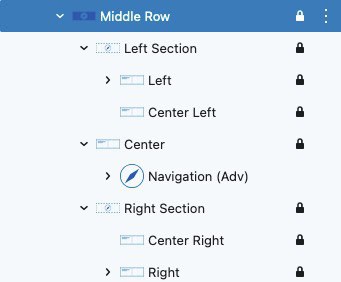
Layout Config: When using the Header Row, this will use the default sections included in a Header Row. (Left, Center Left, Center, Center Right, and Right). Use the Single Container option to make the entire Header Row a Single Container/Section. This can be used for scenarios where you may want something to stretch across the entire header or if you wish to use a Row Layout Block to fully control and customize the Header Row.
Layout Width: Choose the Layout type as Standard, Full Width, or Contained.
- Standard: The Standard Layout extends the background to full width while keeping the content constrained within the site container.
- Full Width: The Full Width layout extends the header background and content across the entire screen, creating a modern, expansive look.
- Contained: The Contained layout restricts the header width to the width of the site container.
When using the Kadence Theme, the Site Container Width can be adjusted in the Customizer -> General -> Layout settings under the Content Max Width Setting.
Min Height: Set a minimum height for the Header Row to ensure it maintains a consistent size, regardless of its content.
Item Gap: Adjust the spacing between items within the Header Row.
Vertical Alignment: Align items within the Header Row vertically. Options include Top, Center, or Bottom alignment.
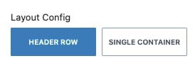
When using the Single Container Layout Config, the nested placement sections will not be used. Giving you full control over the entire Header Row.
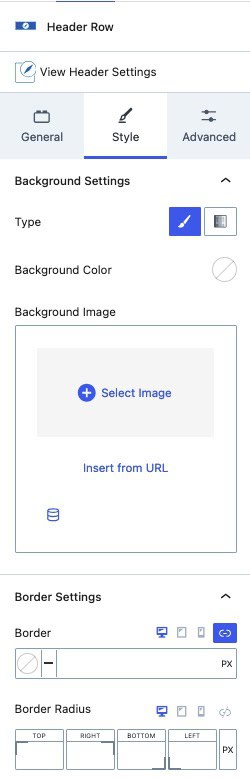
Style Settings
Background Type: Apply a standard Color or Gradient to the Header Row background.
Background Image: Set an Image as the Header Row background.
Border: Add a Border to the Header Row using the available options to specify the color and border sizes.
Border Radius: Apply a Border Radius to round the corners of your Header Row borders.
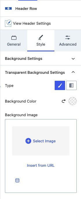
Transparent Background Styles
Transparent Background Settings: These settings are available when the Transparent Header is enabled. You can adjust them to customize the transparent background styles of the Header Row.
Advanced Settings
Padding and Margin: Apply Padding or Margin to your Header Row.
Container Width: Set the maximum width for your container. This setting is useful for defining a max width in the Contained Layout or for limiting the overall width of your Header Row content.
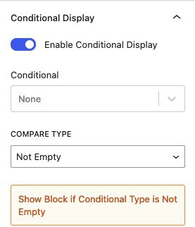
Conditional Display (Pro): Set conditions for displaying the Header Row based on specific criteria.
Additional CSS Class(es): Assign additional Custom CSS Classes to your Header Row for further styling and customization.
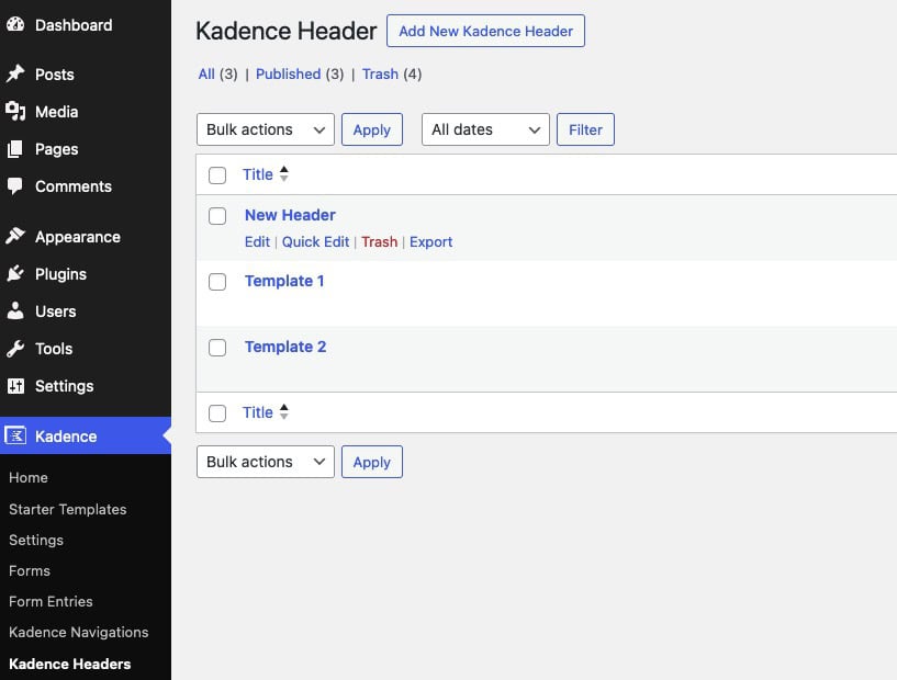
Managing Advanced Headers
Advanced Headers can be managed from the WordPress Dashboard. This can be done from the Dashboard -> Kadence -> Kadence Headers page.
Additional Resources
This document mainly covers the Advanced Header Available Settings. However, the Advanced Header Block features additional blocks that offer even more flexibility. You can refer to the resources below to get a comprehensive understanding of how to utilize Advanced Header Blocks and other Advanced Header-related blocks.
Getting Started with Advanced Header / Navigation Blocks: This comprehensive guide offers detailed instructions on setting up and using the Advanced Header Block and Advanced Navigation Block. It covers the complete setup process and provides essential information to help you effectively use Advanced Headers.
The Kadence Advanced Navigation Block: Learn how Advanced Navigation Blocks give you complete control over your navigation(s) directly in the WordPress editor.
The Kadence Navigation Link Block: Discover how to customize each inner Navigation Link Block.
Advanced Navigation Sub Menus and Mega Menus: Learn how to add Sub Menus and Mega Menus (Pro) to the Advanced Header.
