
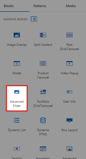
The Advanced Slider block provides an element that displays content in a slideshow format. This block allows users to view multiple content slides within a single space without taking up too much screen real estate. Advanced Sliders often showcase products or highlight important visual content, such as photographs or graphics.
The Advanced Slider Block is available with Kadence Blocks Pro.
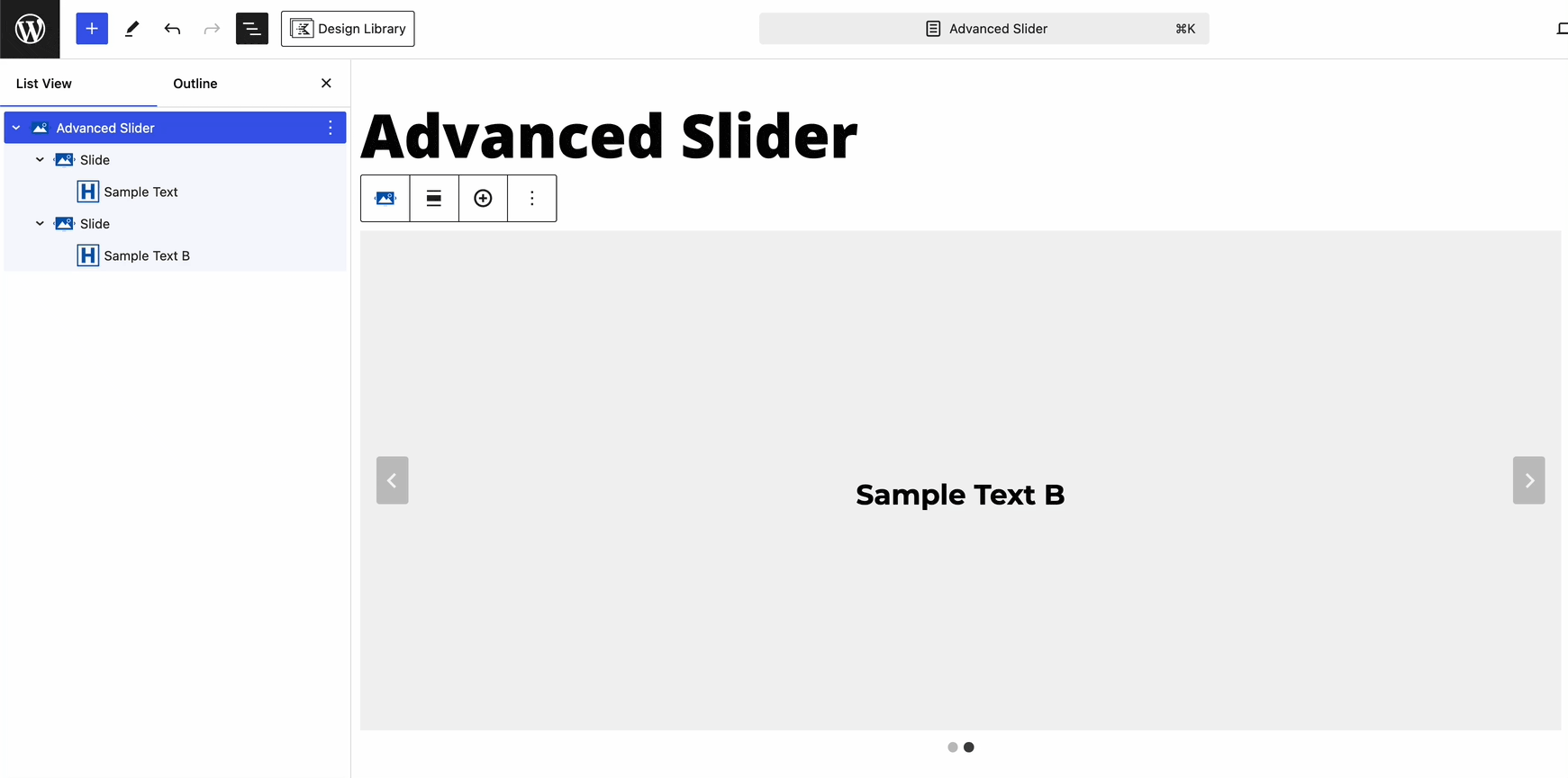
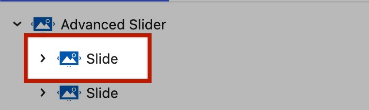
When adding an Advanced Slider Block to a page, the editor presents a Slider with two empty Slides. You have the opportunity to add your images or content by directly adding blocks inside of a Slide.
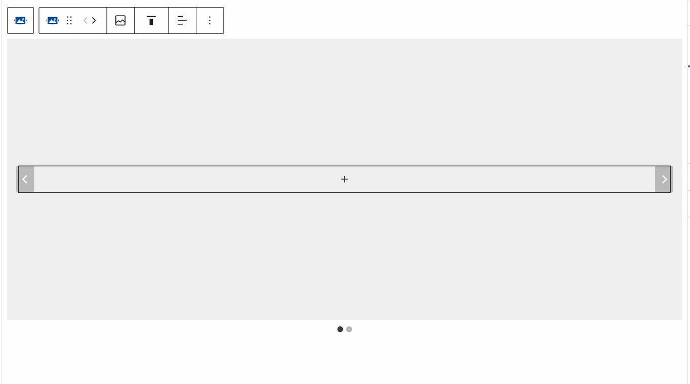
Press the “Add Slide” button (Plus Icon) on the Block Toolbar to add additional Slides.
Advanced Slider Block Settings
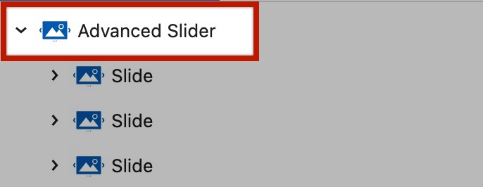
The Advanced Slider consists of a parent Advanced Slider block and nested Slide blocks. Each block has internal settings you can adjust. This section focuses on the Advanced Slider Block Settings. These settings apply to the Advanced Slider as a whole. Use the Slide Block Settings to customize each Slide individually.
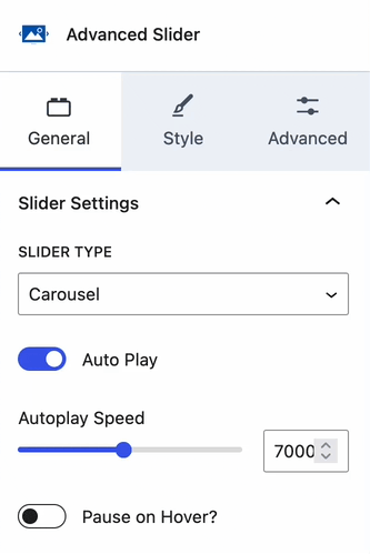
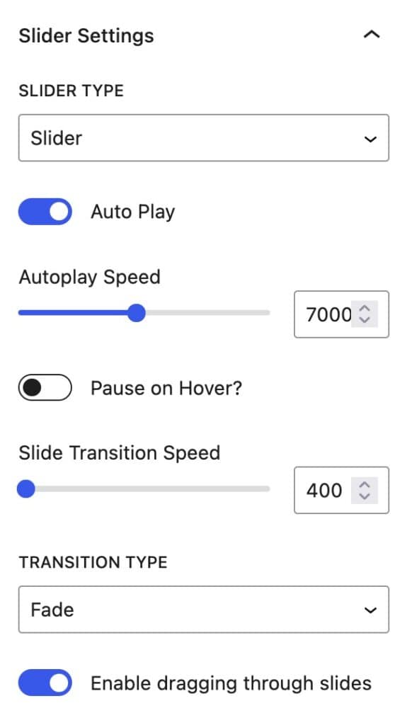
Slider Types
When viewing the Advanced Slider Block Settings, there are two initial Styles to choose from. One being a regular Slider and the other being a Carousel Slider. These Sliders both differ in design and can be used accordingly. (See the examples below)
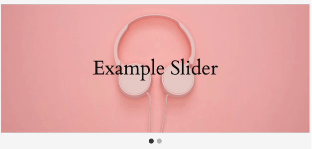
Sample Slider Style:

Sample Carousel Style:

General Block Settings
Auto Play: The Autoplay feature allows a Slider to automatically scroll through the available Slides. When this setting is enabled, you can use the Auto Play Block Settings to customize how the Autoplay will work.
Autoplay Speed: This determines the speed at which the Slider will change Slides. The higher the number, the faster/more frequently the Slides will change. These values are measured in milliseconds.
Pause On Hover: This option allows you to Pause the Autoplay feature whenever a user hovers over the Slider.
Slide Transition Speed: This speed determines how long a transition between the previous and the next Slide will be. The higher the number, the longer the transition will take. These values are measured in milliseconds.
Enable Dragging Through Slides: This option allows users to click and drag Slides to navigate through the Slider.
When using a Carousel Slider Type, there are additional settings available.
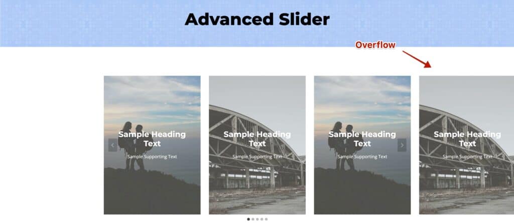
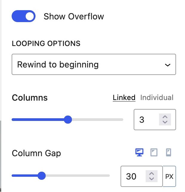
Show Overflow: This option enables your Carousel Slider to overflow, exposing additional Slides. Overflow can occur before and after the main Slider.
Looping Options: There are two main Looping Options. The Rewind To Beginning option will rewind the Slider from the end back to the beginning when the last Slide is reached. The Endlessly Loop option will re-loop all of your Slides continuously.
Columns: This option allows the number of initial Columns shown on the Slider. If overflow is on, this does not account for Overflow Slides.
Column Gap: This option controls the space between the Slide Columns. It can be adjusted for Desktop, Tablet, and Mobile Devices.
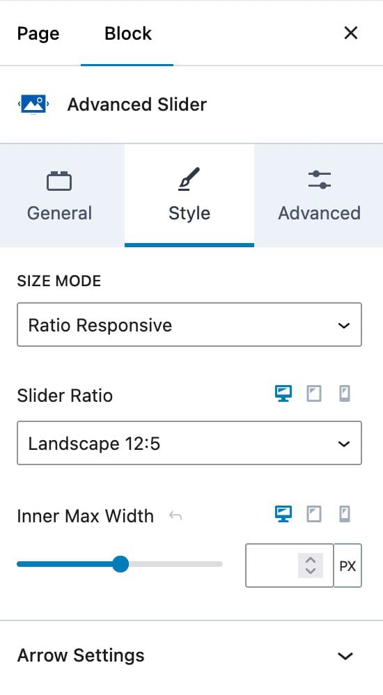
Style Block Settings
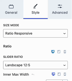
Size Mode: This option is only available for the Slider Slide Type. This can be set to a Ratio Responsive size or set to a Fixed Height. If set to a Fixed Height, you will have the option to adjust the Slider Min-Height setting.
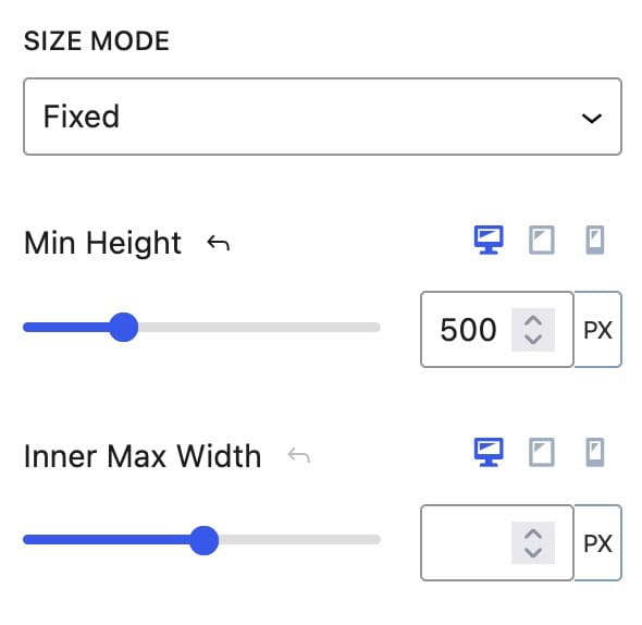
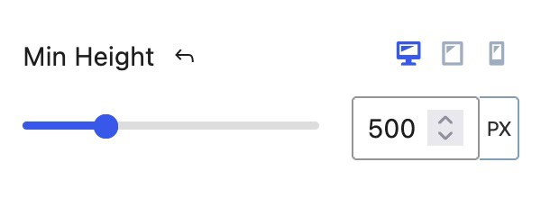
Min Height: This setting adjusts the minimal height the Slider will be. This can be set responsively.
Inner Max Width: This setting adjusts the max width of the content within Nested Slides.
Slider Ratio: When using a Ratio Responsive Size Mode, a Slider Ratio can be set. This can be set to one of many different ratio options available.
If using a Carousel Slider Type, the Size Mode setting will be replaced with a Min Height Setting.
Min Height: This setting can be used on Carousel Slider Types to specify a Minimal Height for the Slider/Slides to present at. This can be set for Dekstop, Tablet, and Mobile Devices.
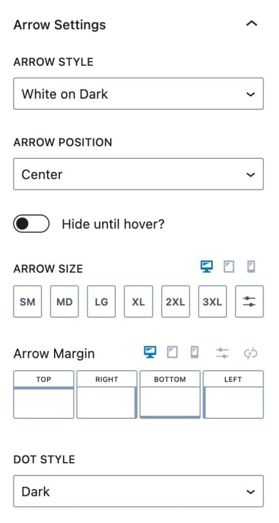
Arrow Style: This adjusts the style of the Arrows used to navigate the Slider. This can be set to either white on dark, black on light, outline black, outline white, or none.
Arrow Position: This sets the position where your Arrows will be on the Slider. This can be set to either center, bottom left, bottom right, top left, or top right.
Hide Until Hover: When enabled, this option allows you to Hide the Advanced Slider Arrows until the Slider is hovered over.
Arrow Size: Use the Arrow Size settings to adjust the size of your arrows for Desktop, Tablet, and Mobile Devices.
Arrow Margin: This can be used to add a Margin to your Arrows.
Dot Style: At the bottom of the Slider, there are navigational dots. You can set the Dot Styles either display as dark, light, or none.
Advanced Block Settings
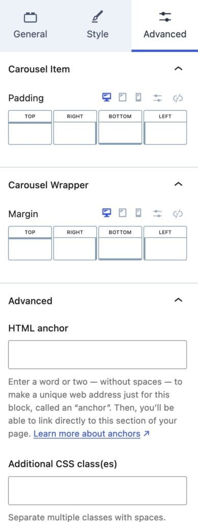
Padding: For both Carousel Style types, padding can be added to the Slider for spacing.
Margin: For both Carousel Style types, margin can also be applied to the Slider for spacing.
HTML Anchor: This setting can be used to add an ID #anchor to the Advanced Slider Block.
Additional CSS Class(es): This setting can be used for adding Custom CSS Class(es) to the Slider for further customizations.
Slide Block Settings
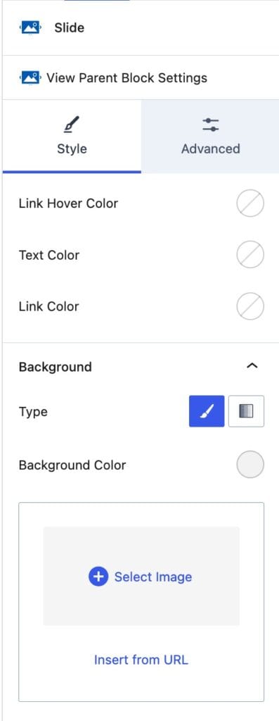
Selecting a Child Slide Block gives you access to the Slide settings. Sections include Slide background settings, Slide background overlay, Slide text color, Slide align settings, and other advanced settings.
Style Block Settings
Link Hover Color: Adjust the color of Links that are within the Slide whenever they are hovered over.
Text Color: Adjust the color of Texts within the current Slide.
Link Color: Adjust the initial color of Link Texts that are within the Slide.
Background: The Background can be set to either a Color, Gradient, or an Image.
Type: The Background Type applies if you are not using an Image for the Background. You have the option to select a Color or a Gradient. Depending on your selection, the next setting will display the appropriate color picker.
Background Images: Below the Background Color Options, an Image can be added and used instead. You can upload an Image from the Media Library or insert one from a URL.
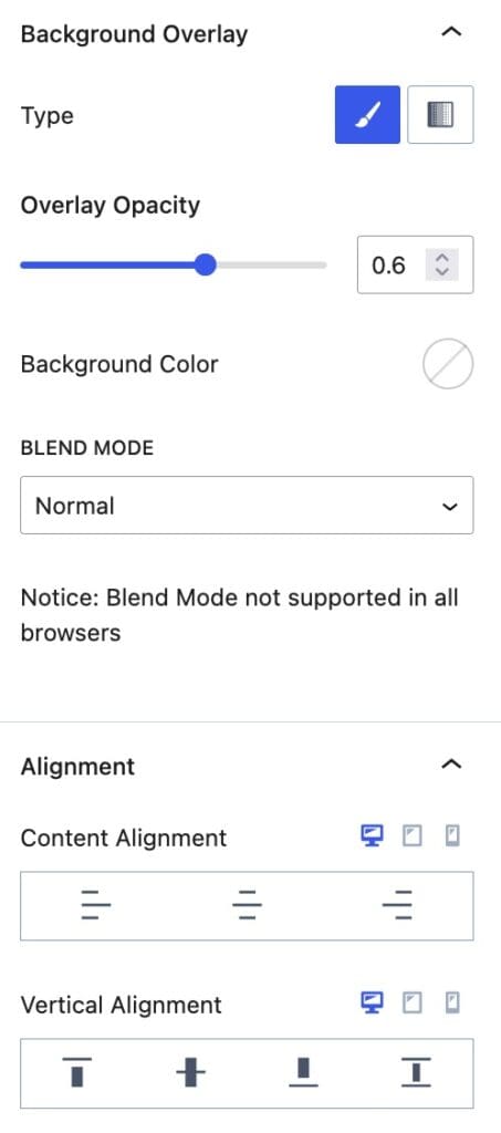
Background Overlay: The Background Overlay presents an overlay color over the current Background.
Type: You can use either a Solid Color or a Gradient Background Overlay Type.
Overlay Opacity: This setting can be used to determine how strong you want the Overlay Opacity to be. With 1 being fully colored and 0 being invisible.
Blend Mode: This setting is set to normal by default and Blend Mode may not be supported in all browsers. You can learn generally about Blend Modes and how they work here.
Content Alignment: This setting can be used to add an Alignment to the inner contents of the Slide.
Vertical Alignment: This setting can be used to add a Vertical Alignment to the inner contents of the Slide.
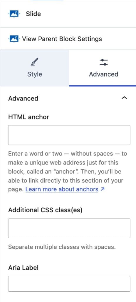
Advanced Block Settings
HTML Anchor: This setting can be used to add an ID #anchor to the specified Slide.
Additional CSS Class(es): This setting can be used for adding Custom CSS Class(es) to the Slide.
Aria Label: Use the Aria Label Block Setting to add an Aria Label to your Slide, making it more accessible.
