
A Modal allows for a fully editable popup to be added to any page. Place any content you wish within the block for any layout you like. The Modal block is only available with Kadence Blocks Pro.
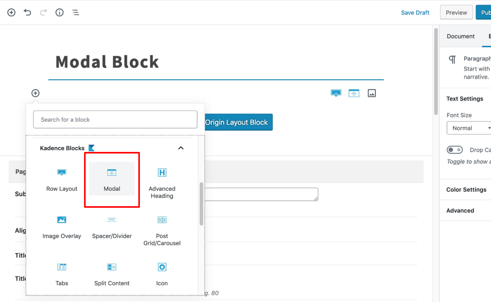
First, select the modal block and add it to your content:
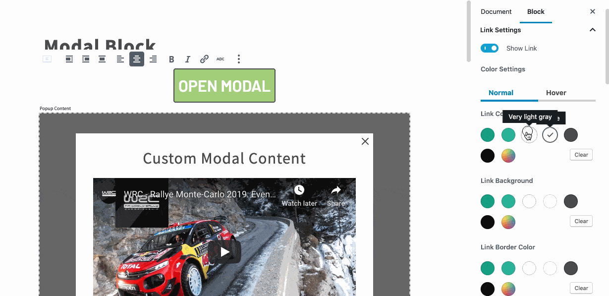
Customize your modal link text:
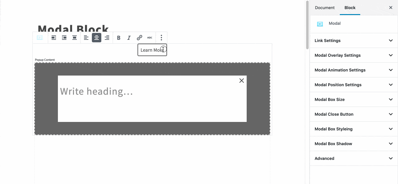
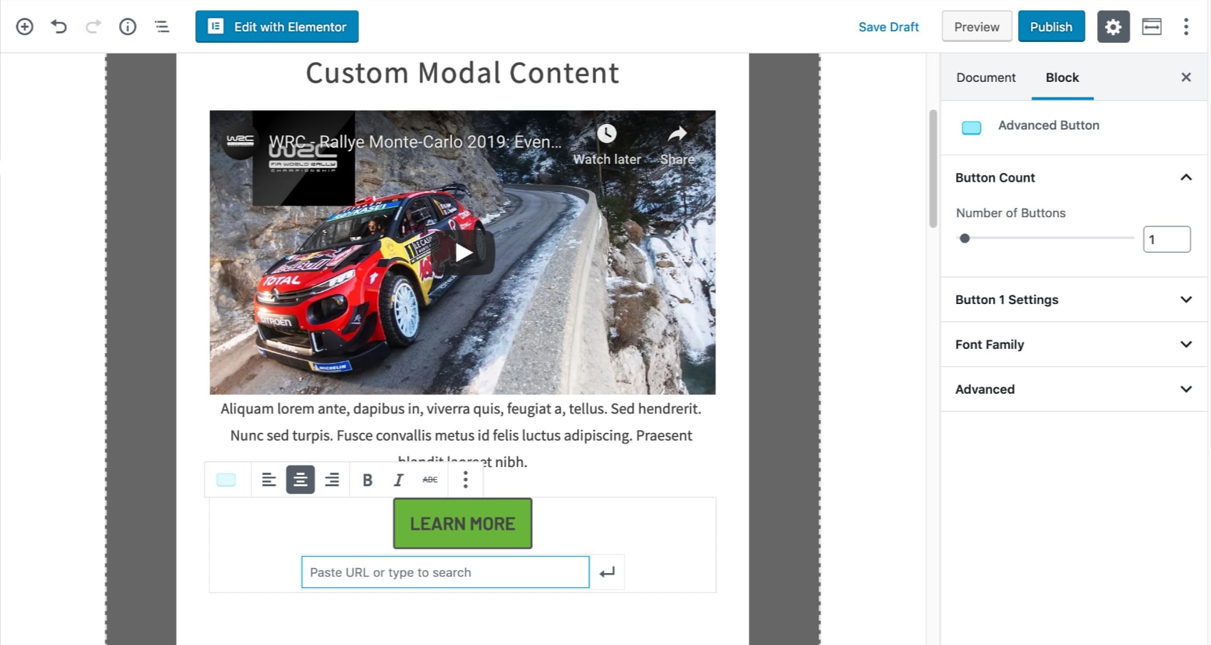
Customize the content within your modal block:
Edit the appearance of your modal link:
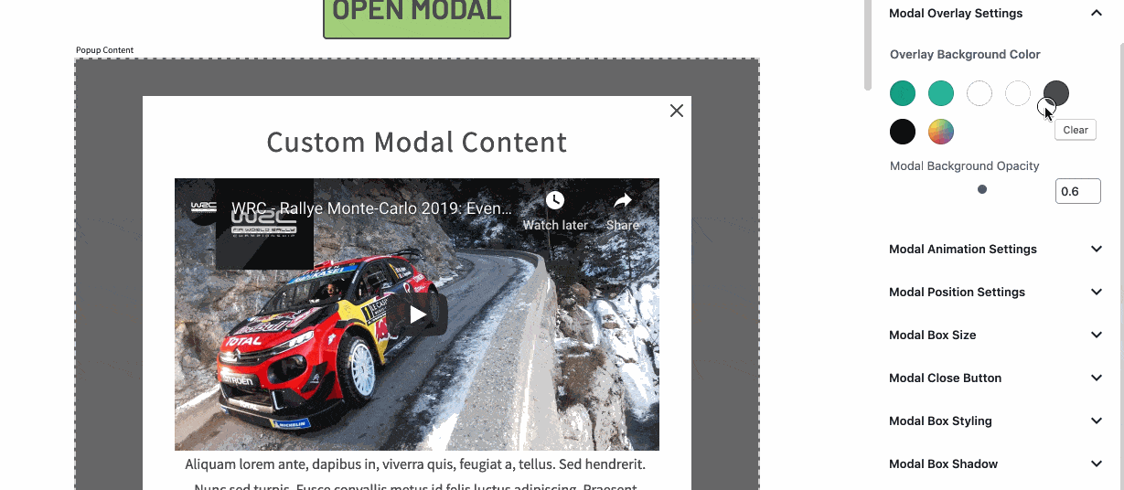
Customize the modal overlay:
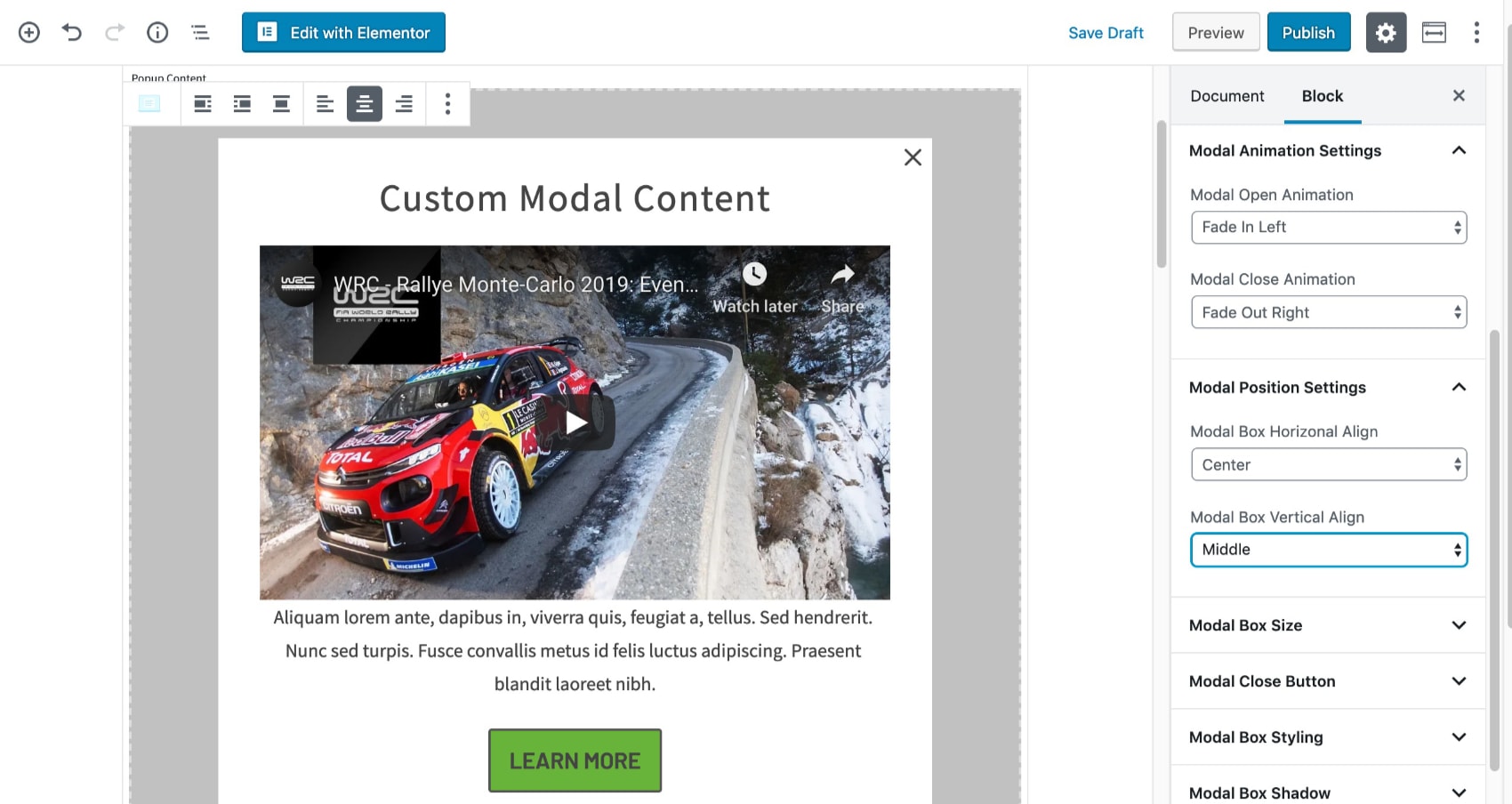
Configure your modal animation and position:
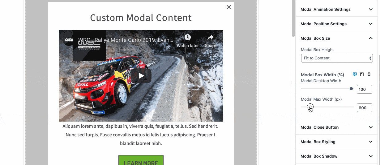
Adjust the width and height of your modal block:
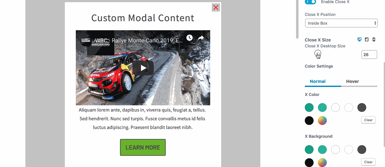
Customize the appearance of the modal “close X.”
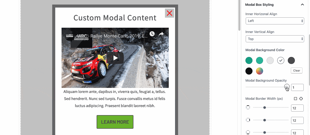
Configure the style of your modal box. Customize backgrounds and add borders:
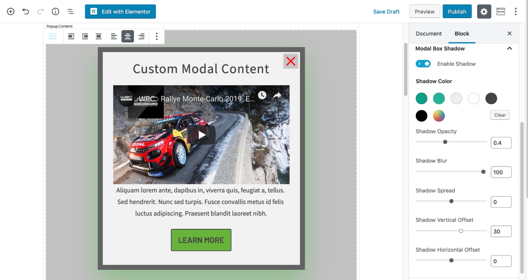
Add a box shadow to give your modal added dimension:
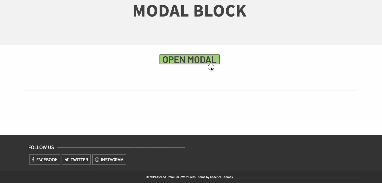
Once you’re happy with the modal, view it on the front end to ensure it looks as intended:
Opening a modal with a custom link.
Within the modal block settings, you can turn off the modal link and then create a custom link somewhere else on your page. You do this by going to link settings in the modal block and turning off the link.
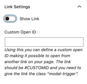
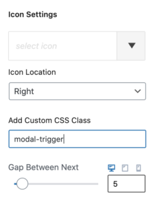
Then right below you will see the input for “Custom Open ID” this is where you would add an id for your custom link. An example would be “customid”.
Next create an advanced button where you want to open this modal and set the link for the button to #customid, below in the button settings add the class “modal-trigger”.
Publish and that button will now open the modal.
