Skip to content
Help Center
  • Pricing
  • ProductsExpand
    • Premium BundlesGet all the tools you need in one bundle
    • Kadence ThemeLightning-fast performance theme for modern websites
    • Kadence BlocksDrop in ready designs with advanced controls for pixel perfect websites
    • Kadence Shop KitCreate a more effective WooCommerce shopping experience
    • Kadence ConversionsBoost sales and build engaged audiences with popups and banners
    • Kadence InsightsEasily create A/B tests. Optimize your pages to drive higher conversions.
    • View All Products
  • AI Starter Templates
  • Blog
  • SupportExpand
    • Help CenterProduct Questions? Not sure how to do something? Start here
    • Support TicketsNeed help? We love to help our customers
    • About usCrafted with love in Missoula, Montana
    • Contact usPre Sale Questions? Need help purchasing?
Account Account
Get Kadence
Kadence Blocks
  • Features
  • Pro
  • Blocks
  • HelpExpand
    • Documentation
    • Submit a Ticket
    • Facebook Group
    • Feature Requests
    • Roadmap
    • Changelog
Help Center
Kadence Blocks

Kadence Blocks

  • Table (Adv) Block
  • Create a Full Screen Landing Page
  • How to use Popup Modal Filters with Advanced Query Loops
  • Integrating Kadence Forms with Mailchimp
  • Site Identity Block
  • Search (Adv) Block
  • Using Advanced Header / Navigation Blocks vs Kadence Theme Header Builder
  • The Kadence Visual Builder & Off Canvas Settings
  • The Kadence Navigation (Adv) Block
  • The Kadence Navigation Link Block
  • The Kadence Header (Adv) Block
  • Google Maps Block
  • Integrating Kadence Forms with Mailerlite
  • Repeater Block
  • Accordion Block
  • Progress Bar Block
  • Form (Adv) Block
  • Gallery (Adv) Block
  • Section Block
  • Product Carousel Block
  • Image (Adv) Block
  • Buttons (Adv) Block
  • Count Up Block
  • Table of Contents Block
  • Lottie Animation Block
  • Show More Block
  • Posts Block
  • Countdown Block
  • Tabs Block
  • Row Layout Block
  • Form Block
  • Info Box Block
  • Spacer/Divider Block
  • Icon Block
  • Icon List Block
  • Text (Adv) Block
  • Testimonial Block

Getting Started

  • Kadence AI-Powered Design Library
  • Installing Kadence Blocks
  • Setting custom widths in multi-column Row Layout Blocks
  • How to define a color Palette with Kadence Blocks
  • How to delete/remove a Block
  • How to Duplicate and Copy/Paste Block Styles
  • Setting Block Defaults
  • Kadence Blocks Pexels Integration

Block Tutorials

  • Responsive Breakpoints in Kadence
  • How to use Popup Modal Filters with Advanced Query Loops
  • Using GIFS and Lottie Animations with Kadence Blocks
  • Search (Adv) Block
  • Displaying Shortcodes in the WordPress Editor
  • Integrating Kadence Forms with Mailchimp
  • Advanced Navigation Sub Menus and Mega Menus
  • Building Headers and Footers in Full Site Editing with Kadence Blocks
  • Creating Sticky and Transparent Advanced Headers
  • Getting started with Advanced Header/Navigations
  • Integrating Kadence Forms with Mailerlite
  • Split Content Quick Start Guide
  • How to control the Kadence Design Library
  • Adding Video Backgrounds to Row Layout
  • Pexels Picker
  • Adding Old Wireframes, Starter Packs, and Sections to the New Design Library
  • How to customize the design library color palette
  • Adding a Fullwidth Row
  • Adding Privacy Policy link to Kadence Form
  • Set Equal Column Heights with the Row Layout Block
  • Image Overlay Quick Start Guide
  • Modal Block Quick Start Guide

Pro Addon

  • Custom Queries for Advanced Query Loop Block
  • Kadence Blocks Pro Plugin
  • Advanced Slider
  • Video Popup Block
  • Image Overlay Block
  • Split Content Block
  • Modal Block
  • Dynamic Content
  • Query Loop (Adv) Block
  • Repeater Block
  • Using a Dynamic List Block
  • Dynamic Content: Custom Input and Showing Fields from all Post Types
  • How to Design a Post Grid/Carousel using a Kadence Element
  • Dynamic HTML Block
  • Using Custom SVG Icons with Kadence Blocks
  • Post/Grid Carousel Block
  • Kadence Custom Fonts
  • Post Grid/Carousel Block – Configure a Blog List

Troubleshooting Blocks

  • How to Recover a Broken Block

Advanced

  • Prebuilt Layouts
  • Using Tooltips with Kadence Blocks
  • Custom Queries for Advanced Query Loop Block
  • Adding a Custom Font to Kadence Blocks

Advanced Headers

  • Importing & Exporting Advanced Headers & Navigations
  • The Kadence Header (Adv) Block
  • The Kadence Navigation (Adv) Block
  • The Kadence Navigation Link Block
  • Getting started with Advanced Header/Navigations
  • Getting the most out of Navigation Link Blocks
  • Using Advanced Header / Navigation Blocks vs Kadence Theme Header Builder
  • Creating Sticky and Transparent Advanced Headers
  • Advanced Navigation Sub Menus and Mega Menus
  • Advanced Header Best Practices
  • The Kadence Navigation Builder
  • The Kadence Visual Builder & Off Canvas Settings
  • Building Headers and Footers in Full Site Editing with Kadence Blocks
  • Home
  • Knowledge Base
  • Kadence Blocks
  • Kadence Blocks
  • Block Tutorials

Responsive Breakpoints in Kadence

Users sometimes want to know how to know more about responsive breakpoints in Kadence. For example, if you adjust the size of your browser, you will notice the content in your site respond accordingly. Generally, Kadence has the following breakpoints:

Desktop: > 1024px
Tablet: 768px – 1024px
Mobile: < 768px

Responsive Settings

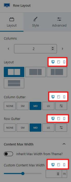
Some options through the Kadence theme and blocks include icons for desktop, tablet, and mobile devices. Clicking on one of these icons will update the setting for that screen size allowing you to set a responsive option. The Kadence theme and blocks plugin have various responsive settings.

For example, the Row Layout block has “Layout” settings that let you adjust the column layout. Just above the setting are the three breakpoint icons. Initially, the setting applies to desktop devices, but you can decide to add different settings for tablet and mobile devices. This allows you to turn a four-column row into a two-column row for tablets and a single column for mobile devices.

Users sometimes want to know if they can customize these breakpoint values. However, there are no settings to change the breakpoints. If you need more control over styles at different screen widths, you must rely on media queries.
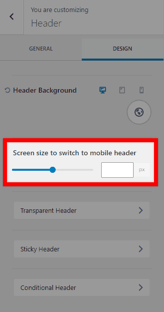
Mobile Header

Another responsive setting applies to the mobile header. You can set the screen width at which the header switches between the mobile and desktop header. Navigate to Appearance > Customize > Header, then click on the Design tab. There is an option to set the “Screen size to switch to mobile header.” This setting sets the screen width (in pixels) at which the desktop header will turn into the mobile header. Screen widths lower than this setting will show the mobile header, and widths above this setting will show the desktop header.

How to use Popup Modal Filters with Advanced Query Loops
  • Pricing
  • Products
    • Premium BundlesGet all the tools you need in one bundle
    • Kadence ThemeLightning-fast performance theme for modern websites
    • Kadence BlocksDrop in ready designs with advanced controls for pixel perfect websites
    • Kadence Shop KitCreate a more effective WooCommerce shopping experience
    • Kadence ConversionsBoost sales and build engaged audiences with popups and banners
    • Kadence InsightsEasily create A/B tests. Optimize your pages to drive higher conversions.
    • View All Products
  • AI Starter Templates
  • Blog
  • Support
    • Help CenterProduct Questions? Not sure how to do something? Start here
    • Support TicketsNeed help? We love to help our customers
    • About usCrafted with love in Missoula, Montana
    • Contact usPre Sale Questions? Need help purchasing?
Account Login
  • Features
  • Pro
  • Blocks
  • HelpExpand
    • Documentation
    • Submit a Ticket
    • Facebook Group
    • Feature Requests
    • Roadmap
    • Changelog