
A modal refers to a graphical user interface (GUI) element that overlays the main content of a webpage, typically to display additional information or functionality without navigating to a new page. Modal windows are often used to prompt users for input, showcase images or videos, or present alerts and notifications. They temporarily interrupt the user’s interaction with the main content, creating a focused and interactive space for specific tasks. Kadence Modal blocks are versatile components, providing a clean and intuitive way to present information while maintaining the context of the underlying page. They enhance the user experience by preventing the need for full-page reloads and allowing seamless interactions within the current interface. Designers can customize models in terms of appearance, behavior, and content to align with the overall aesthetics and functionality of a website.
Here’s a Modal Block Quick Start Guide for a speedy introduction.
Block Settings
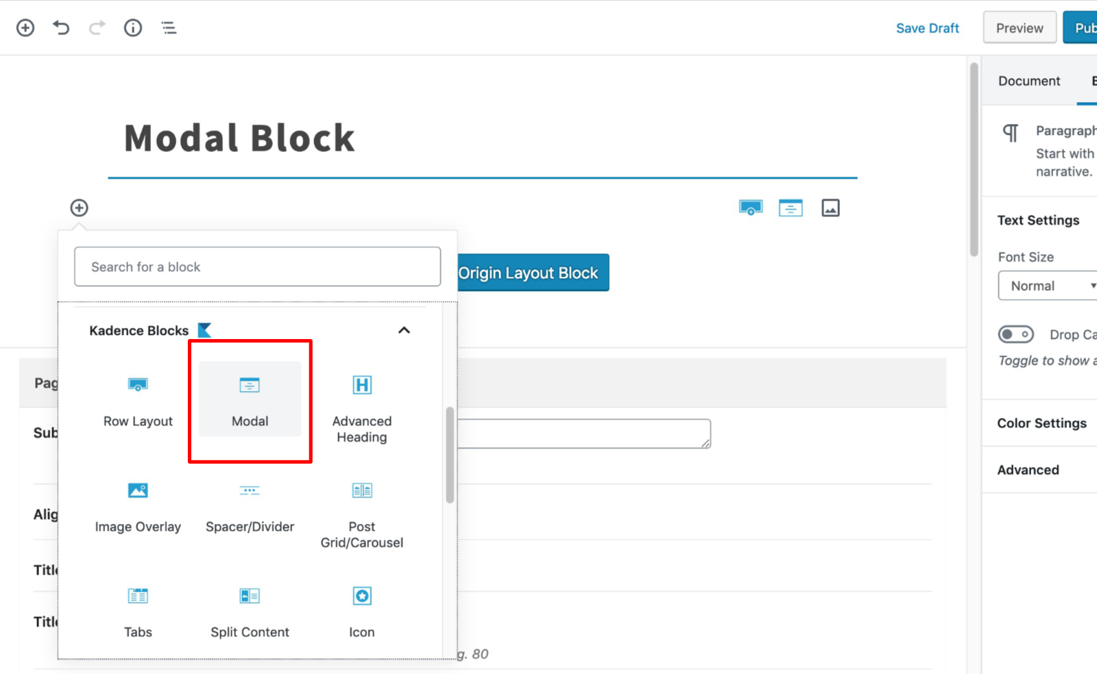
You can add a modal to the page by finding the Modal block.
General
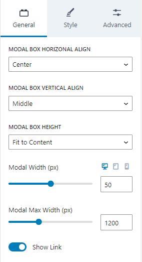
The Modal block provides a few settings in the General tab. The Modal Box Horizontal Align setting lets you align the modal to the center, left, or right.
The Modal Box Vertical Align sets the modal to the middle, top, or bottom.
The Modal Box Height setting can be “Fit to Content”, “Fixed Minimum Height”, or “Full Screen Height”. There is an additional setting for the Fixed Minimum Height when the option is chosen.
The Modal Width can be set for desktop, tablet, and mobile devices. This is a percentage of the Modal Max Width setting.
Modal Max Width sets the max width of the modal.
The Modal link can also be hidden by disabling the “Show Link” option. This is useful when you need to hide the modal, but you want to show it again in the future.
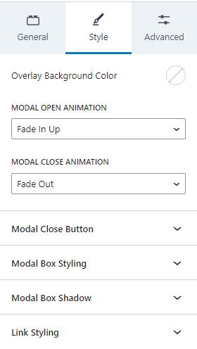
Style
The Style tab has settings for the Modal style. You can adjust the Overlay Background Color, add a Modal Open Animation, and a Modal Close Animation.
Additionally, there are settings for the Modal Close Button, the Modal Box Styling, Modal Box Shadow, and the Link Styling.
Modal Close Button
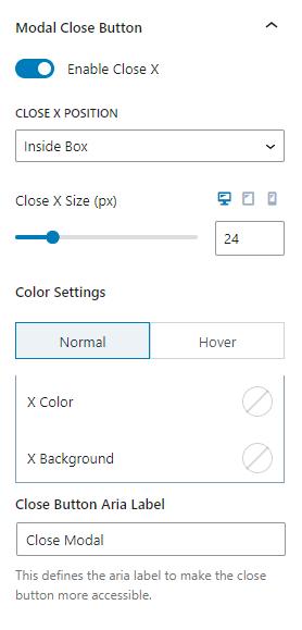
When Modals open, they can be closed. You can enable or disable the close button. Either way, the modal closes when the user clicks outside of the modal.
The close button displays an “X” and can be positioned inside or outside of the modal box. You can also adjust the close button size for desktop, tablet, and mobile devices.
There are color settings for the close button. You can adjust the normal colors and the colors for when the user hovers over the button. You can change the “X” color and background.
There is also a setting to change the Close Button Aria Label. This setting defines the aria-label for accessibility.
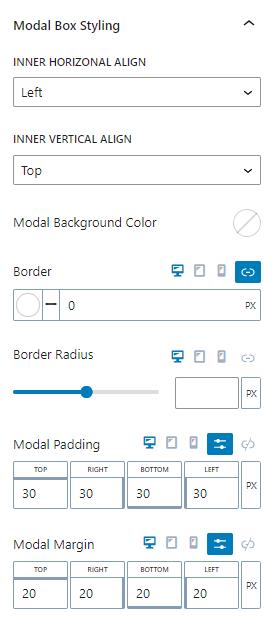
Modal Box Styling
The modal box can be styled. The inner horizontal and vertical alignments can be adjusted. Horizontally, it can be aligned left, center, or right. Vertically, the content can be aligned to the top, middle, or bottom.
The modal can have a background color.
You can set the border color and size. This can be set independently for desktop, tablet, and mobile devices.
The border radius can also be set for desktop, tablet, and mobile devices. You can adjust the setting with a slider or using the number pad.
Modals have padding and margin settings to add space. These values can be adjusted for desktop, tablet, and mobile devices.
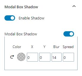
Modal Box Shadow
The modal box can have a shadow. The shadow can have a color, an X and Y offset, a blur, and a spread.
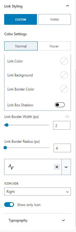
Link Styling
Links can inherit the theme’s link style, or create a custom style.
When setting a custom style, you can set the normal or hover colors. You can set custom link, background, and link border colors. You can also add a shadow for the link box.
The link border width can also be adjusted along with the link border radius.
The links can have an icon in the text. The icon can be on the right or left sides of the text. Additionally, there is an option to show only the icon.
Lastly, there are Typography settings to change the font settings.
Advanced
The Advanced tab has a few advanced options. Generally, the modal block is used inside the content of a post. However, if the Modal is placed outside of the content, the “Load Content After Footer” setting may help if the modal breaks.
The modal can also have a custom open ID. The Custom Open ID setting lets you define a link ID to open the modal. However, keep in mind that the link needs a “modal-trigger” class too.
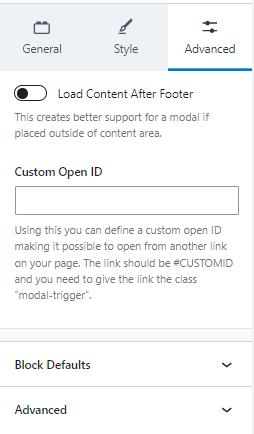
Block Defaults
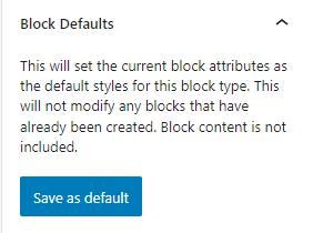
Sometimes, you need to add a block many times and need them to have identical styles. In these cases, you can save the block’s current settings as default settings for new blocks of the same type. For example, if you use the Advanced Text block throughout your content, you might find it helpful to save default settings so that new Advanced Text blocks have them by default.
Kadence blocks have a Block Defaults section under the Advanced tab in the block settings. After you adjust the settings to the desired defaults, find the Block Defaults section and click the button that reads Save as Default.
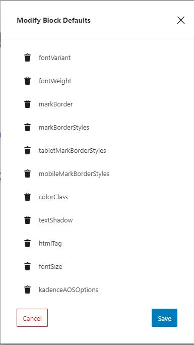
After clicking the button, you will find two new links in the section to Modify Attributes and Reset Defaults. If you choose to Modify Attributes, you can delete the default settings individually. If you choose to Reset Defaults, all the default settings are removed.
Remember, the default settings only apply to newly added blocks, not existing blocks.
