
The Navigation Link Block is a Block within Advanced Navigations that offers versatile control over individual navigation links. This block allows you to add sub menus, mega menus, media, descriptive text, and highlight texts to your navigation links. Use the Block Settings to further customize each link by applying specific colors and styles to them. Giving you complete control over each Navigation Link within your Advanced Navigations.
Navigation Link Block Settings
Utilize the Navigation Link Block Settings to individually style your navigation links, including options for link color, background color, typography settings, and more. To apply styles to the entire navigation, use the Advanced Navigation Block Settings instead of customizing each navigation link separately.
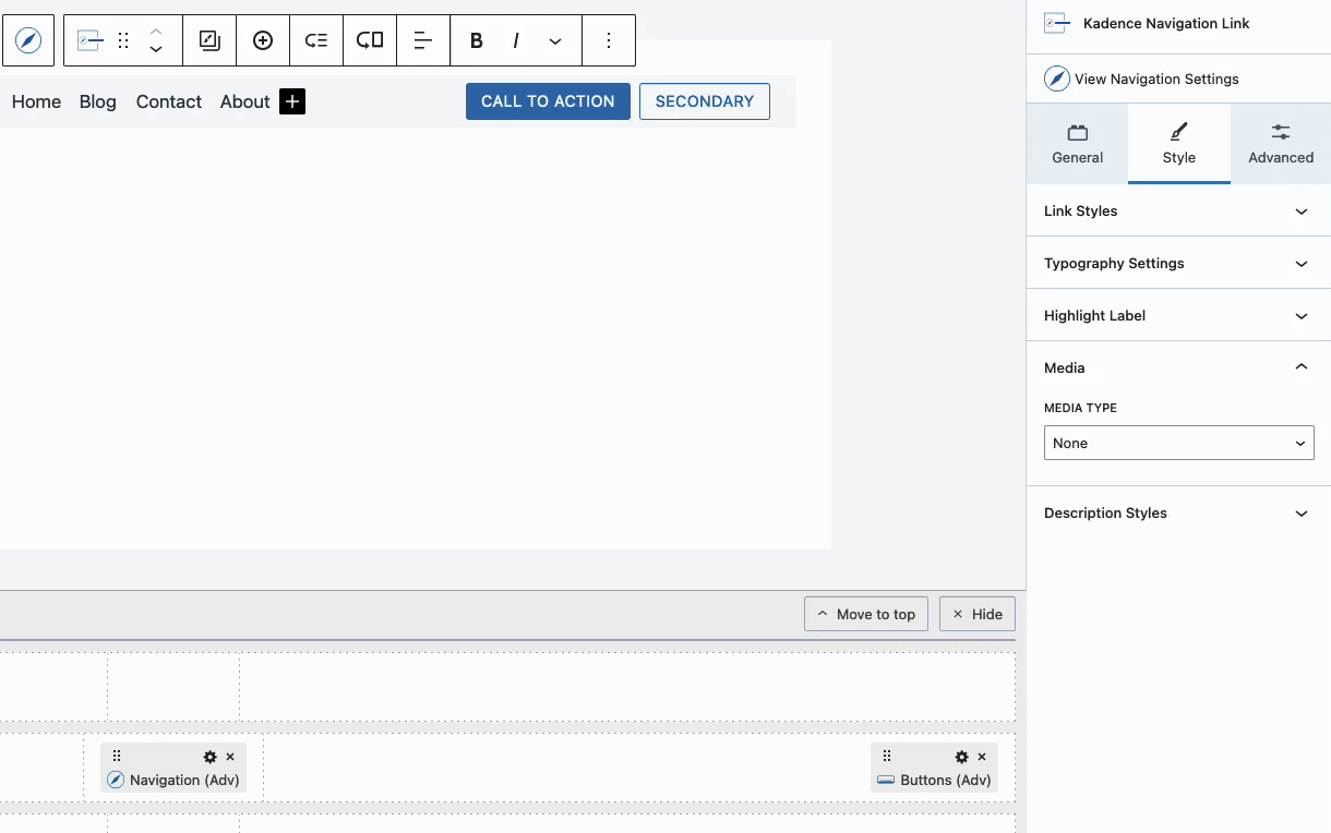
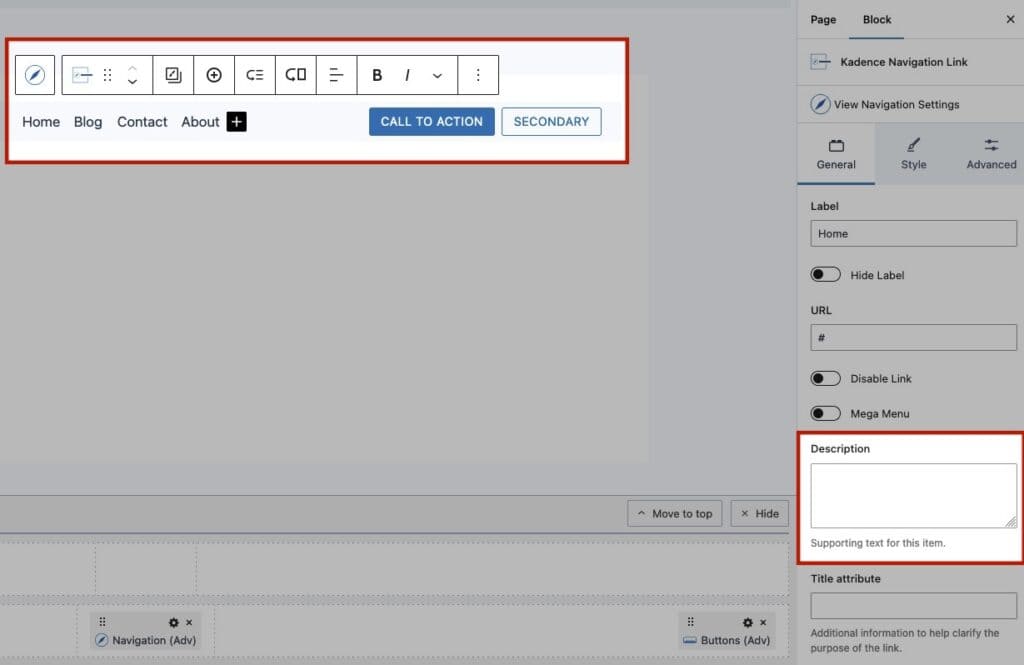
Access the Navigation Link Block Settings by selecting a Navigation Link Block. Use the General, Style, and Advanced Tabs to customize your navigation link.
For a comprehensive overview of the Navigation Link Block Settings, click here.
Adding Sub Menus and Mega Menus
Navigation Links offer robust functionality for creating both Sub Menus and Mega Menus (Pro). With the free version of Kadence blocks, you can easily build Sub Menus, providing a clean and organized way to display additional navigation options.
Kadence Blocks Pro extends this capability with Mega Menus, allowing you to design complex, multi-column layouts that can include Blocks and additional Advanced Navigations. These features enhance your site’s navigation, making it more intuitive and visually appealing while simplifying complex structures.
For a complete overview of Sub Menus and Mega Menus, click here.
Advanced Style Settings
Navigation Links offer a range of block settings for further styling, including adding images, icons, description texts, and highlight texts to your links. Below are some of the extensive styling options available for Navigation Links. For a complete list of settings, please refer to the Navigation Link Block documentation.
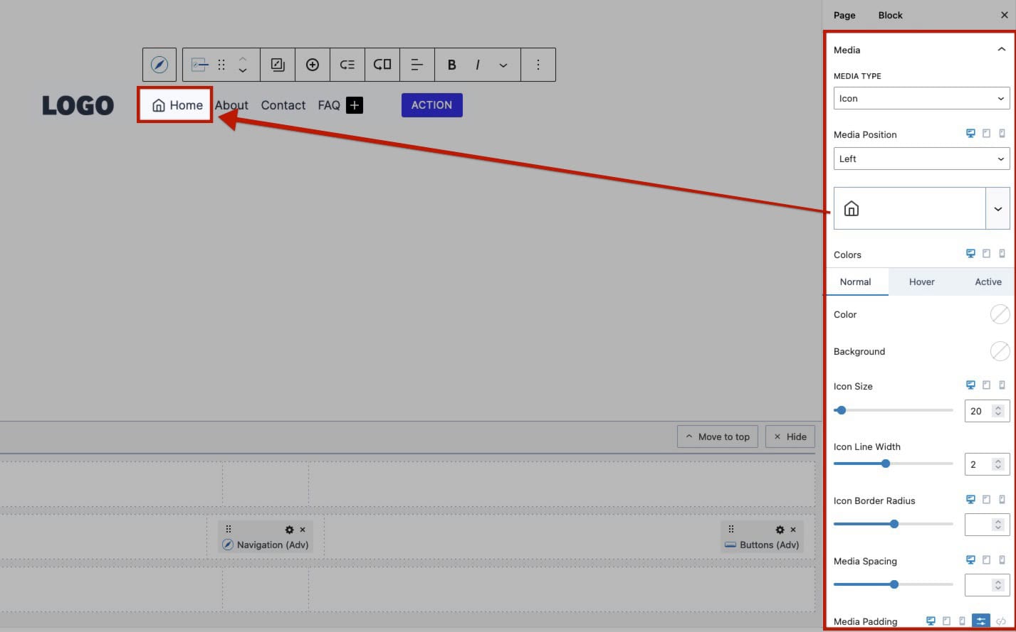
Adding Media to Nav Links (Pro)
Enhance your Navigation Links with either an Icon or an Image. This can be done in the Navigation Link General Block Settings under the Media settings.
When using a Media, either an Icon or an Image, the Media settings will add additional styling settings for the specified media type. Use these settings to do things like position and style your Media.
When using an Icon, you can further customize it through the available Block Settings in the Media Style settings.
When using an Image, you can also adjust image-related settings like Max Width and Border Radius using the Media Style settings.
Example of an Icon Navigation Link:
Example of an Image Navigation Link:
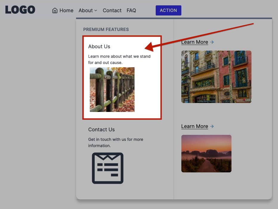
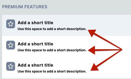
Adding Description Text to Nav Links
Navigation Link Blocks support description texts. These texts appear below the Navigation Link Label and can be used to describe the navigation link in greater detail. Use the Navigation Link General Block Settings to add a Description Text to the Navigation Link.
Use the Description Style Block settings to customize the typography, colors, and customizations of the Description Text.
Example of Navigation Link Description texts:
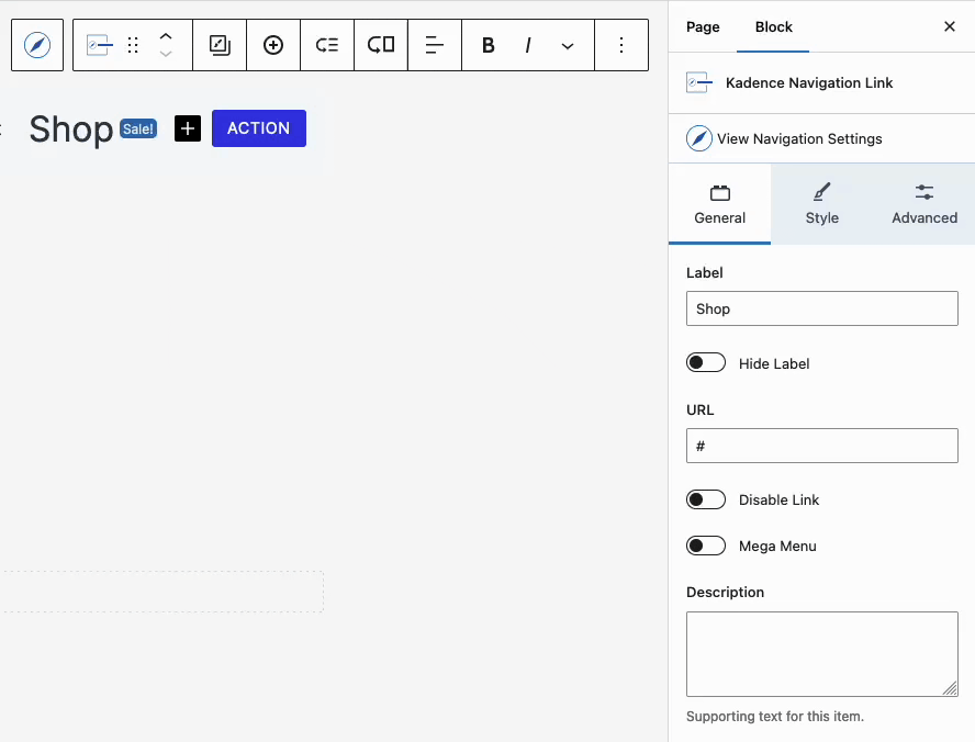
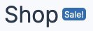
Adding Highlight Labels to Nav Links (Pro)
Use Highlight Labels to emphasize additional information related to a Navigation Link. For instance, on a Shop Menu Item, you can add a “New” or “Sale” Label next to the main Navigation Link.
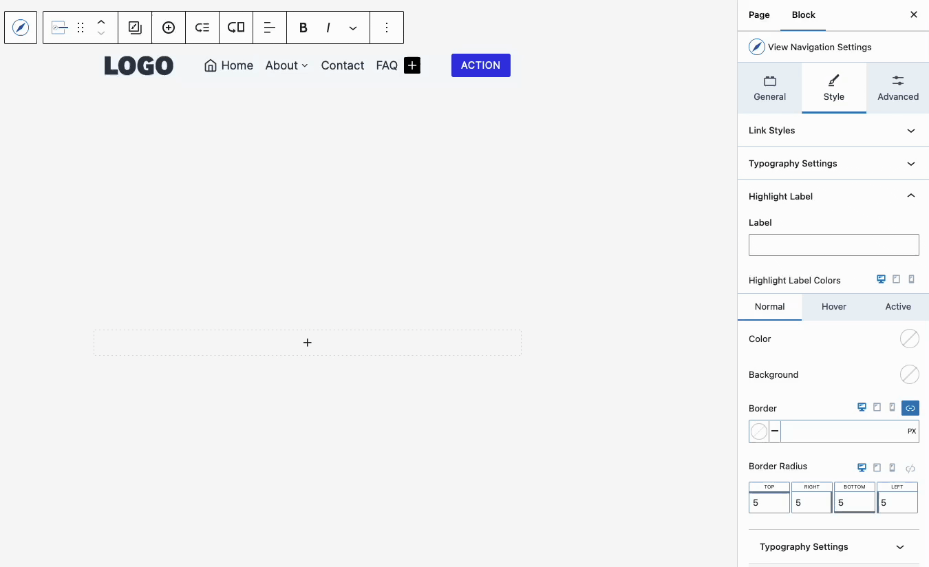
Start by selecting the Navigation Link Block and navigating to the Style Tab. Expand the Highlight tab and add either a Text or Icon to the Highlight. This will trigger the Highlight Label to appear visually next to the Navigation Link.
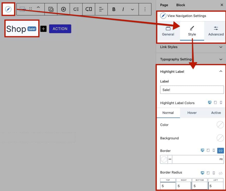
Use the Highlight Label Block Settings to fully customize your Highlight Label according to your preferences. You can adjust various styles, including colors, background colors, border radius, and more, to create a label that meets your design needs and enhances your navigation. (Learn about each Highlight Label Block Setting here.)
