
Kadence features the Table (Adv) Block
Getting Started
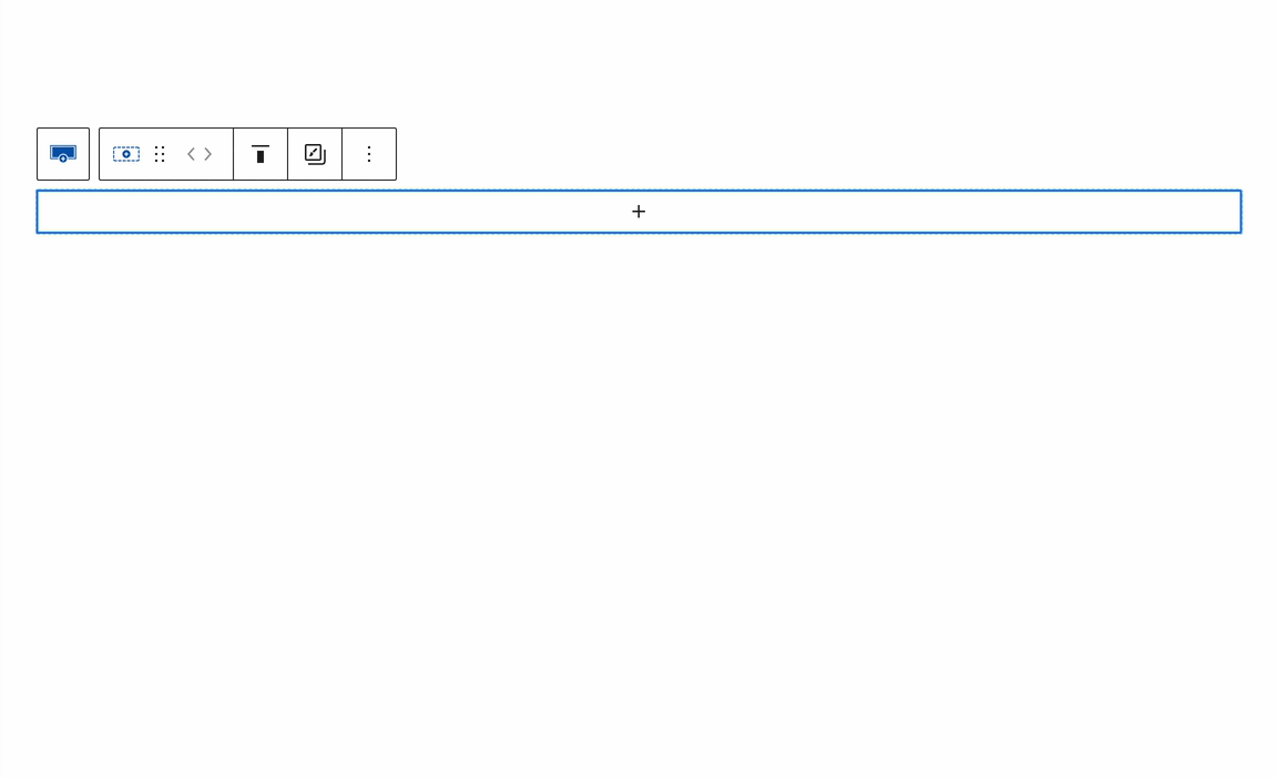
Get Started by adding a new Table (Adv) Block to the WordPress Editor.
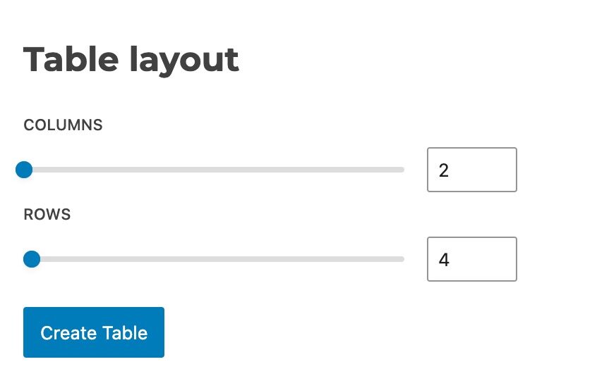
This will prompt you to select a Table Layout. Here, you can specify the initial number of Rows and Columns to include. (Additional Rows and Columns can be added later as needed.)
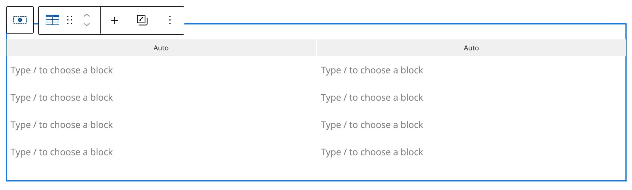
Then, your table will be created with the selected number of Columns and Rows ready to be used.
You can also use the Table (Adv) Block Settings to adjust the number of Rows and Columns within the table.
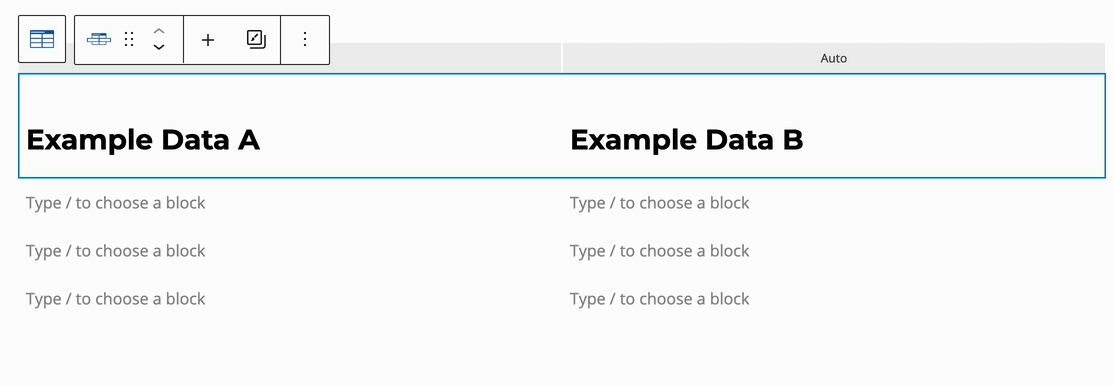
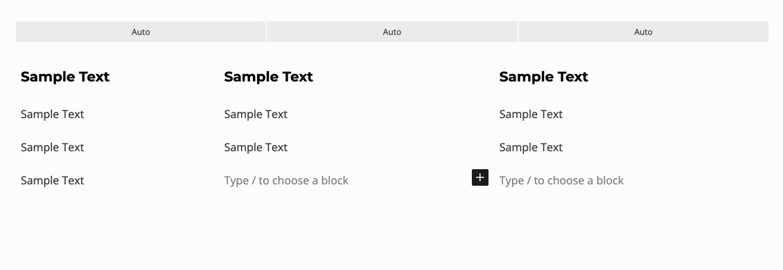
Each Table Data Block can contain nested Blocks, giving you full control over the Table Contents. By default, a standard Paragraph Block is included, allowing you to start adding text right away.
Click on any Table Data Area, then press the ‘/’ key and type to add a Block. Alternatively, click on the Table Data Block and use the Black Plus Icon to choose a Block.
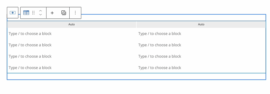
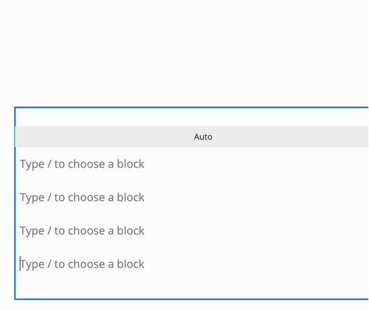
Table Rows
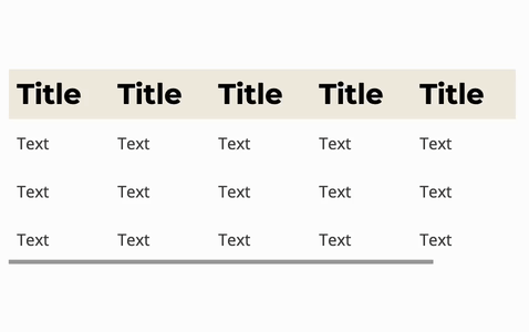
Table Rows are horizontal groups of Table Data that align content within a table. Each Table Row contains one or multiple Table Data Blocks (Columns), which can hold various Blocks. Table Rows help organize data across the width of the table and can be added, removed, or customized as needed to fit your design or content structure.
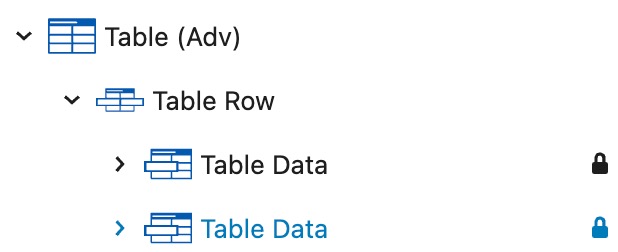
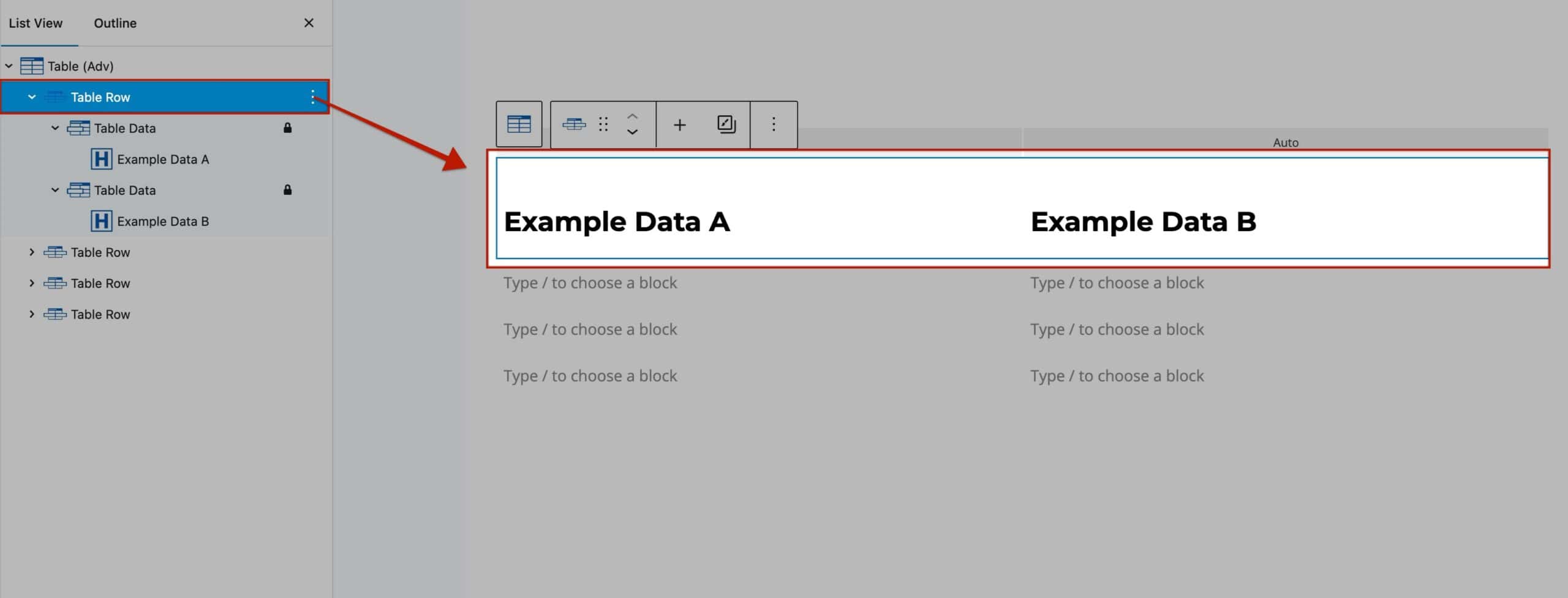
Table Rows can be rearranged by selecting the Table Row Block and using the Arrow Icons in the Block Toolbar. This allows you to move Table Rows up or down within the table.
With a Table Row Block selected, use the Plus Icon to add new Table Rows to the Advanced Table. You can insert additional Table Rows above or below the current Row, or position them at the top or bottom of the entire Advanced Table Block.
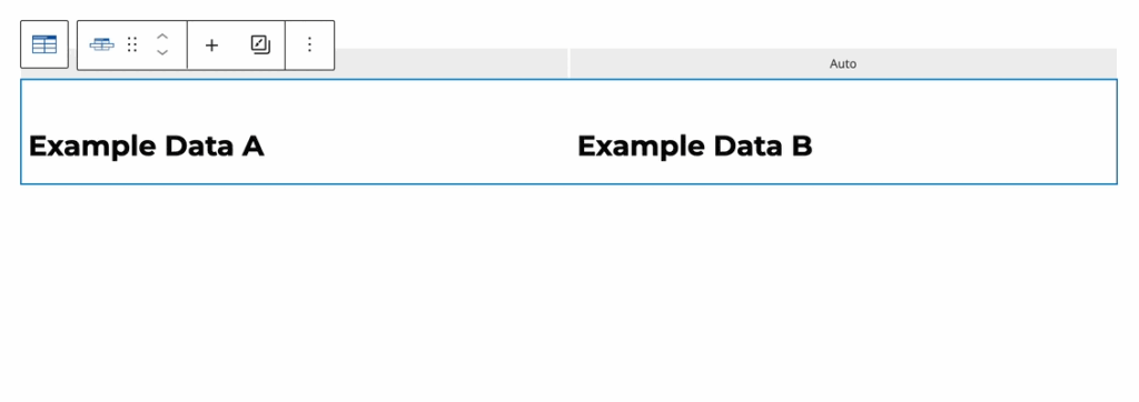
Table Row Settings
Table Row Settings: Use the Table Row Block Settings to customize the style and height of a Row on an individual level.
Row Background: Set a Background Color for the Table Row.
Row Hover Background: Set a Hover Background Color that appears when a user hovers over the Table Row.
Row Height: Specify a Height for the Table Row. Adjust this setting responsively for different devices. The measurement can also be changed from Pixels to EM or VH.
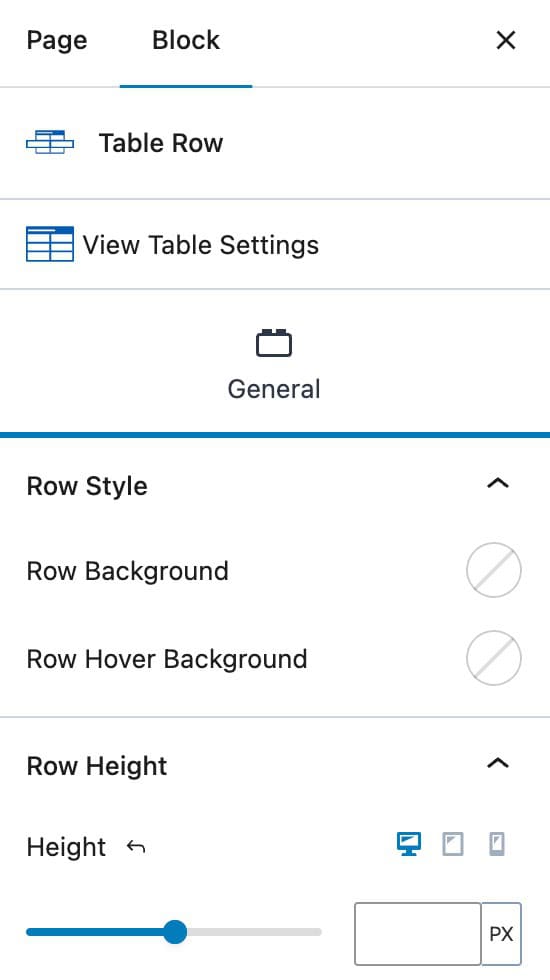
Table Data
Inside each Table Row, you will notice Table Data Blocks. The Table Row is the Row itself, while the Table Data Blocks each represent a Column within that Row. When adding blocks to Advanced Tables, the blocks will be added to and nested inside of the inner Table Data Blocks.
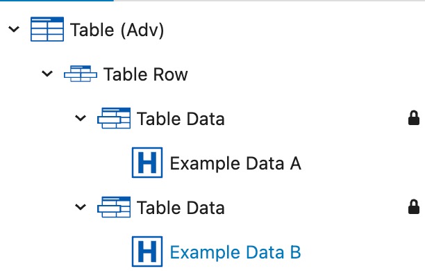
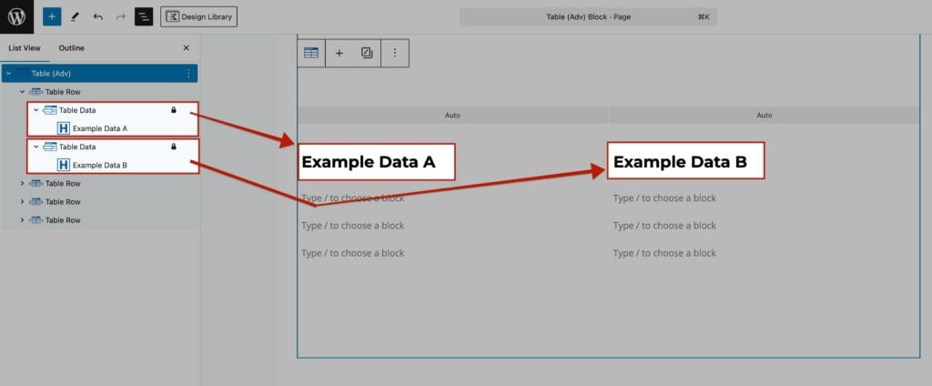
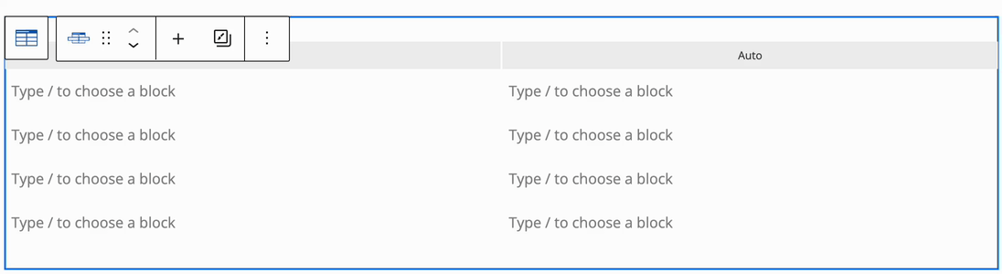
Table Data can be rearranged by selecting the Table Data Block and using the Arrow Icons in the Block Toolbar.
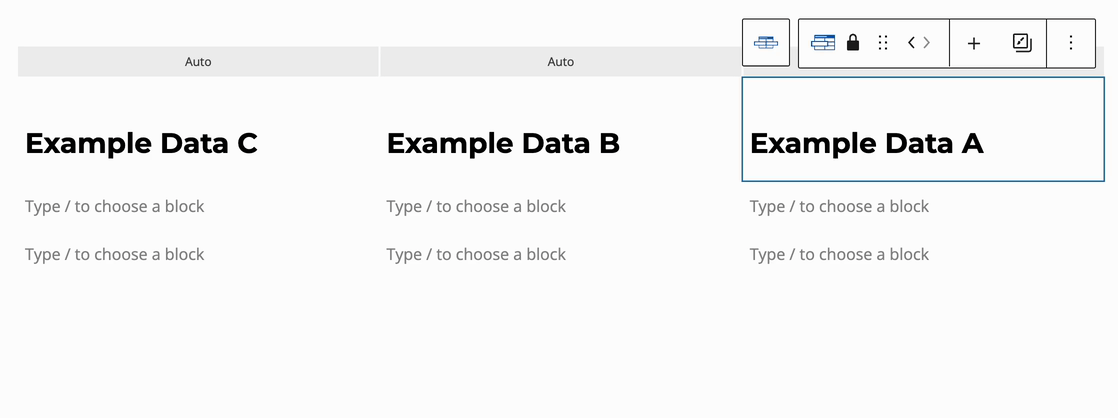
With a Table Data block selected, use the Plus Icon to add new Table Data columns to the Advanced Table. You can insert additional Table Columns before or after the current Table Data Block, or position them at the start or end of the Advanced Table.
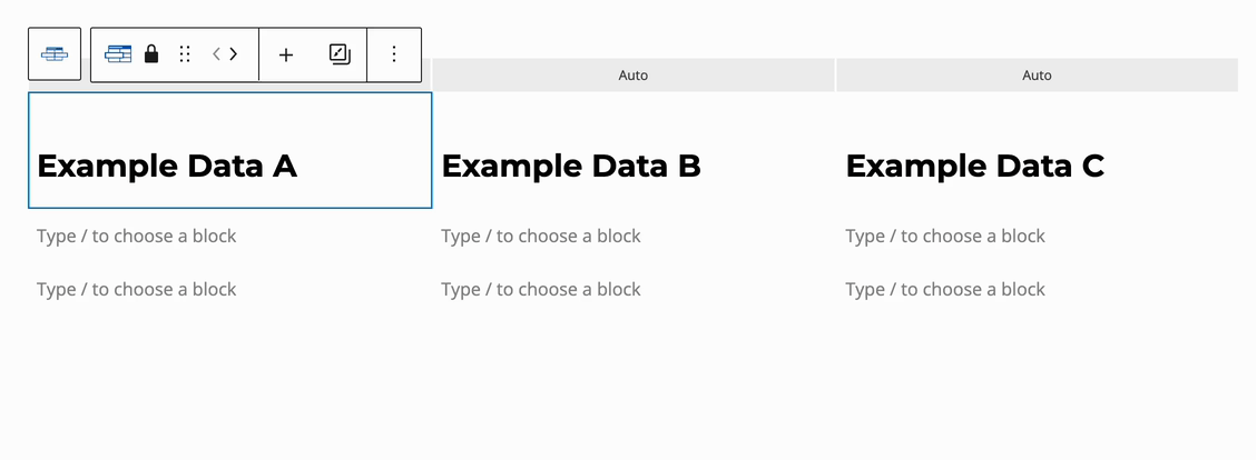
Table Data Settings
Use the Table Data Block Settings to add a Padding to the Table Data Block. This can be adjusted responsively for Desktop, Tablet, and Mobile Devices.
To adjust the Column Widths, refer to the Table (Adv) Column Width Settings below.
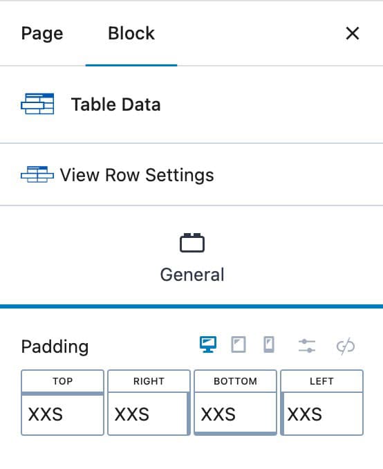
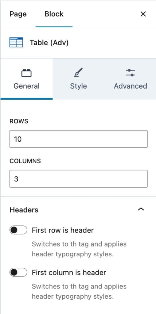
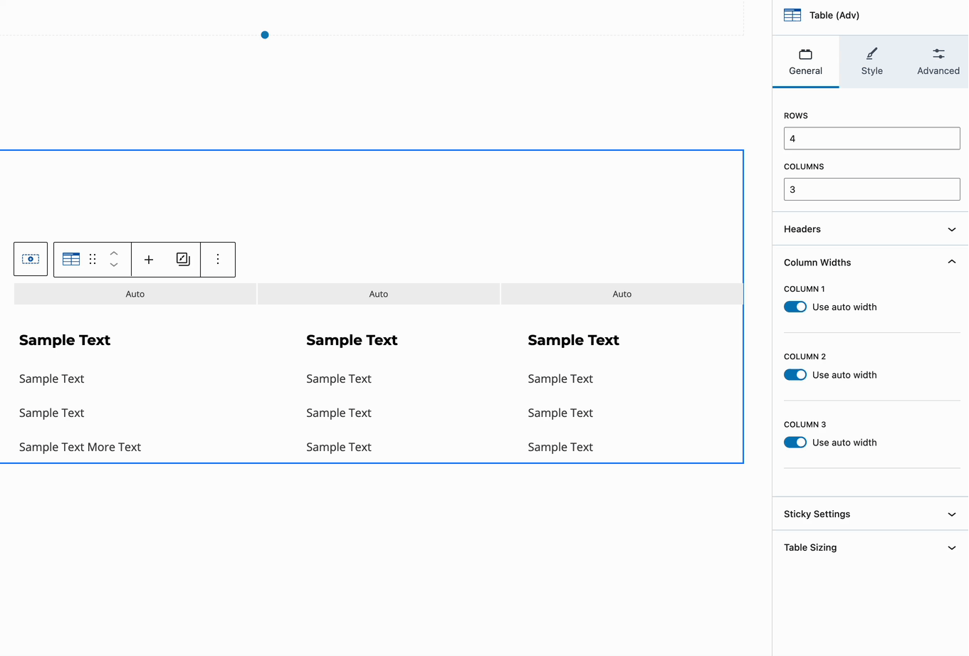
Table (Adv) Block Settings
General
Rows: Specify the number of Rows to display in the Table.
Columns: Define the number of Columns (Table Data Blocks) to include in each Row within the Table.
First Row is Header: Enable this setting to change the HTML Tag of the First Row to a TH Tag. This also applies Header Typography Styles to the First Row.
First Column is Header: Enable this setting to change the HTML Tag of the First Column to a TH Tag. This also applies Header Typography Styles to the First Column.
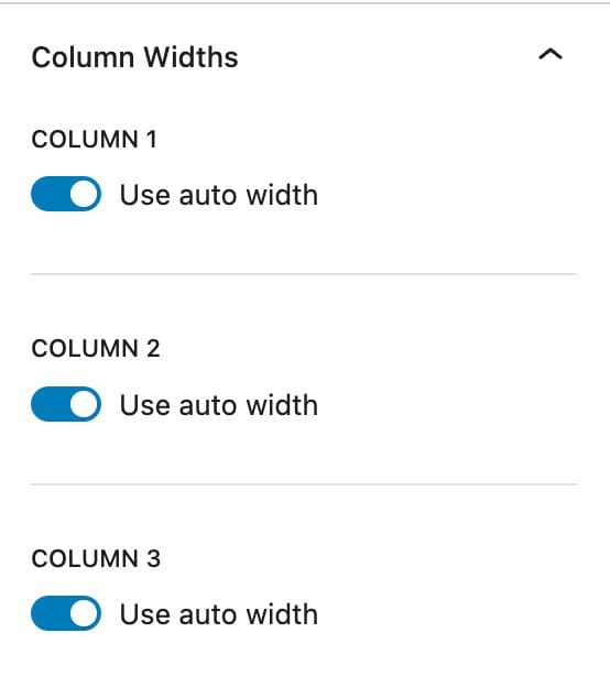
Column Widths
Column Widths: By default, the Column Widths option uses Auto Width. Each Column within the Table is added to the Column Widths list. Auto Width dynamically adjusts each Column’s width based on the amount of text it contains, ensuring a balanced and responsive layout.
Custom Column Widths: Turn off the Use Auto Width toggle to manually set the width of each column. By default, column widths are measured in percentages, but you can switch to pixels for more precise adjustments. When changing the unit of measurement, all custom columns will automatically use the selected unit.
Custom column widths can be set individually for Desktop, Tablet, and Mobile devices, allowing for responsive table design.
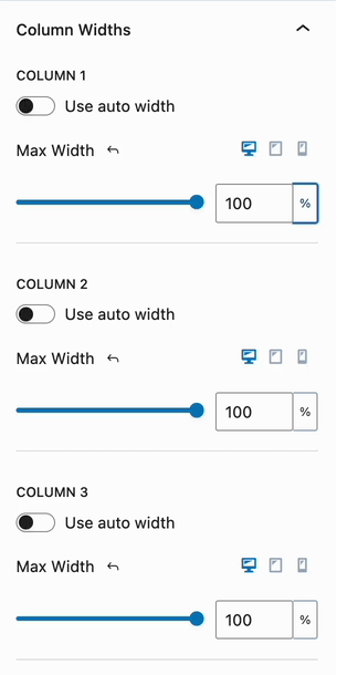
Additionally, you can use the Slider to adjust the width measurement. Alternatively, select the Table Block and use the Adjusters (the Blue Outlined Circle Icons) within the Table Block interface to visually modify Column Widths.
Sticky Settings (Pro)
Sticky Settings: The Sticky Settings for the Advanced Table Block require Kadence Blocks Pro.
Sticky First Row: Set the First Row of a Table to be sticky. For this setting to work, a Max Height must be set under the Table Sizing Settings below the Sticky Settings.
Sticky First Column: Set the First Column of a Table to be sticky. For this setting to work, a Max Width must be set under the Table Sizing Settings below the Sticky Settings.
Table Sizing Max Width: Set a Maximum Width for the Table. This would apply to Table Columns.
Table Sizing Max Height: Set a Maximum Height for the Table. This would apply to Table Rows.
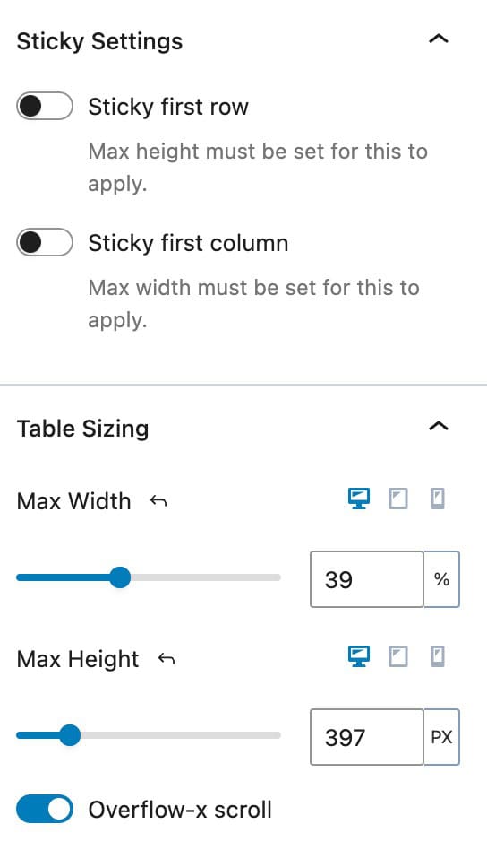
Overflow-x Scroll: This setting can help keep Advanced Tables responsive on smaller screen sizes. If a Table is too wide or has a lot of potential side-scrolling content, enabling this option will allow it to be side-scrolled and navigated with an X Scroll Bar. This allows users to swipe or scroll to see the remaining Columns of the table.
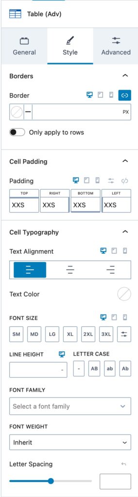
Style
Use the Style Settings to adjust the overall styling of the Advanced Table.
Borders: Add Borders to your Advanced Table. You can set a Border Color and Size responsively for different device types. Use the Only apply To Rows option to apply the Border Settings only to Rows and not Columns.
Cell Padding: Add Padding to your Table Cells. This adds padding to each Table Data Block Cell.
Cell Typography: Adjust the Typography of the Table Data Block Cells. This consists of the following available typography options:
- Text Alignment
- Text Color
- Font Size
- Line Height
- Letter Case
- Font Family
- Font Weight
- Letter Spacing
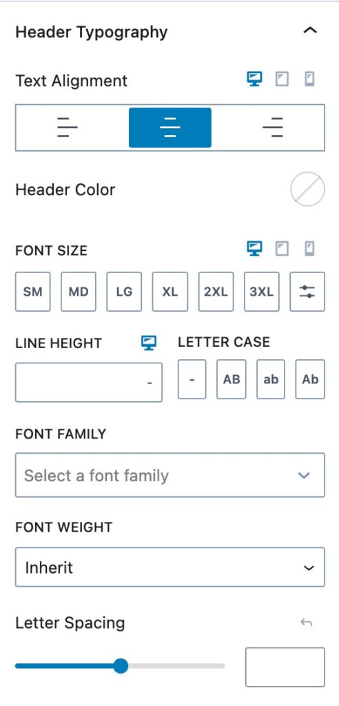
Header Typography: These settings apply to the First Row or Column if set to be a Header.
Text Alignment: Set an Alignment for Text within a Header Table Data Cell.
Header Color: Set a standard Header Text Color for Blocks within the Header Table Data Cell.
Additionally, you can also adjust the following Typography Settings for Headers inside of the Advanced Table Block:
- Font Size
- Line Height
- Letter Case
- Font Family
- Font Weight
- Letter Spacing
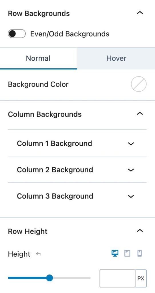
Even/Odd Backgrounds: Use this option to apply alternating background colors to Even and Odd Rows in the table. You can set both a Normal Background Color and a Hover Background Color.
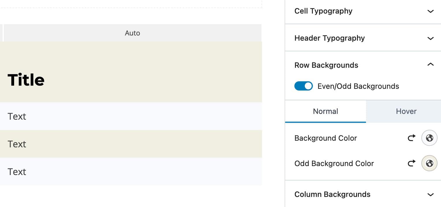
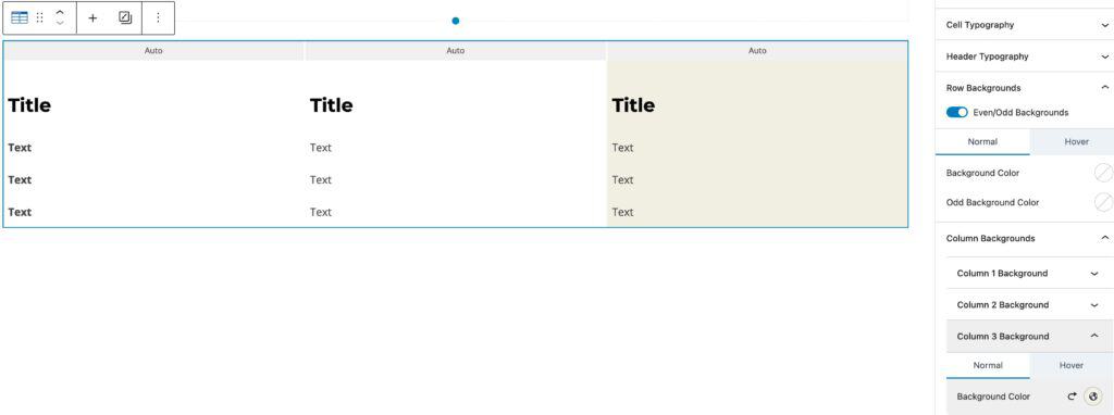
Column Backgrounds: Each available Column will have a Column Background option. Use the Column Background Options to add a specific Background Color to specific Columns within the Table.
Row Height: Set a standard height for rows within the Advanced Table.
Advanced
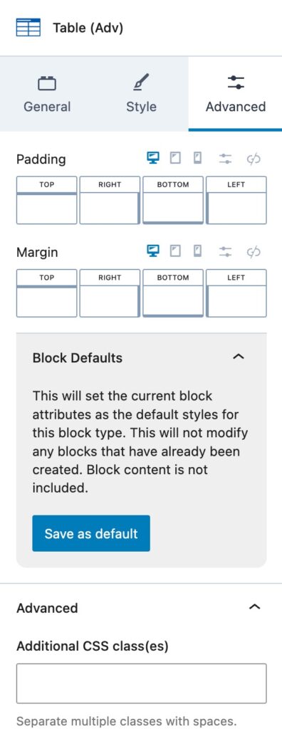
Padding and Margin: Add a Padding and/or Margin to the entire Advanced Table Block.
Block Defaults: Save the current Block Settings Configuration as the Block Default. This will automatically use the current settings on all new Advanced Table Blocks. Learn more here.
Additional CSS Class(es): Add additional CSS Class(es) to the Advanced Table Block.
