
The image overlay block adds a highly customizable image menu option to the new editor. The block provides a background picture with an overlay. The overlay can have a background color and text and offers many customizable settings.
To set up the image overlay on your site, follow the quick start tutorial.
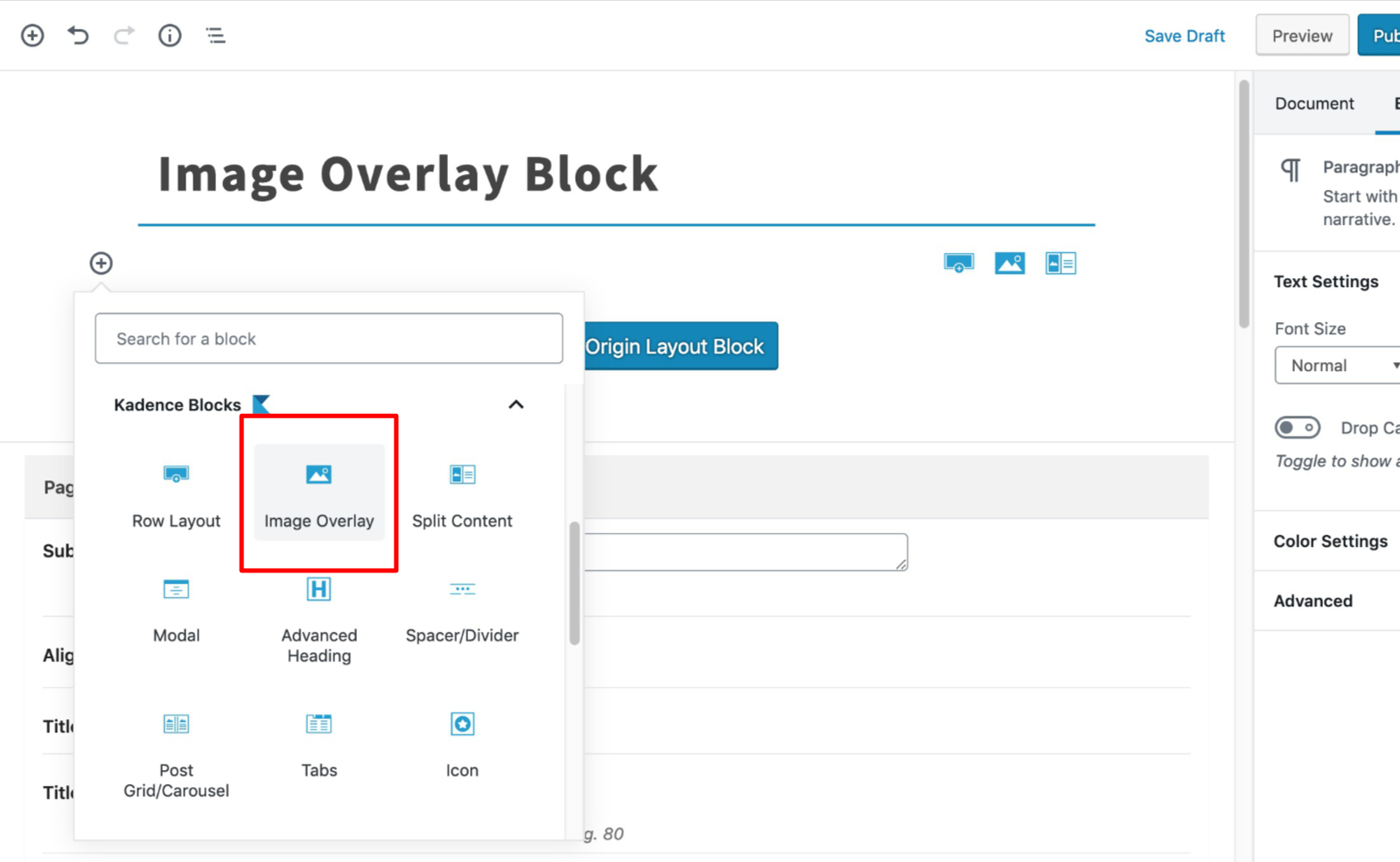
Select the Image Overlay Block from the blocks list:
General
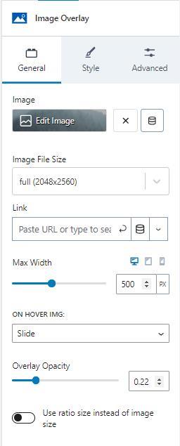
The general tab lets you set several customizations. There is an image selector to choose or update the image. The image can be set dynamically.
The image file size provides options for sizes registered on your site. The image overlay also lets you set a link for the image.
The max width setting sets the max width of the image and is adjustable for desktop, tablet, and mobile devices by clicking on the corresponding icons.
There are several animation options provided when a mouse hovers over the image. The image can remain static, zoom in, slide, grayscale, or blur when the hover event triggers.
The overlay opacity settings set the opacity of the overlay color when the image isn’t hovered over.
The image can preserve a ratio size instead of the image size if you enable the option.
Style
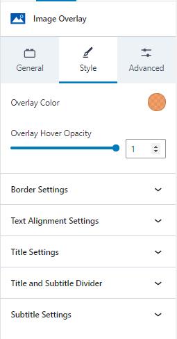
The style tab provides several sections of settings.
The style tab sets the image overlay color using a color selector.
The overlay hover opacity sets the opacity for the overlay color when the mouse hovers over the image.
Border Settings
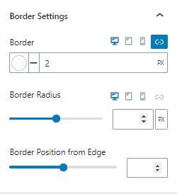
Border settings let you change the border color, style, and width. You can also adjust the border-radius and position from the edge.
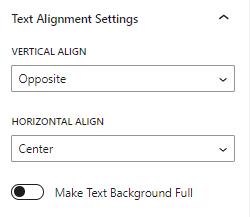
Text Alignment Settings
You can adjust the text’s vertical and horizontal alignment. The vertical value can be the top, center, or opposite. The horizontal alignment can be left, center, right, or opposite. The opposite value sets the title and text to opposite alignments.
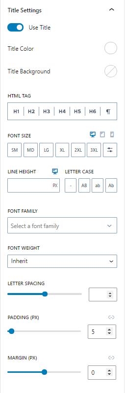
Title Settings
The title settings allow you to enable or disable the title text. You can also change the color, background color, HTML tag, font size, line height, letter case, font family, font weight, letter spacing, padding, and margin.
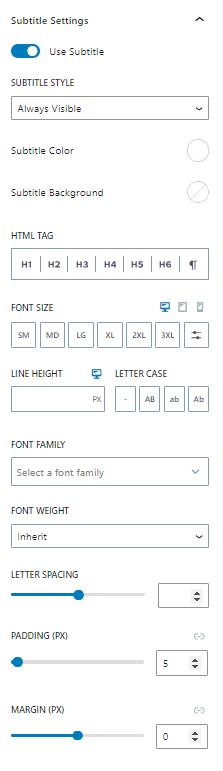
Subtitle Settings
The subtitle settings provide similar settings as the title. The subtitle can be enabled or disabled. In addition to the other settings, the subtitle can be hidden until hovered or always be visible.
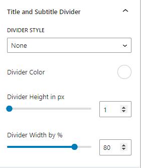
Title and Subtitle Divider
The title and subtitle can have a divider between them. The divider style can be solid, dashed, dotted, or double lines. You can also change the divider’s color, height, and width.
Advanced
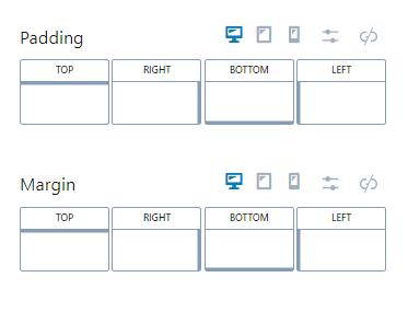
Padding / Margin
You can set the padding and margin in the advanced tab. The values can be set individually or can be linked. The settings can also be adjusted for desktop, tablet, and mobile devices.
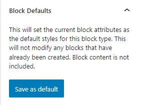
Block Defaults
Sometimes, you need to add a block many times and need them to have identical styles. In these cases, you can save the block’s current settings as default settings for new blocks of the same type. For example, if you use the Advanced Text block throughout your content, you might find it helpful to save default settings so that new Advanced Text blocks have them by default.
Kadence blocks have a Block Defaults section under the Advanced tab in the block settings. After you adjust the settings to the desired defaults, find the Block Defaults section and click the button that reads Save as Default.
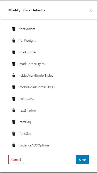
After clicking the button, you will find two new links in the section to Modify Attributes and Reset Defaults. If you choose to Modify Attributes, you can delete the default settings individually. If you choose to Reset Defaults, all the default settings are removed.
Remember, the default settings only apply to newly added blocks, not existing blocks.
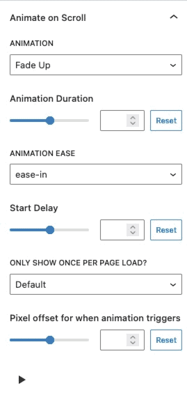
Animate on Scroll (Pro)
The Animate on Scroll settings allows you to add an animation to your block. This is a PRO feature and requires Kadence Blocks Pro in order to work. You can select an animation duration, ease, and start delay. You can set this animation to show once per page and set a pixel offset for when the animation triggers.
You can press on the play icon at the bottom of the settings to see how your animation looks in the editor.
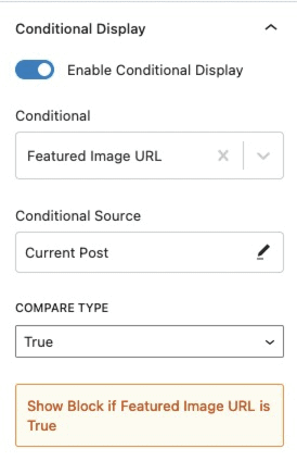
Conditional Display (Pro)
The Conditional Display setting allows you to display the button based on a condition. This is also a Kadence Blocks Pro feature.
