
Kadence Blocks v3.1 introduced the Advanced Form Block. The Advanced Form Block has different useful field types and many ways to customize and design a form on your website.
Getting Started
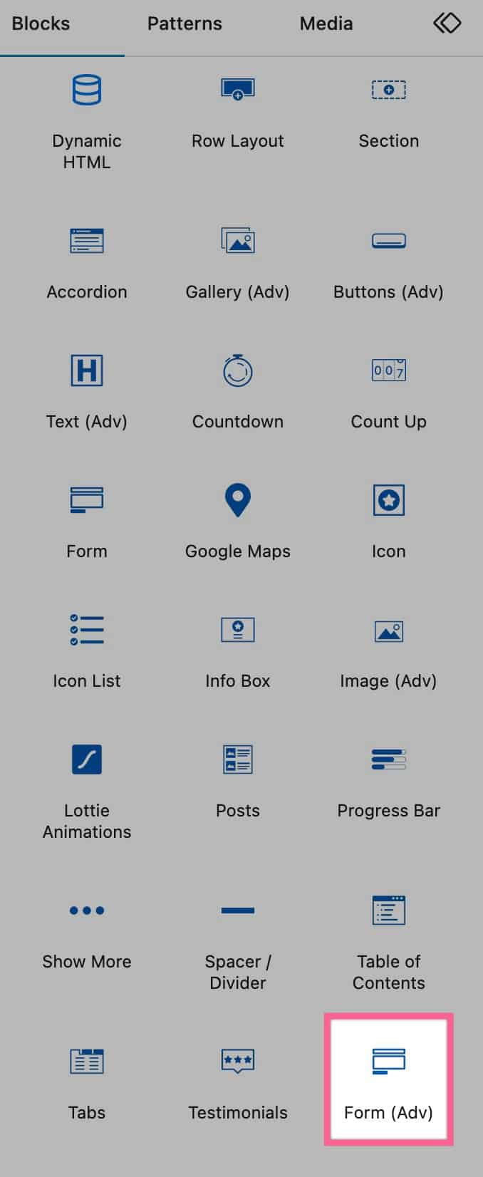
You can add an Advanced Form block to your website by looking for the Form (Adv) Block under the Kadence Blocks Category.
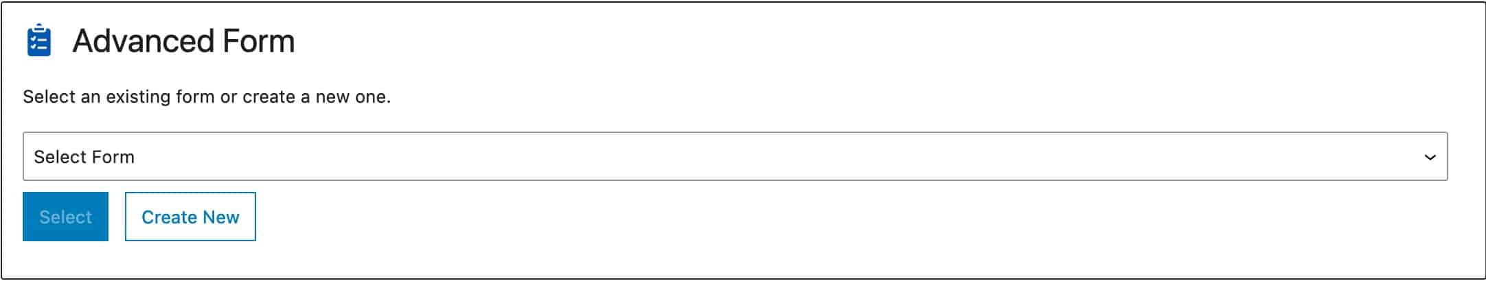
Once you add the Form (Adv) block to the page, you can either select a previously created Form or create a new one.
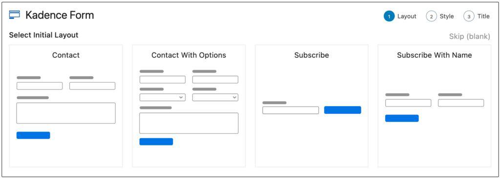
Then you will be able to select a Form Layout. You can also skip this step if you wish to start from scratch.
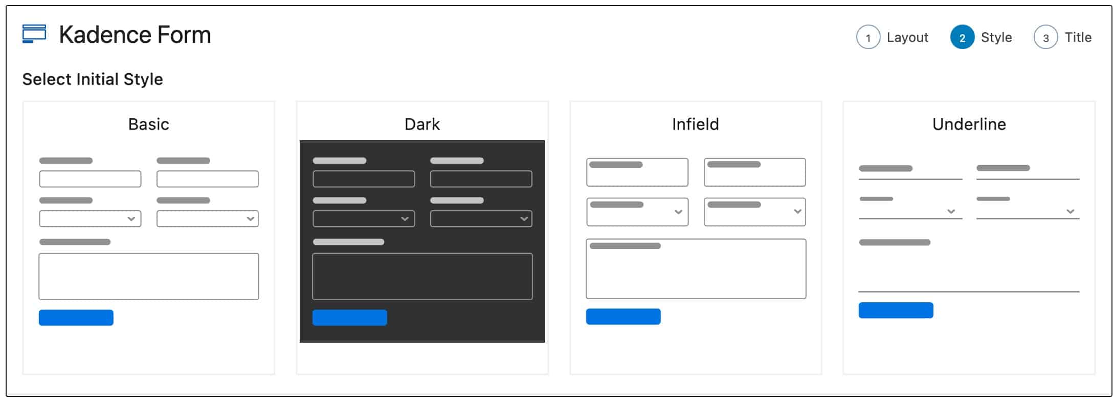
Then you will be able to select an Initial Style for your form.
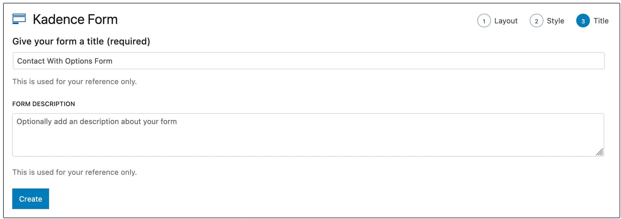
Finally, you will be able to add a Title and Description for your Form.
Now you are all set to begin customizing and using your Advanced Form!
Form Blocks
Once your Form is created, you can add and remove blocks/fields as needed. Below, we will review the available Layout Blocks and Form Fields you can use on your Adv (Form) Block.
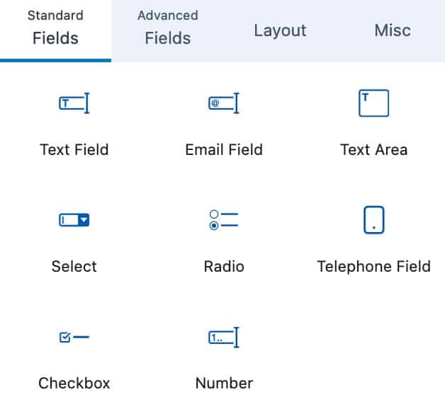
Standard Fields
These are the standard Form fields that are available on the Adv (Form) Block.
The current available Standard Fields are; Text Field, Email Field, Text Area, Select, Radio, Telephone Field, Checkbox, and Number.
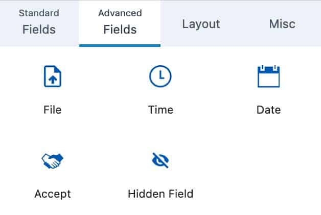
Advanced Fields
These are more Advanced Fields that can be added to your form.
The current Advanced Fields are; File, Time, Date, Accept, and Hidden Field.
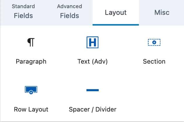
Available Layout Blocks
The Form Block allows you to add certain Layout Blocks to your Form. These blocks consist of the Paragraph Block, Advanced Text Block, Section Block, Row Layout Block, and Spacer/Divider Block.
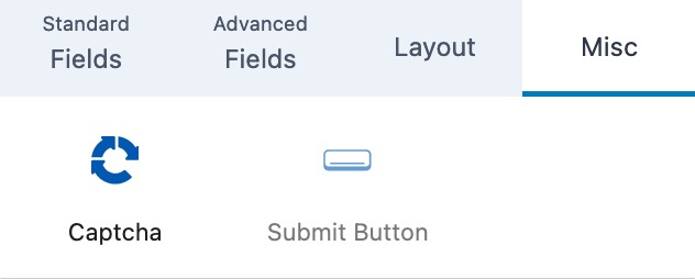
Misc Fields
The Misc Fields hold the additional fields that aren’t classified as one of the other categories. You can currently add a Captcha or Submit button to your form using the Misc Fields.
Field Block Settings
Each Field Block allows you to customize it by using the Block Settings.
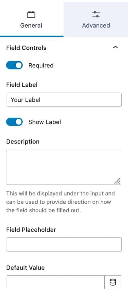
General Settings
You can use the Field Controls setting to make the field required or not.
You can add your Field Label using the Field Label setting.
You can toggle the Show Label option to show or hide your label.
You can add a Description to your field. This will be displayed under the input and can be used to provide direction on how the field should be filled out.
You can add a Field Placeholder to your field by using the Field Placeholder setting.
You can also set a Default Value for the field using the Default Value setting. You can use a Dynamic Default Value.
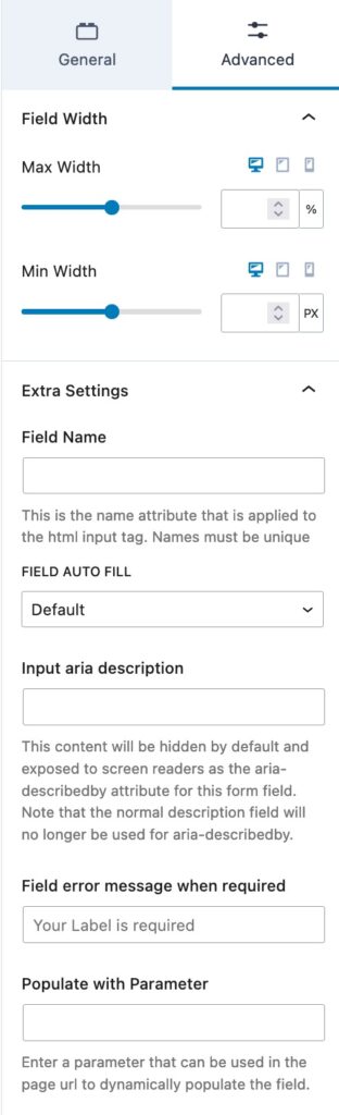
Advanced Settings
You can use the Field Width settings to set a Max Width and Min Width for Desktop, Tablet, and Mobile Devices.
The Extra Settings allow you to customize additional settings for your field.
The Field Name setting allows you to add a name attributed that is applied to the HTML input tag.
The Field Auto Fill option allows you to select which Auto Fill Field should be used to automatically to populate the field.
You can use the Input Aria Description setting to add an aria-describedby attribute to the form field.
The Field Error Message When Requires setting allows you to set a specific requirement message for the field.
The Populate With Parameter setting allows you to enter a parameter that can be used in the page URL to dynamically populate the field.
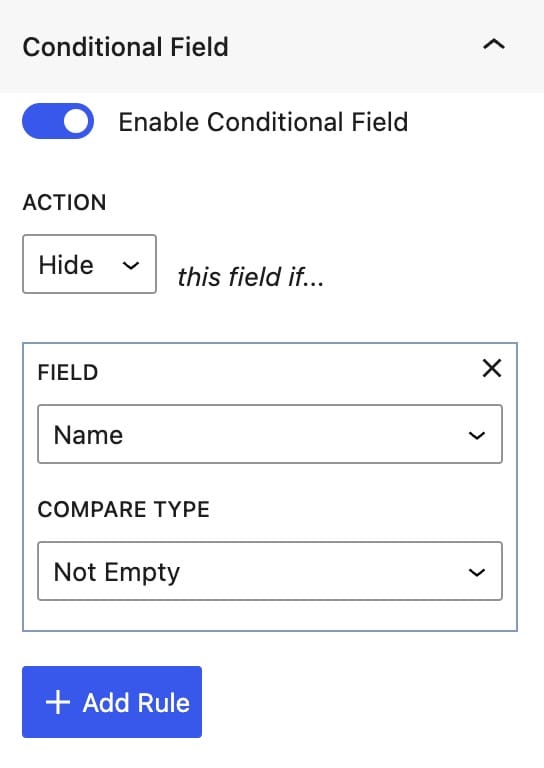
Conditional Fields
You can enable and use Fields Conditionally. You can do this by turning on the Enable Conditional Field Block Setting.
The Action can be set to either Show or Hide.
Then you can select the Field you would like the Condition to be based on.
Finally, you can set the Compare Type to make the condition work. You can select from the following compare types; Not Empty, Empty, =, !=, Contains, Does Not Contain, Begins With, Does Not Begin with, Ends With, or Does Not End With.
You can expand the Advanced tab to see more Advanced Settings.
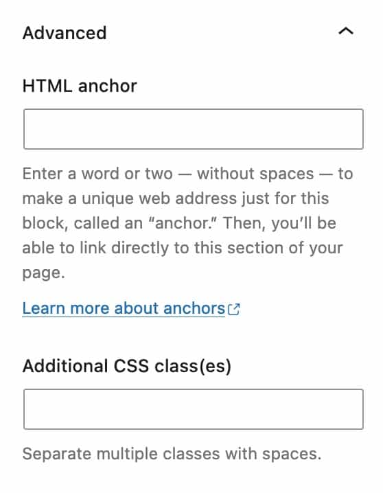
You can set an HTML Anchor and add Additional CSS Class(es) to your Field.
Form Block Settings
The Advanced Form Block has different Block Settings that can be used for the entire Block rather than individual fields.
General Settings
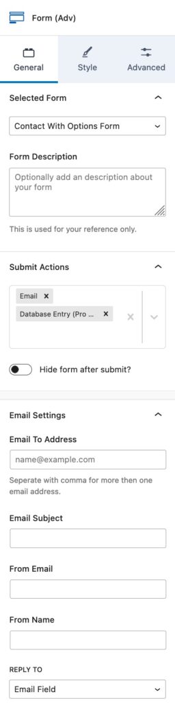
You can view the Selected Form setting to see the selected Form.
You can add a description about your form for reference using the Form Description setting.
The Submit Actions option allows you to select and use one or multiple Submit Actions.
The following Submit Actions are available for Free Users: Email, Redirect, Mailer Lite, and FluentCRM
The following Submit Actions are available for Blocks Pro Users: ConvertKit, ActiveCampaign, Auto Respond Email, Database Entry, Brevo, MailChimp, Get Response, and Webhook.
Whenever you enable an Action To Submit, you will see a new setting in the Block Settings for that Action To Submit.
You can use the toggle to Hide the Form after the form is submitted.
The Email Settings allow you to set up how the email is received.
The Email To Address should be the email address that the form submission is sent to.
You can use the Email Subject setting to set an email subject.
The From Email setting allows you to set the Form Email. This is the email address that is displayed when sending the form to the To address.
The From Name setting allows you to set the From Name that is displayed.
The Reply To setting allows you to set which email address is used when the original email is replied to.
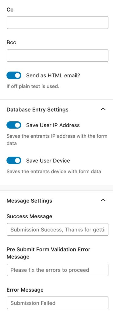
You can use the CC setting to set a Cc for the email.
You can use the Bcc setting to set a Bcc for the email.
The Send as HTML email toggle can be disabled if you would like to use plain test instead.
The Database Entry Settings allow you modify how the DataBase Entry is received.
You can use the Save User IP Address to log the ip address of the user who submits the form.
You can use the Save user Device to log the device of the user who submits the form.
The Message Settings allow you to customize the messages shown on your form when something goes wrong or when it successfully submits.
The Success Message setting allows you to set the message for when the form is successfully submited.
The Pre Submit Form Validation Errors happen before the Form is submited.
The Message setting allows you to add a standard message to alert the user of the errors on the form.
The Error message allows you to set a message for whenever the form submission failed.
Style Settings
The Stye Settings allow you to customize the style of the contents of your form.
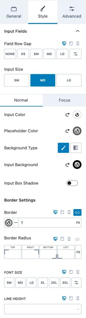
You can expand the Input Fields to modify their Style.
You can set a Field Row Gap for your Input Fields.
You can also set an Input Size. You can choose from small, medium, or large.
You can also set the colors for your Input Fields. You can set the Normal Colors and the Focus Colors for when a user is focused on the field
You can set an Input Color, a Placeholder Color, a Background Type, an Input Background, and an Input Box Shadow. You can set these colors for both the Normal and Focus state.
The Border Settings allow you to set the Border on your Input Fields. You can set the Border Size (px), a Border color, and a Border Radius.
You can also set the Font Size and Line Height for your Input Fields.
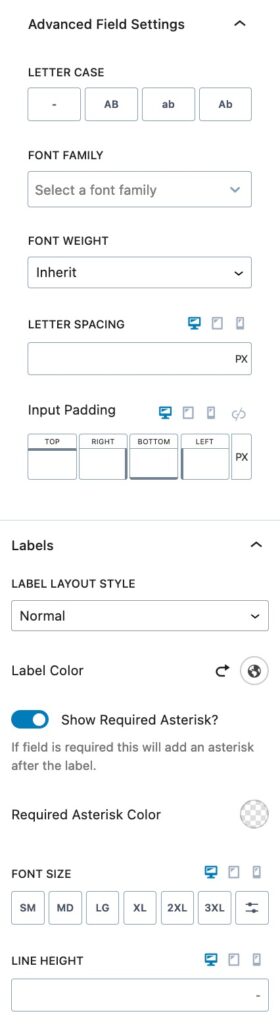
You can expand the Advanced Field Settings to find more Style Settings for the Input Fields.
You can set a Letter Case for your Input Fields.
You can also set a Font Family for your Input Fields.
You can set a Font Weight and Letter Spacing for the Input Fields.
You can also use the Input Padding setting to add a padding to the Input Fields.
You will also see the Labels settings. You can expand them to style your Labels.
You can set the Label Layout Style. You can choose from Normal, In Field Label, or Float Label.
You can use the Label Color setting to set the color of your Label.
You can choose to Show Required Asterisk. This would add an asterisk to indicate required fields.
You can also set a color for the Required Asterisk.
You can also set the Font Size and Line Height for the Label.
You can expand the Advanced Field Settings to find more Style Settings for the Labels.
You can set the Letter Case, Font Family, and Font Weight for your Label.
The Letter Spacing option allows you to adjust the letter spacing on the Label texts.
You can use the Padding and Margin settings to add a padding and/or margin to the Label.
You can expand the Radio/Checkbox Labels to modify their Style.
You can set a Label Color for your Radio/Checkboxes.
You can also set the Font Size and Line Height.
You can expand the Advanced Label Settings to access more Radio/Checkbox Label Style Settings.
You can set a Letter Case for your Radio/Checkbox Labels.
You can also set the Font Family.
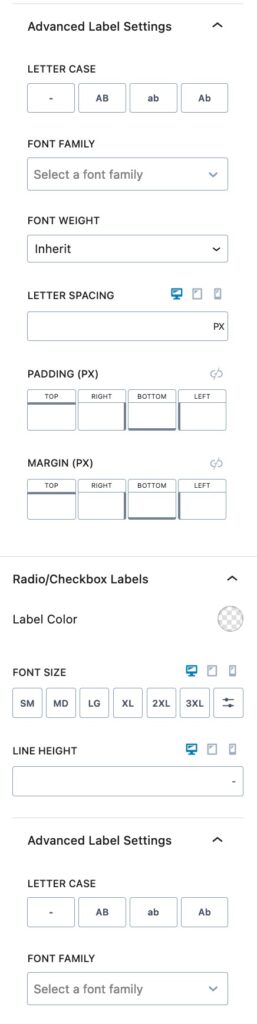
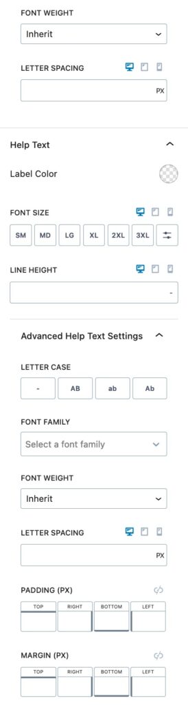
You can set the Font Weight and Letter Spacing for your Radio/Checkbox Labels.
You can expand the Help Text to style your Help Text.
You can set a Label Color for the Help Text.
You can also set a Font size and Line Height for the Help Text.
You can expand the Advanced Help Text Settings to explore more Style Settings.
You can set a Letter Case, Font Family, Font Weight, and Letter Spacing for your Help Text.
You can also set a Padding and Margin for the Help Text.
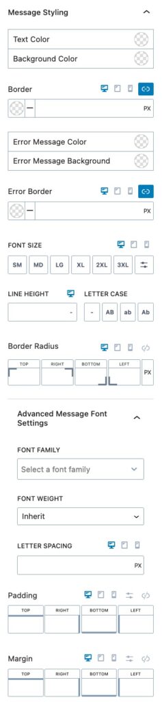
You can expand the Message Styling to style your message.
You can set the Text Color and Background color for your Message.
You can also set a Border for your Message Field. You can select the Border Color and size for desktop, tablet, and mobile devices.
You can set the Error Message color and the Error Message Background color.
You can set the Error Border size and Color.
You can use the Font Size setting to adjust the size of your Message field.
You can set the Line Height and Letter Case for your Message Field.
You can also set a Border Radius for your Message Field using the Border Radius setting.
You can expand the Advanced Message Font Settings to access more Message Font Settings.
You can set the Font Family and Font Weight.
You can also use the Letter Spacing setting to adjust the Message Letter Spacing.
You can use the Padding and Margin setting to adjust the Padding and Margin around your Message Field.
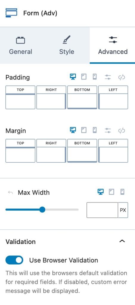
Advanced Settings
The Advanced Settings are for more advanced settings and allow you to do more customization to your Advanced Form Block.
You can set a Padding on your Form (Adv) Block for Desktop, Tablet, and Mobile devices.
You can set a Margin on your Form (Adv) Block for Desktop, Tablet, and Mobile devices.
You can also set a Max Width to the Advanced Form Block. This can be set responsively.
Validation
You can expand the Validation tab to turn Browser Validation on or off. Whenever Browser Validation is on, the Form will use the default Browser Validation messages. If this is turned off, then the Custom Error Message will be displayed instead.
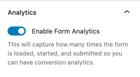
Analytics
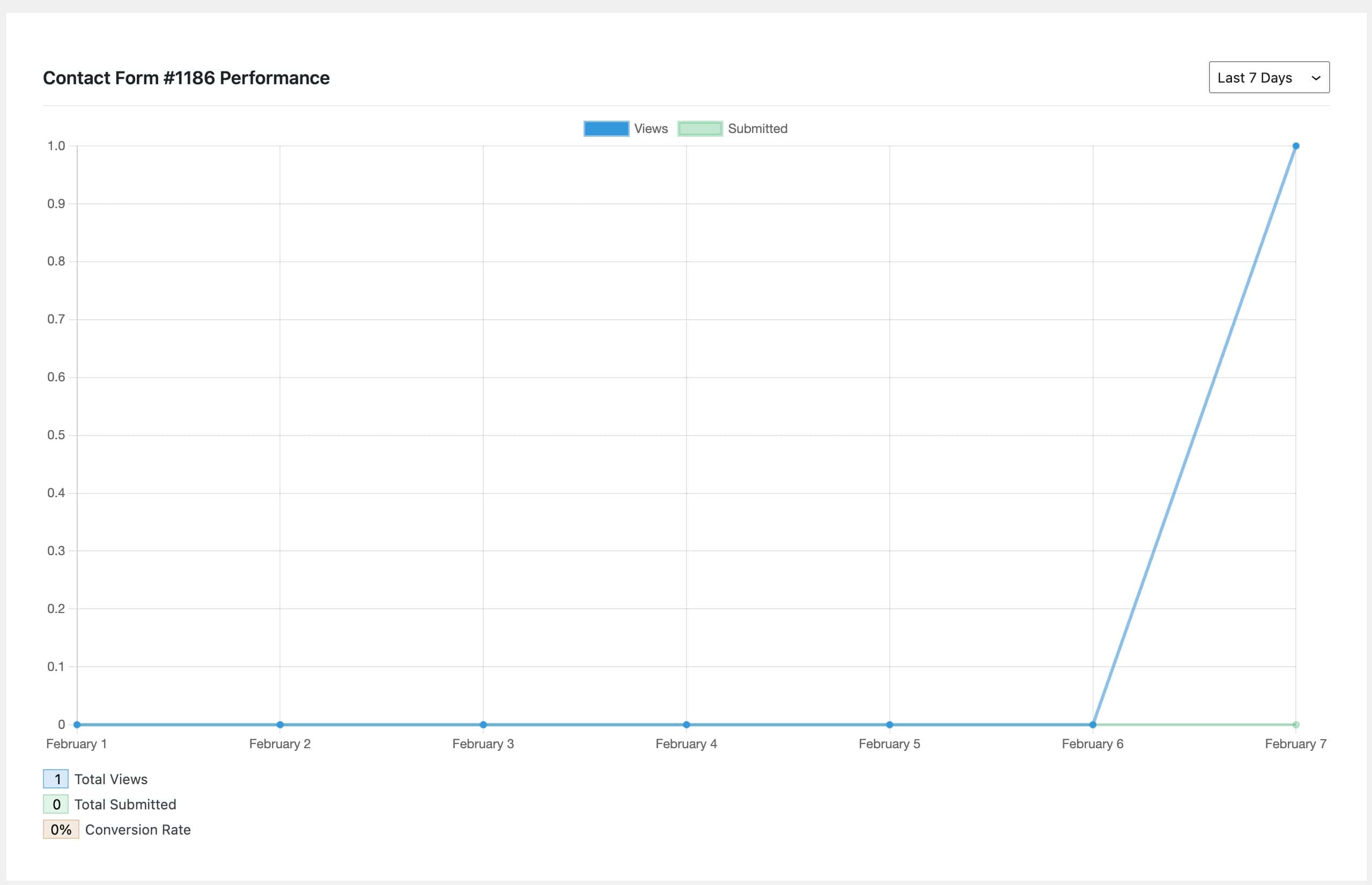
You can expand the Analytics settings to use the Form Analytics option. This will capture how many times the form is loaded, started, and submitted. Allowing you to have data on how often your Form in converting.
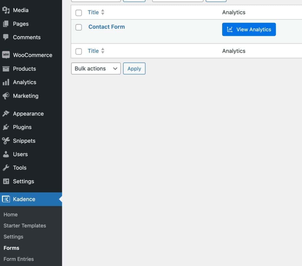
You can view your Analytics Data by going to your WordPress Dashboard and navigating to your Kadence -> Forms. You will have a Column named Analytics with a View Analytics button that you can press to access the Analytics Data.
If you are looking for more analytics and conversion tracking, you can check out Conversion Bridges integration with the Kadence Form.
You can expand the Advanced tab to see more Advanced Settings.
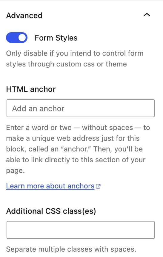
You can toggle the option to enable Form Styles. You should only disable this if you intend to use custom styles or a child theme to style your Form.
You can additionally set an HTML Anchor and add Additional CSS Class(es) to your Advanced Form Block.
Using Dynamic Placeholders
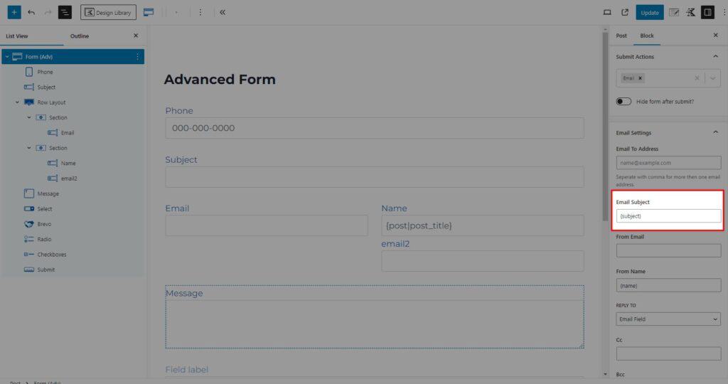
The Form (Adv) Block allows you to use dynamic placeholders to populate some settings using the form’s input values. For example, these can be used with the “Auto Repond” and “Email” actions. Auto-responses are sent to the input address, while emails are sent to the site admin. However, you can dynamically update the “Email To Address,” “Email Subject,” and “Email Message” with placeholders.
To use a dynamic placeholder, add a “Field Name” using the “Extra Settings” for a form input. The placeholder uses the name of the field surrounded in brackets: {field_name}.
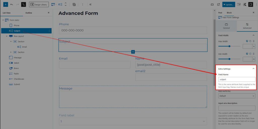
You can use a field name as a placeholder in email settings like the “Email Subject.” Another example would be a placeholder in the “Email To Address” to send the email to a dynamic address. The image below uses the “subject” field as a placeholder {subject} to update the email subject line. When the admin receives the email after the user submits the form, the subject line will be user-submitted text.
