
Use the Kadence Search (Adv) Block to search for posts, pages, and products across your website. This block can be integrated into theme Theme Widgets, Advanced Headers, and anywhere else the Block Editor is available, enhancing search functionality across your site.
The Advanced Search Block offers extensive customization options, including the choice between a standard Search Bar or a pop-up Search Modal, allowing you to adjust it for your design preferences.
Using the Search (Adv) Block
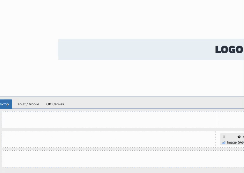
The Advanced Search Block can be used anywhere blocks are available on your website. Get started by adding a new Search (Adv) Block to the post/page/widget.
Block Settings
To customize the functionality and appearance of the Advanced Search Block, select the Search (Adv) Block and adjust the options available in the Block Settings.
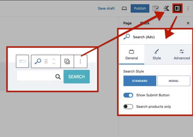
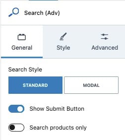
General Settings
Search Style: Choose the style for the Search Block. When set to Standard, searches can be submitted directly within the block. When set to Modal, a search button appears, and clicking it opens a pop-up modal containing a search box for performing searches. (See the examples below to understand how these two styles differ.)
Show Submit Button: When using the Standard Search Style, this option adds a submit button next to the Search Block, allowing users to submit their searches. When using the Modal Search Style, the Submit Button will automatically be used instead.
Search Products Only: By default, the Advanced Search Block searches both posts, pages, and products. Enable this option to limit the search function to products only.
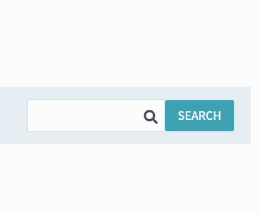
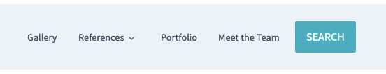
Example of a Standard Search Style with a Submit Button. This search style places a search input box directly on the page, offering users a convenient way to enter search terms. It can also include a visible submit button to initiate the search.
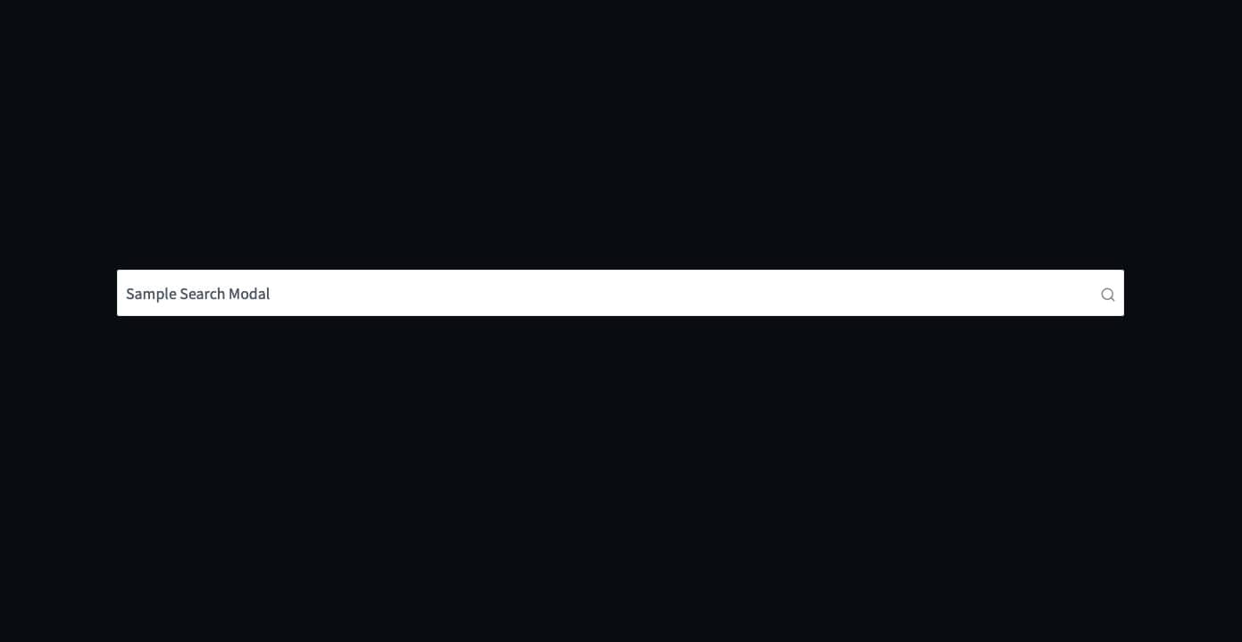
Example of a Modal Search Style. When using this style, clicking on the Search Button will trigger a modal to open. Users can then input their search terms within the modal window, providing a cleaner page layout by keeping the search bar hidden until needed.
Customizing the Search/Submit Button
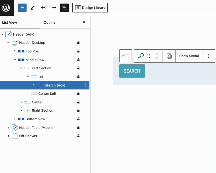
Search Submit Button: When using the Search Submit Button feature or the Modal Style Search, a standard Advanced Button Block labeled Search is added. This button can be selected and styled as needed.
In the List View, expand the Search (Adv) Block, then expand the Buttons (Adv) Block. Select the Button Block named Search (Adv) nested inside to access the settings for the Search Submit Button.
With the Search Button Block selected, you can rename the block and use the Block Settings to adjust the button’s style and appearance.
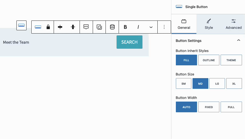
For more information on the available Button (Adv) Block Settings and single Advanced Button Block Settings, check out the Buttons (Adv) Block Document here.
Style Settings
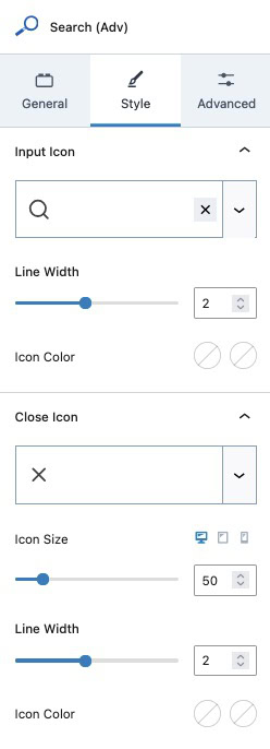
Input Icon: Select a Kadence Icon (Free) or a Custom SVG Icon (Pro) for the Search Input Icon
Line Width: Adjust the Line Width of your Input Icon.
Icon Color: Adjust the Icon Input Color for the Normal and Hover State.
Close Icon: Set a Close Icon using either a free Kadence Icon or a Custom SVG Icon (Pro). The Close Icon settings apply to Search (Adv) Blocks that use the Modal Style.
Icon Size: Set an Icon Size for the Close Icon.
Line Width: Set a Line Width for the Close Icon.
Icon Color: Set a Color for the Close Icon for the Normal and Hover State.
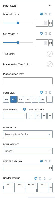
Input Style: Adjust the styles of the Input Box and Texts.
Max Width: Assign a Max Width to the Input to limit the width of the Search Box.
Min Width: Assign Min Width to ensure the Search Box takes up a minimal amount of Width.
Text Color: Adjust the Text Color.
Placeholder Text Color: Adjust the color of the Placeholder Text.
Placeholder Text: Add a placeholder text for when the search box is empty.
Font Size: Adjust the Font Size for the Placeholder and Input Texts.
Line Height & Letter Case: Adjust the Line Height and Letter Case for the Input and Placeholder Texts.
Font Family: Assign a Font Family for the Input and Placeholder Texts.
Letter Spacing: Adjust the letter spacing of the Input and Placeholder Texts.
Border Radius: Add a Border Radius to the Search Box.
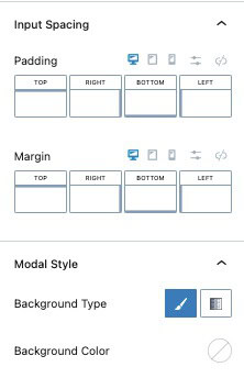
Input Spacing: Add Padding or Margin to the Search Input Box.
Modal Style: Adjust the Styles of the Modal if you are using the Modal Search Style.
Background Type: Set the Modal to use either a Background Color or Background Gradient.
Background Color/Gradient: Set the Color or Gradient for the Modal Background.
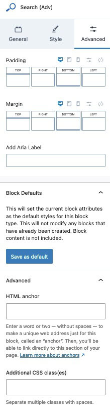
Advanced Settings
Padding & Margin: Add a Padding and/or Margin to the entire Search (Adv) Block.
Add Aria Label: Add an Aria Label to your Search (Adv) Block for better accessibility.
Block Defaults: Save the current Block Settings Configuration as the Block Default. This will automatically use the current settings on all new Search (Adv) Blocks. Learn more here.
HTML Anchor: Add a custom HTML Anchor #ID to the Search (Adv) Block.
Additional CSS Class(es): Add additional CSS Class(es) to the Search (Adv) Block.
