
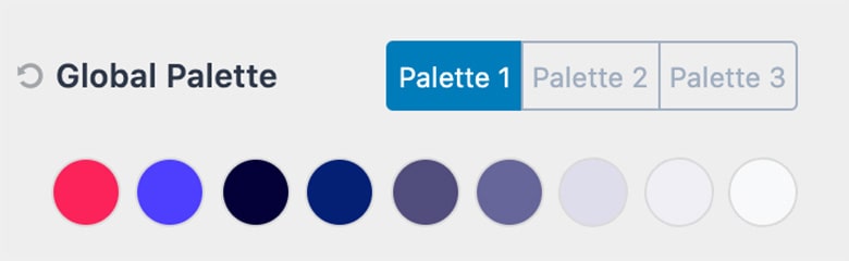
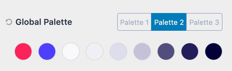
You can find the Kadence global colors in your site’s admin dashboard under Appearance > Customize > Colors & Fonts > Colors.
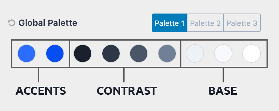
There are 9 colors. You can switch which palette you are using in the customizer but that will just change which 9 colors are used. The order is important and in general, you would want to keep to the same pattern that you see when you first load the theme. There are three sections of colors, the first two are accent colors, then next 4 have to do with contrast colors that help provide subtle design hierarchy usually in text, the last three are for backgrounds that help define subtle differences in sections of a page or post.
The color palette is not a bunch of colors you might want to use on your site.
The colors are already used throughout your site to define the subtle feel of your site. These colors define the “skin” that your site is using and establishes the base you design from. When you adjust the color palette you are adjusting the site as these colors are used in various places throughout the site to keep your site within your design system.
1. Accent
2. Accent – alt (think of what happens when you hover over the accent color).
3. Strongest text
4. Strong Text
5. Medium text
6. Subtle text – borders
7. Subtle Background (light enough that strong text is readable)
8. Lighter Background (light enough that medium text is readable)
9. (white or very close to white).
By setting these colors and using them throughout your site it will help you keep to a design system and make it very easy to tweak the system later on. If you are wanting a palette of colors you might use then add those in the Kadence Blocks Colors (you can add unlimited) so you can access them easily in the block editor.
Color Palette Examples:
To illustrate an example of a light skin and a dark skin, here’s an illustration and color scheme from control.rocks


How to create a color palette
Accent Colors
Your accent color will likely be used the least on your actual site. This is the attention-grabber that highlights the important things. Your calls to action and your powerful one-liners. This is the color you should really put the most time into as it truly will set the rhythm for your brand.
Once you have it dialed in then select an alt accent color, this could be another color that compliments your main accent or just a darker or lighter shade of your accent color.
Contrast (Text) Colors
Contrast or Text colors are great ways to create a design hierarchy with your text, borders etc. Usually, these are the darker “gray” colors that determine the text color for your heading and main site text. While these can be a full gray usually you get a richer looking site if they are an off gray like a cool or warm gray. How cool and how warm depends on your accent colors.
Cool Gray Example:
#1a202c
#2d3748
#4a5568
#718096
Warm Gray Example:
#27241D
#423D33
#504a40
#625d52
Gray Example:
#222222
#3b3b3b
#515151
#626262
These subtle differences can really add that rich and premium feel to your design.
Base (Background) Colors
Your base or background colors are usually at the lightest end white with two off-white variations that have just enough contrast to be show a visual difference without having so much contrast that the text is lost in the color. Your base color is the color that people will notice the least, but if selected well makes all the rest of your colors come together.
Cool Example:
#edf2f7
#f7fafc
#ffffff
Warm Example:
#e8e6e1
#faf9f7
#ffffff
Accessible (readability)
Another key factor that is not always taken into account when establishing a color palette is readability. Lucky for you, the web is full of tools to help you create the perfect contrast with your colors to be accessible. A free resource that we recommend is called WebAIM.
Inspiration
The way we think about creating color palettes at Kadence was influenced by Steve Schoger over at https://refactoringui.com/. We highly recommend you checkout out his design tips. We also suggest you browse well-designed sites to get inspired and see how others are using color palettes.
