
With the Kadence Theme, enjoy complete control over the website’s footer using the Footer Builder feature. This empowers users to craft a footer that aligns perfectly with their site’s design and functionality. Whether adjusting the layout or fine-tuning individual elements, the Footer Builder provides the flexibility needed to create the ideal footer for the website.
Editing the Footer
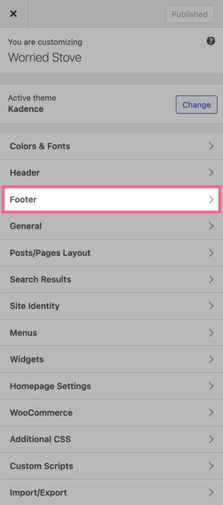
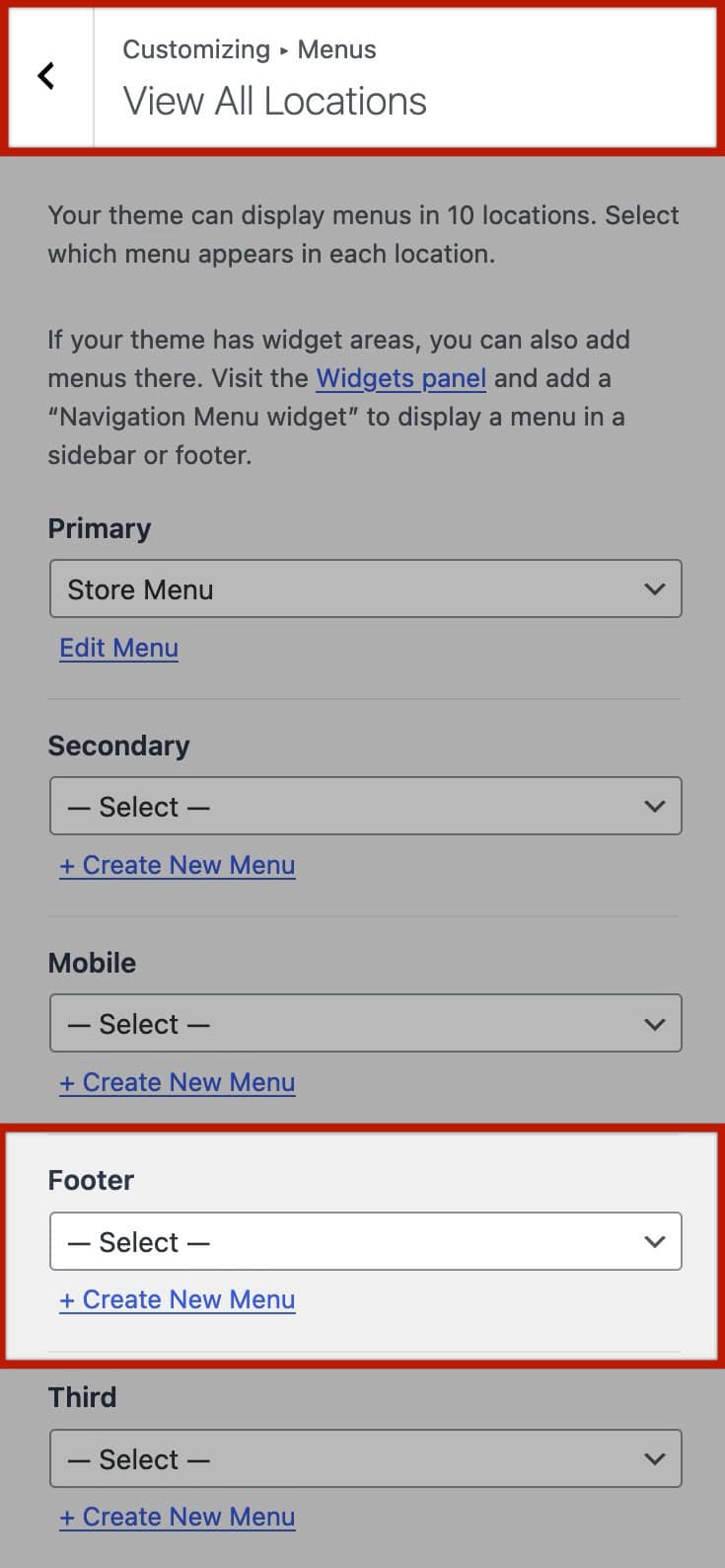
To access the Footer settings, navigate to the WordPress Customizer. You can find the Customizer either from the Dashboard under Appearance -> Customize or by simply clicking “Customize” in the Admin Toolbar while on the front end. Once in the Customizer, head over to the Footer tab to begin customizing the footer layout and elements.
General Footer Settings
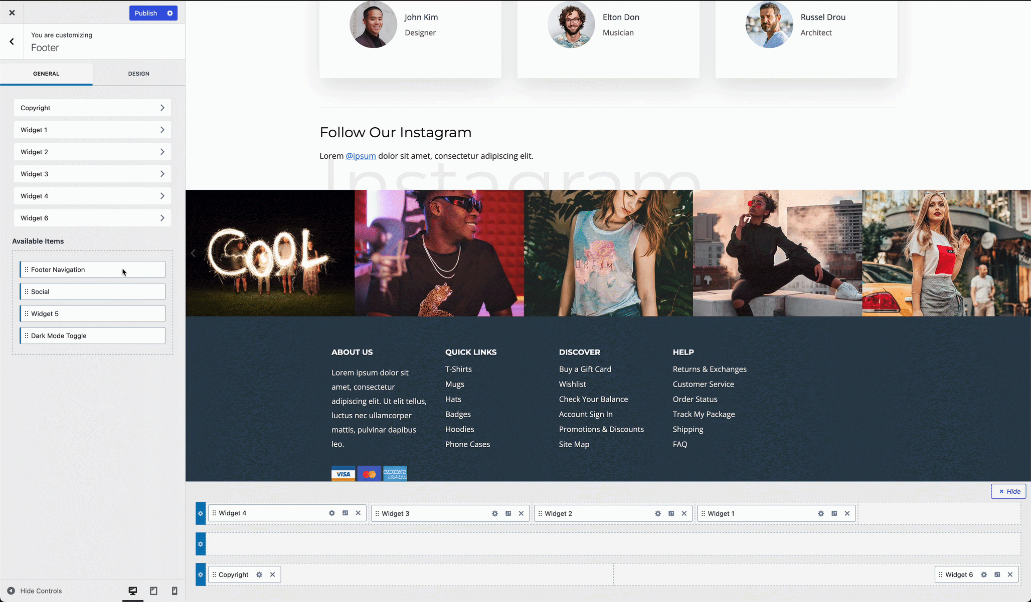
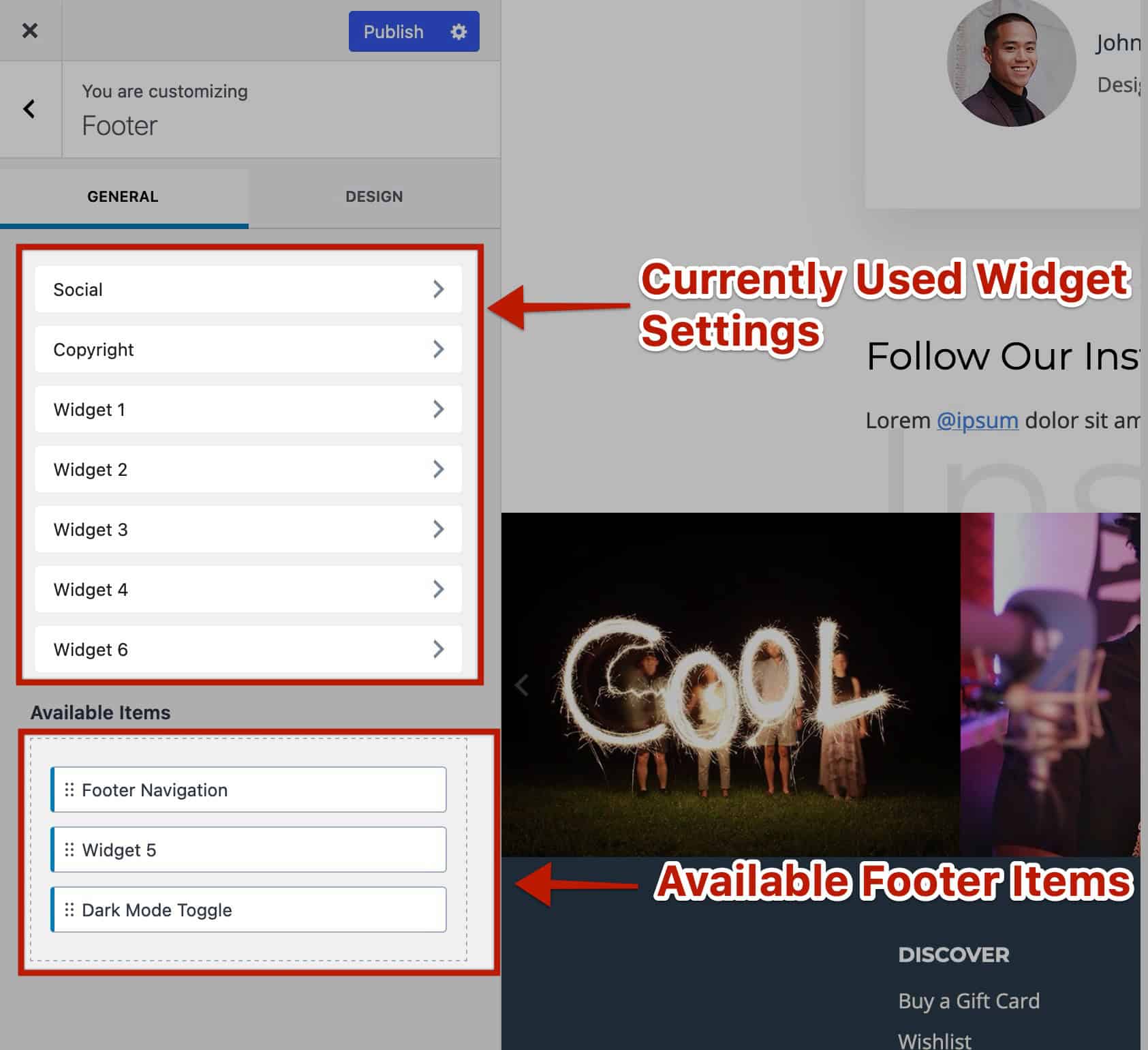
To customize the footer, drag and drop items from the Available Items list into the Footer area. Above the Available Items, you’ll find item names accompanied by an arrow icon, representing setting tabs for each item currently in the footer. As you add items, they’ll appear in this list, allowing you to click on any item tab to customize its settings individually. You can learn more about the Kadence Footer Items Here.
Design Footer Settings
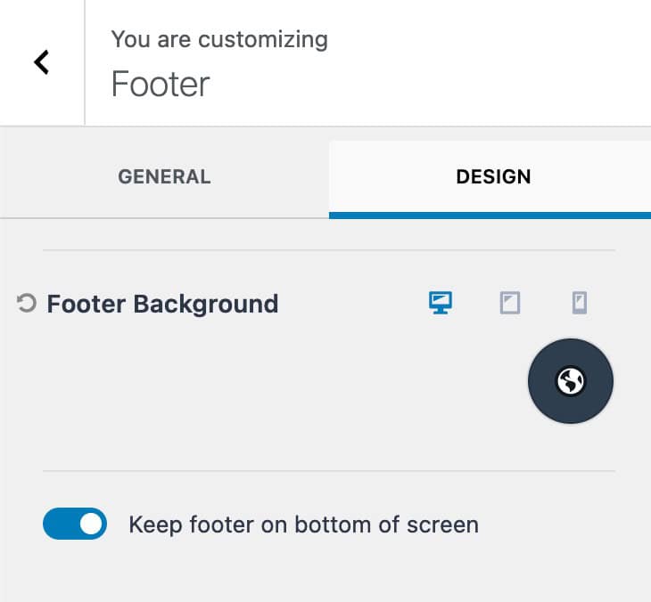
The Design Tab within the Footer Customizer Settings can be used to customize the appearance of the footer.
From this tab, adjust the Footer Background across all device types to suit design preferences. Additionally, there is an option to enable keeping the footer at the bottom of the screen.
Footer Row Settings
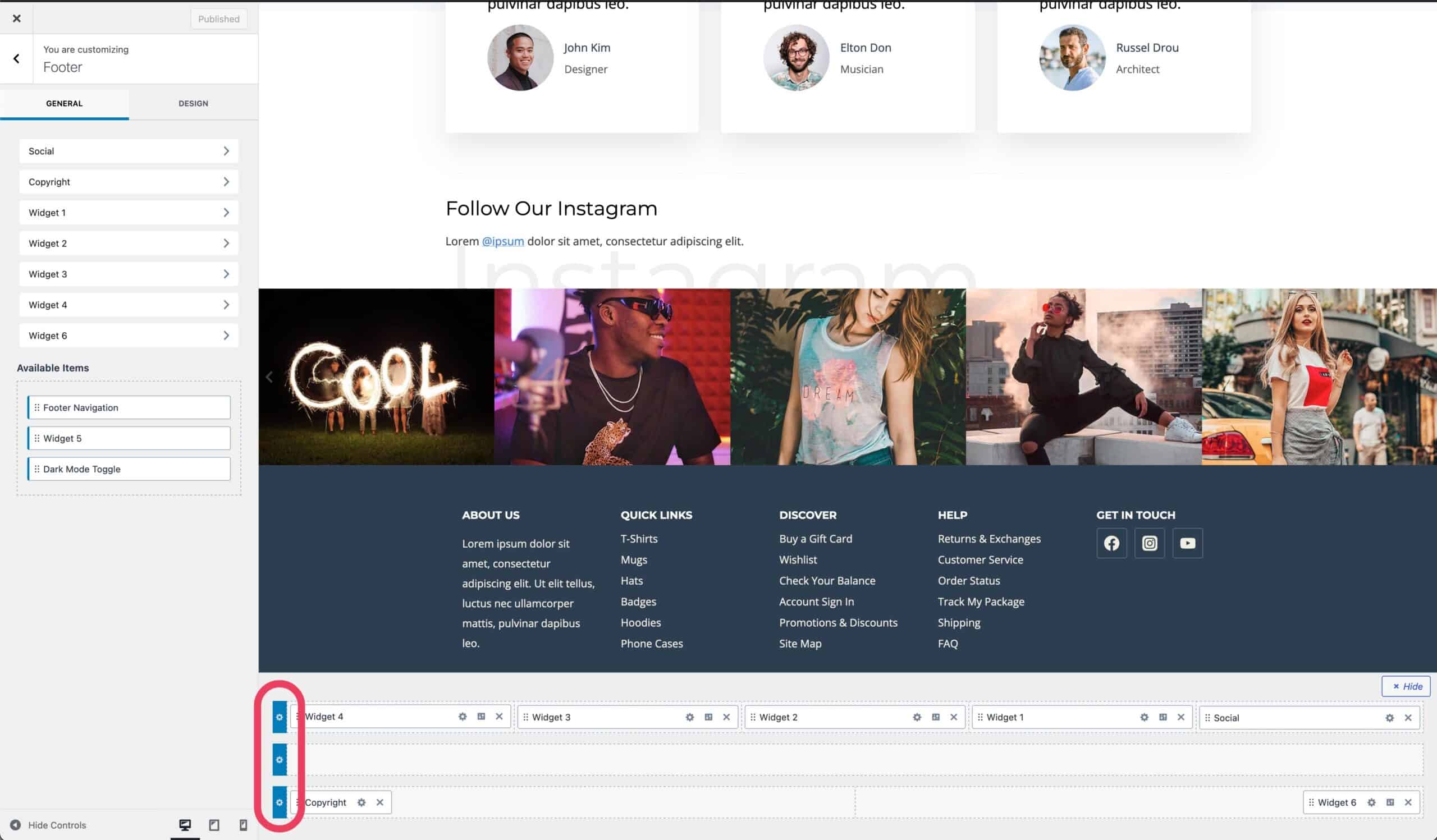
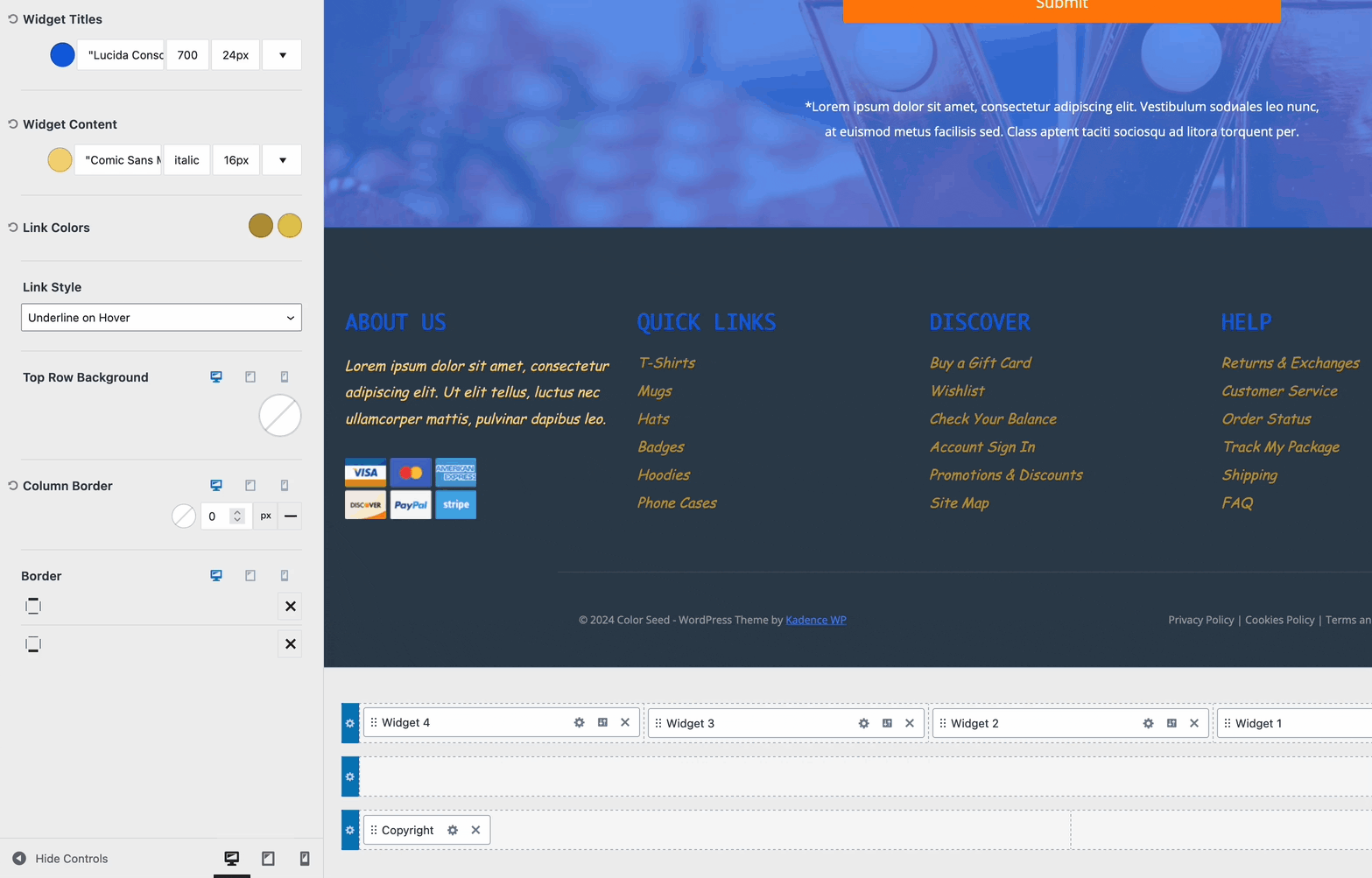
The Footer consists of three distinct rows: the top row, the main row, and the bottom row. To customize each row, simply locate it in the visual editor and click on the settings icon situated on the far left of the respective row.
General Row Settings
Tailoring the appearance of the footer involves adjusting several key settings. Let’s explore each one:
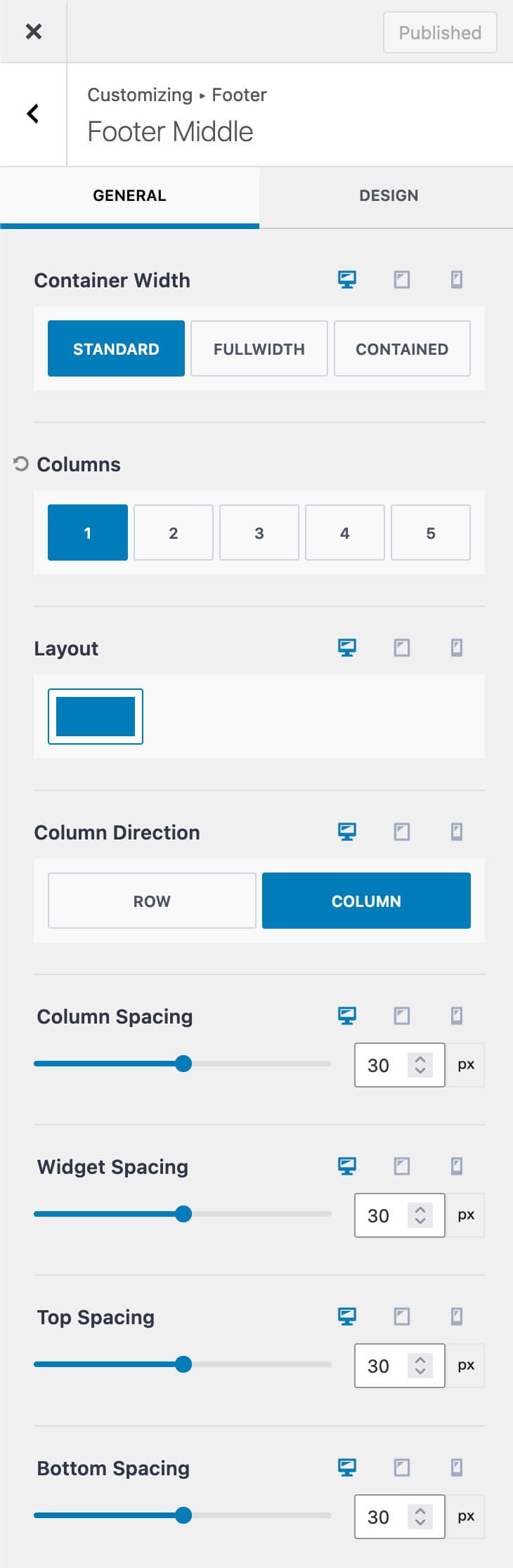
Container Width: Determine how wide the content in the footer row will appear. Options include:
- Standard: Follows the website’s default width.
- Full Width: Spans the entire browser width.
- Contained: Restricts content within a defined width.
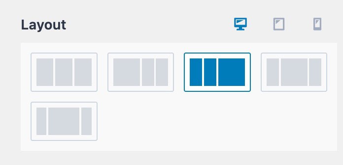
Number of Columns: Specify how many columns the footer row should contain.
Layout: Customize column arrangements for desktop, tablet, and mobile devices. Different layouts are available depending on the number of columns used.
Column Direction: Choose whether content within each column should be stacked vertically (Column) or arranged horizontally (Row) for each device.
Column Spacing: Adjust the distance between columns.
Widget Spacing: Control the spacing between individual widgets or elements within each column.
Top and Bottom Spacing: Set the amount of space above and below the entire footer row.
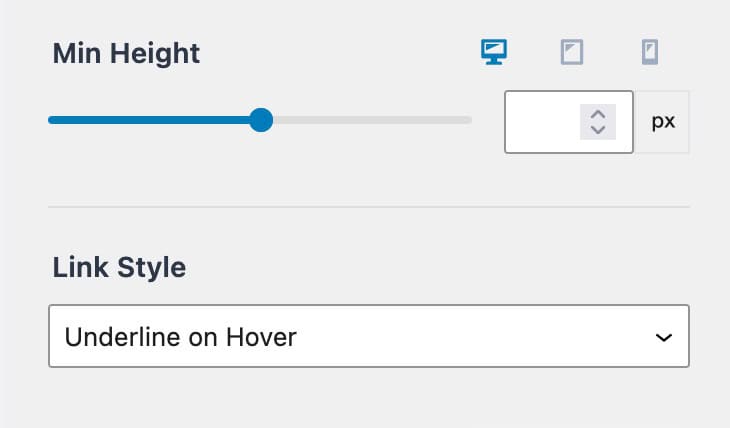
Min Height: Define the minimum height of the footer row.
Link Style: Specify how links within the footer should appear, with options including underline on hover, underline, or no underline. (Click here for a visual of the link stylings)
Design Row Settings
Customize the design of the Footer Row using the Design Customizer settings.
Widget Settings
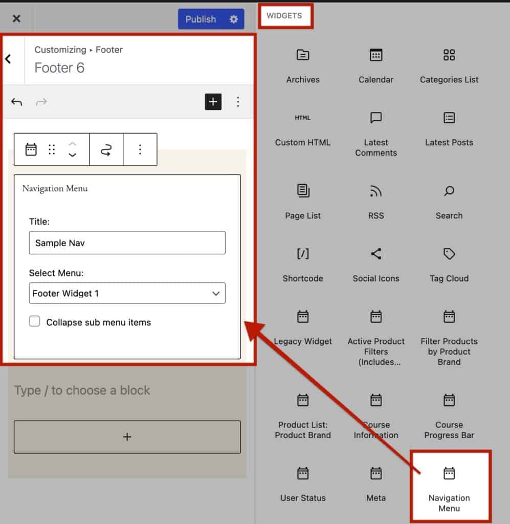
Gutenberg offers different built-in Widgets, such as the Navigation Widget. Themes and Plugins may also provide additional Widgets.
When using these Widgets, you can use the first set of Footer Row Design Settings to adjust the Widget Title, Content, and Link Settings.
Widget Titles and Widget Content Colors: Customize the color of widget titles and content to match the website design preferences.
Use the Widget Titles setting to modify title colors and typography settings.
Use the Widget Content settings to modify content colors and typography settings.
Use the Color Picker along with the Font, Style, and Size dropdowns as preferred to change these stylings for both mentioned settings.
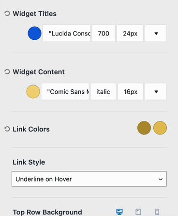
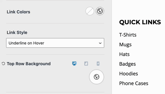
Link Colors: Define colors for Links in the Initial and Hovered states.
Link Style: Define how links appear within widgets by choosing from options from underline on hover, underline, or no underline. (Navigation Widgets use mostly Link Texts.)
Row Settings
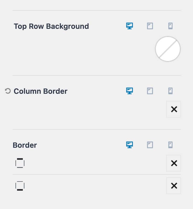
Row Background: Tailor the background color of each row by utilizing the Row Background setting. You can opt for a solid color, gradient, or image background.
Column Border: Add borders to separate columns within the footer row for desktop, tablet, and mobile devices. This option is available when multiple columns are present in the footer row
Top and Bottom Border: Enhance the appeal of the footer row by adding top and bottom borders. This feature works regardless of whether multiple columns are present in the footer row.
Kadence Footer Items
While in the Customizer and navigating to Footer settings, a section labeled “Available Items” will be found where elements can be dragged and dropped onto the footer. Above these available items are tabs corresponding to each item currently in the footer. These tabs serve as shortcuts to customize the settings of individual footer items.
Social
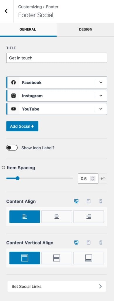
The Footer Social item allows Social Icons and Links to be added to the footer.
Title: Introduce the social icons with a title, such as “Connect with us.”
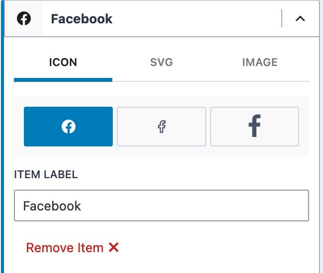
Social List: A list of current social media items, each with a label and icon. Click the down arrow to modify these settings. A Custom SVG or image can replace a Social Icon.
Add Social+: Utilize this button to add additional social media icons/options to the Social List.
Item Spacing: Adjust the spacing between the Social Items.
Content Alignment and Content Vertical Alignment: Customize the alignment of icons across desktop, tablet, and mobile devices.
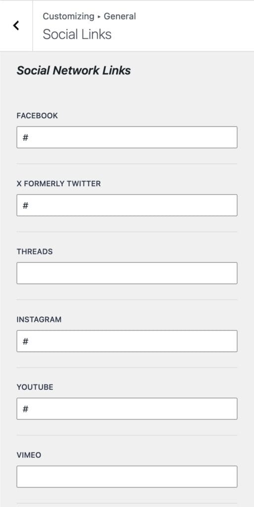
Set Social Links: Add or edit social links directly from this option. Alternatively, navigate to Customizer -> General -> Social Links to manage these links.
Input handles or URLs for each Social Network when editing Social Links.
Available Social Listings: Includes popular platforms like Facebook, Twitter, Instagram, YouTube, and more.
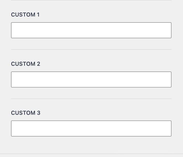
Custom Options: For social media platforms not listed by default, use these options for specialized social media integration. Custom Options are found at the bottom of the Social Network Links List, labeled Custom 1-4.
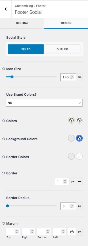
Access the Design Tab to adjust the styles of Footer Social Icons.
Social Style: Choose between Filled or Outline styles for Social Icons. Filled icons utilize a background color, while Outline icons use an outline color (border).
Icon Size: Set a size for the Social Media Icons.
Brand Colors: Enable or disable the use of Brand Colors, which are the default colors associated with each social icon. Options include yes, no, on hover, or until hover.
Initial Color and Hover Color: Customize the initial and hover colors for Footer Social Icons.
Background Colors: For Filled Style icons, set background colors for both the initial and hover states.
Border: Add a border to the icons and specify border colors for both the initial and hover states.
Border Radius: Adjust the border-radius to control the curvature of Social Icons.
Margin: Set a margin to define the spacing around Social Icons.
Copyright
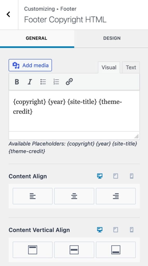
Integrate copyright-related information into the Footer using the Copyright Footer Item.
Visual/Text Editor: The visual/text editor can be used to add copyright information to the footer. Built-in options are available to populate various placeholders. Here are the available placeholders that can be utilized:
| Placeholder: | Output: |
| {copyright} | Displays the © symbol. |
| {year} | Displays the current year |
| {site-title} | Displays the site title. |
| {theme-credit} | Adds credits for the Kadecne Theme |
Content Align and Content Vertical Align: The copyright alignment options can be used to adjust the position of the copyright contents.
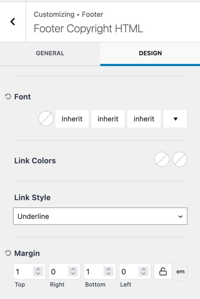
Utilize the Design Settings to adjust the styles of the Footer Copyright Item.
Font Settings: Adjust the font color, weight, and size for copyright information.
Link Colors: Set colors for both the initial and hover states of links within the Copyright Item.
Link Style: Choose between underline or no underline for the link style.
Margin: Add a margin to the Footer Copyright Item.
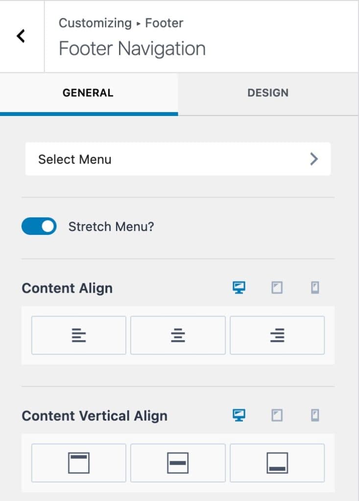
Footer Navigation
The Footer Navigation feature allows you to incorporate a Kadence Navigation Menu directly into the footer.
Select Menu: This option is to designate a default Footer Menu, which will be displayed as the Footer Navigation. The Select Menu button will pull up the Customizer Menus options. Here a Footer Navigation Menu can be set.
Stretch Menu: Expand the menu across the available space within the Footer Row/Column.
Content Align Settings: Set a Content Align and Content Vertical Align option to align the Footer Navigation as preferred.
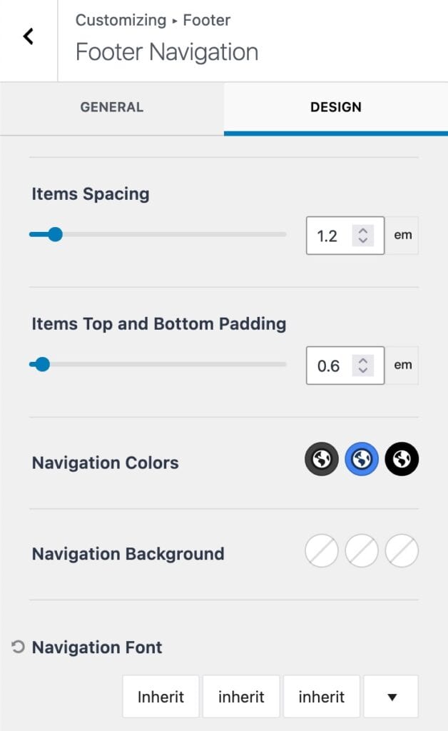
You can fine-tune the style of the Footer Navigation Item using the Design tab.
Item Spacing: Define the spacing between Menu Items within the Navigation.
Items Top and Bottom Padding: Add padding above and below the Menu Items.
Navigation Colors: Set colors for Initial, Hover, and Active States, including Main Color and Background Color options.
Navigation Font Settings: Customize Font Family, Weight, and Size to align with the overall website design.
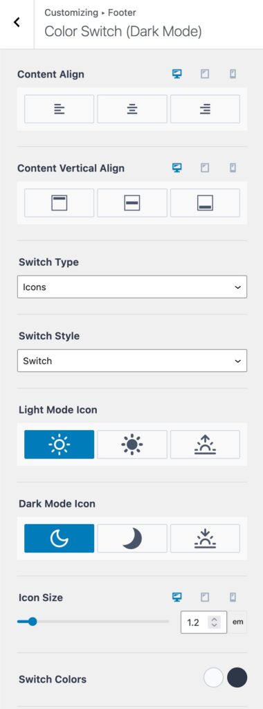
Dark Mode Toggle (Kadence Pro)
The Dark Mode Toggle Item allows you to add the Dark Mode Toggle Switch to the Footer. This is a part of the Kadence Theme Pro plugin. To view the color switcher, dark mode must be enabled under Customizer -> General -> Color Switch (Dark Mode) settings.
Content Align Settings: Set a Content Align and Content Vertical Align option to align the Color Switch as preferred.
Choose a Switch Type: Select from Icons, Text, or a combination of Icons and Text.
Switch Style: Choose between Switch or Buttons. This is the style in which the color switcher presents.
Switch Style Sample

Button Style Sample

Designate a Light Mode Icon and a Dark Mode Icon.
Icon Size: Define the Icon Size. This can be responsively set for Desktop, Tablet, and Mobile.
Customize the Switch Colors: Set colors for both the Initial and Hover States of the Dark Mode Switch.
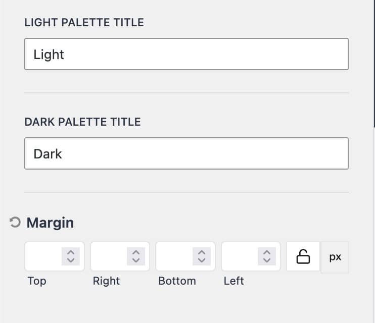
A Light Palette Title and a Dark Palette Title can be set to correspond with the color switch. This helps with accessibility

.Margin: Set a Margin for the Color Switch Item to control its spacing within the layout.
Creating a Custom Widget
Creating a Widget can be done in two ways: It can either be done directly within the Customizer or from the Dashboard.
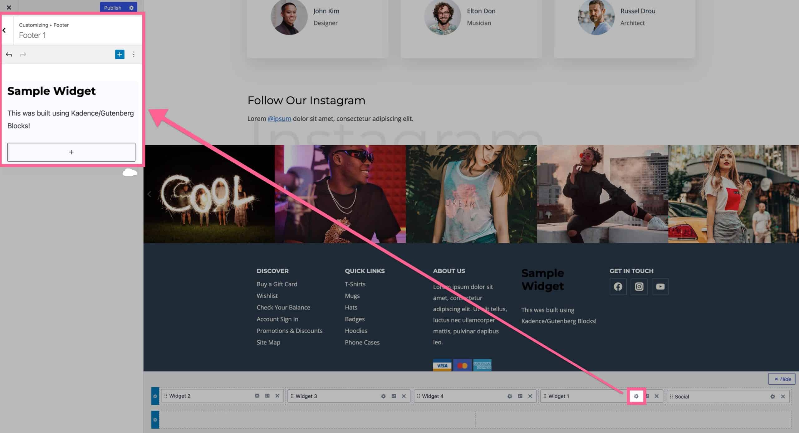
In the Customizer, start by adding a Widget to the Footer. Click on the Settings Icon next to the Widget Item to customize its settings.
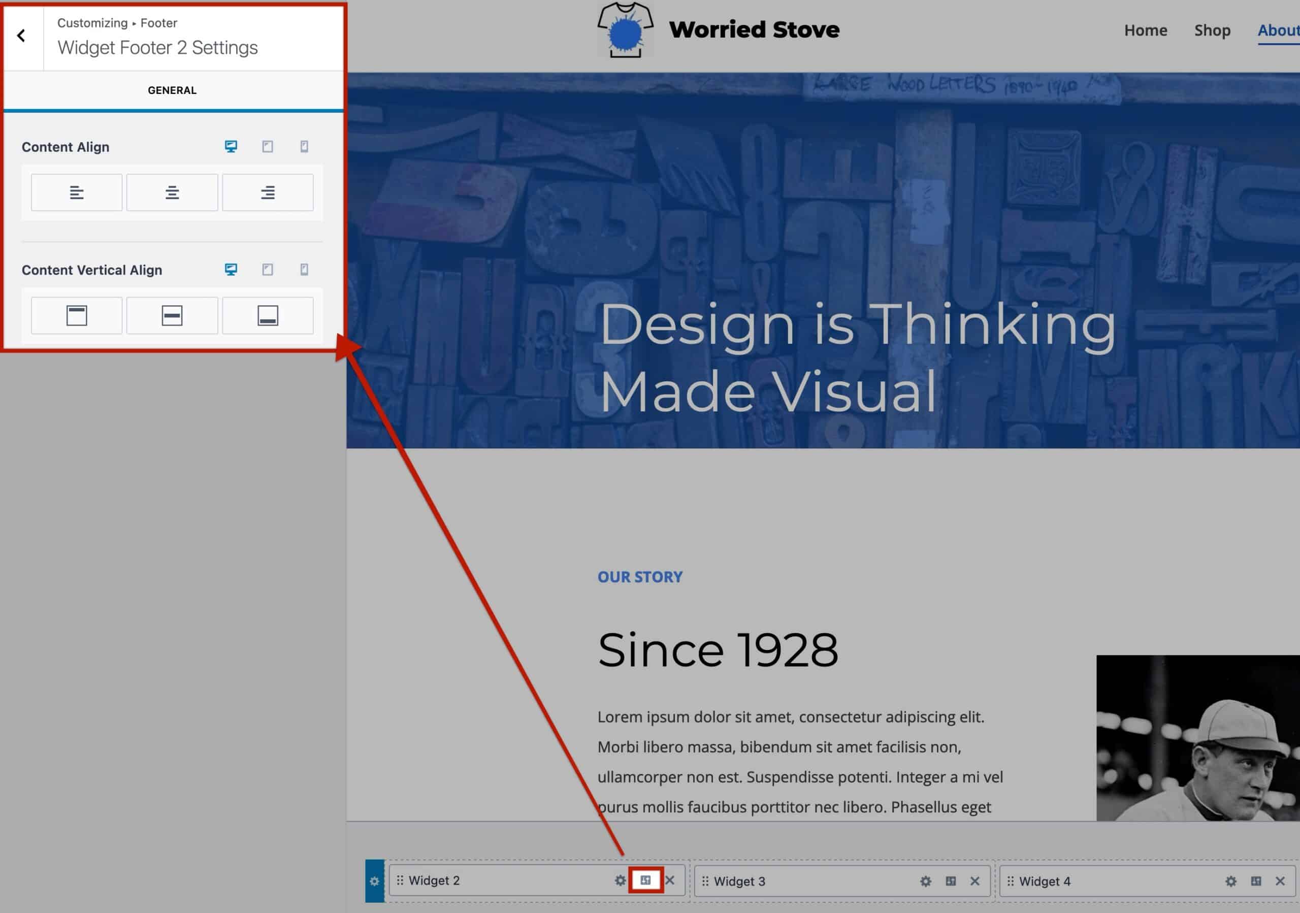
Next to the Widget Setting Icon, there is a Toggle Icon. This icon allows access to and modification of additional Widget Alignment Settings.
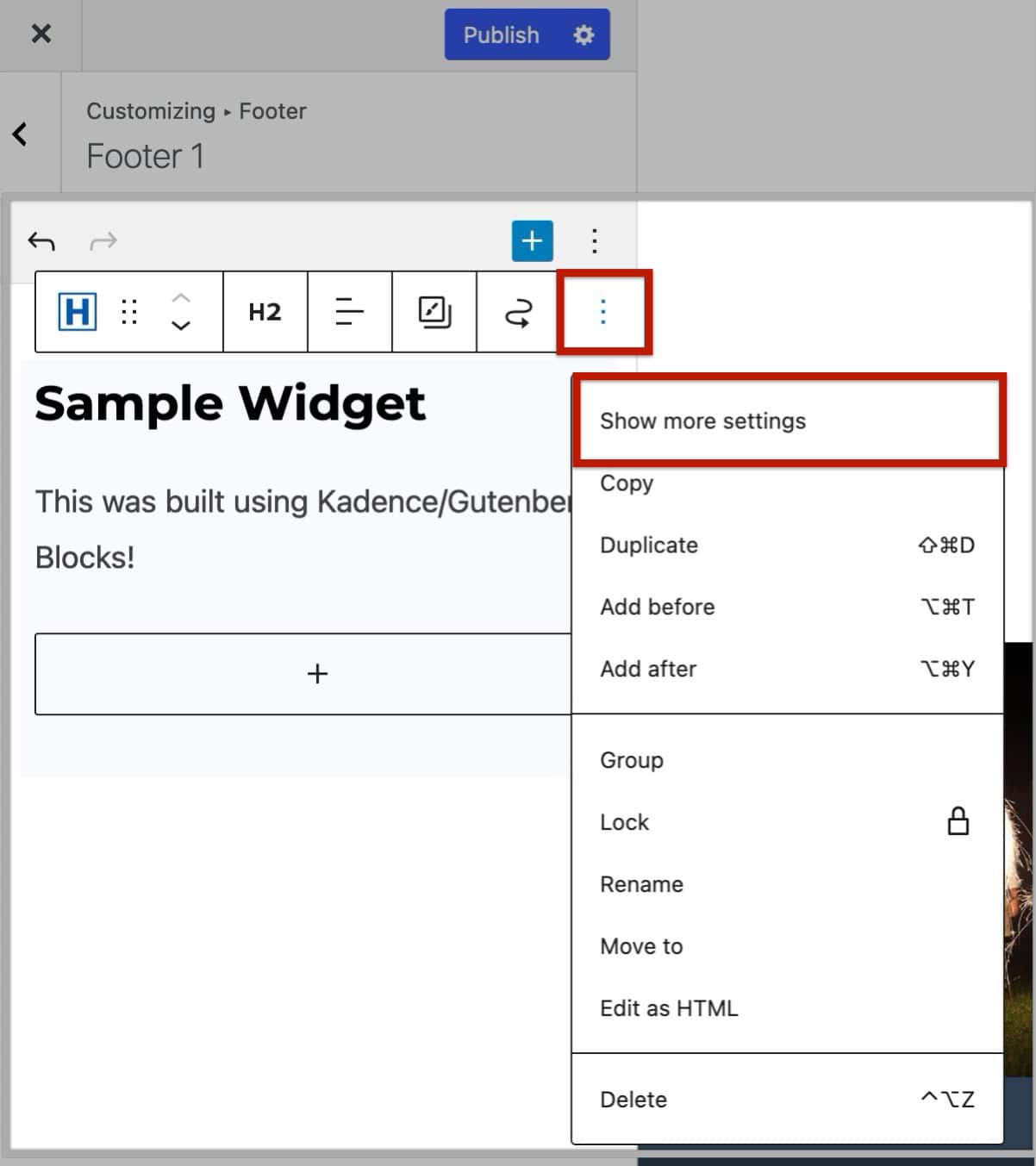
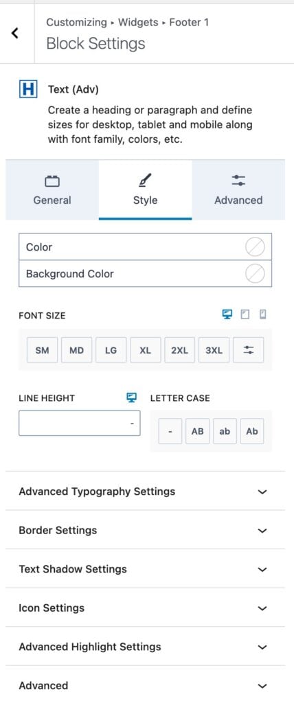
While editing a Widget, incorporate Blocks and customize them as needed. To access Block Settings, select a Block and use the Block Toolbar to “Show More Settings.” This action unveils Block Settings for that specific Block within the Customizer.
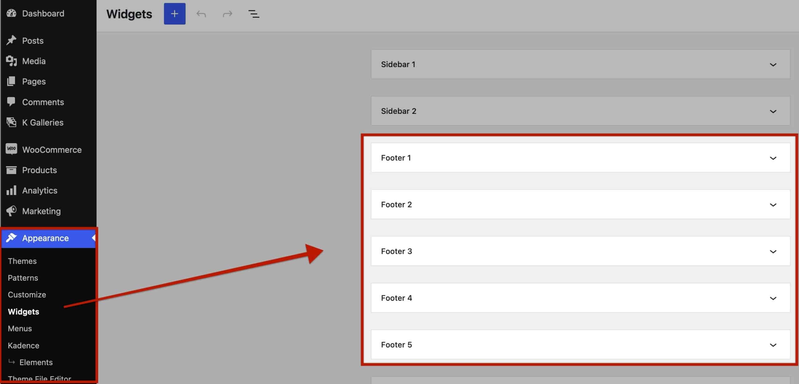
Edit Footer Widgets directly from the Dashboard. Navigate to Dashboard -> Appearance -> Widgets. Locate Footer Widgets 1-6, expand them, and make desired edits. Remember to click “Update” to save changes once finished.
