
Website Navigation: Best Practices to Follow + Examples!
Have you ever been on a website where you couldn’t easily find what you were looking for?
When you visit a website, you’re probably searching for specific information, like what a company charges for their product or ways to contact someone. The first place you’ll look is in the website’s top menu, also known as its navigation, menu bar, header, or nav bar.
Without navigation, you wouldn’t be able to easily notice and click those pricing and contact pages or other important pages on the website. You may even have trouble finding the website in the first place!
Website navigation is an essential asset on every website, including yours. It improves the user experience and even your search engine optimization (SEO) efforts.
But not all navigation is created equal. It can be hard to get it right. After all, what exactly is website navigation? How should it look? What pages should be included?
In this article, we dive into these answers and more. Let’s take a closer look at website navigation, best practices, and examples.
What is website navigation, and why does it matter?
Websites are a hub for information about you or your company. They usually have multiple pages, sections, and links so visitors can find what they are looking for quickly. Website navigation makes this possible.
Your navigation is simply a list of links or menu of options that website visitors can select and go to. Plus, website navigation refers to the elements of menus, including the buttons and links, overall design, and copy. It can also refer to sub-navigation menus (or submenus), which provide even more options under main navigation menus.
Website navigation is one of the key aspects of website design and showcases your most important web pages.
Good website navigation helps guide users towards certain actions, like browsing your product pages or contacting you. Navigation also allows you to highlight the information and pages you want to emphasize.
Understanding and optimizing your website’s navigation has a lot of benefits. Here are some of the top advantages:
- Improve user experience. When people go to your website, they’re probably searching for specific information, like what your pricing is or what services you offer. Your website navigation will probably have a main menu with “Pricing” and “Services” as clear options, leading users to easily find that information.
- Higher engagement and retention. When visitors are easily able to locate information, they’ll probably stay on your site much longer. Websites with poor navigation drive users away since they can’t figure out how to get around the website.
- Boost SEO. Website navigation helps more than just your users; it allows search engines to understand your website better. Navigation paints a clearer picture of how your site is structured and laid out. So, search engines will learn which pages are important and what your site is about. It won’t take much for them to start indexing your website!
These benefits are great for increasing your site’s new users, engagement, and search rankings.
But it’s important to remember that good website navigation ultimately increases your conversion rate. Website users will be more satisfied with the site, stay on it longer, and go through a seamless conversion process.
Types of website navigation
You know what website navigation is and why it’s important, but did you know that there are different types of navigation? That’s right–your site will most likely house multiple menus.
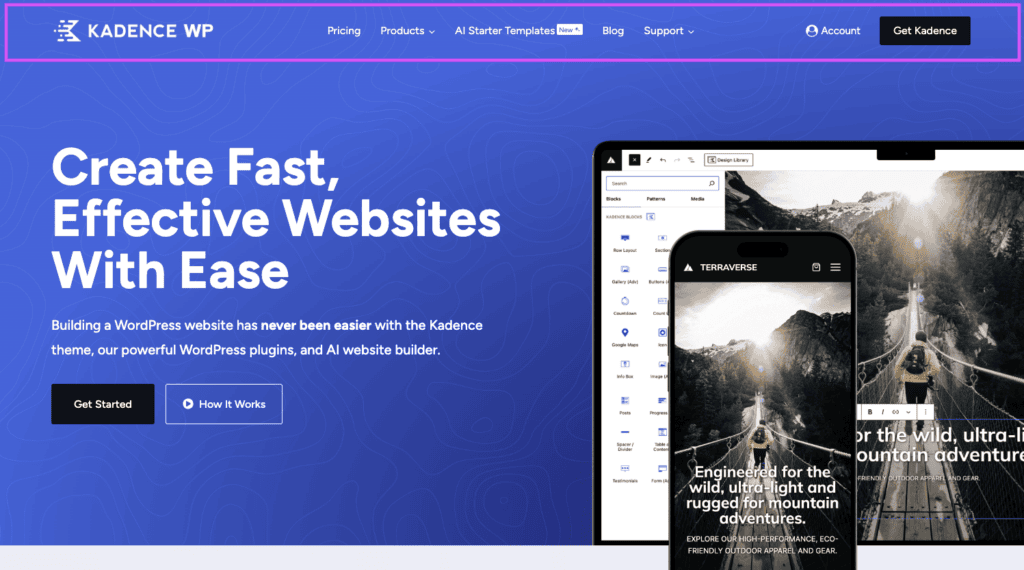
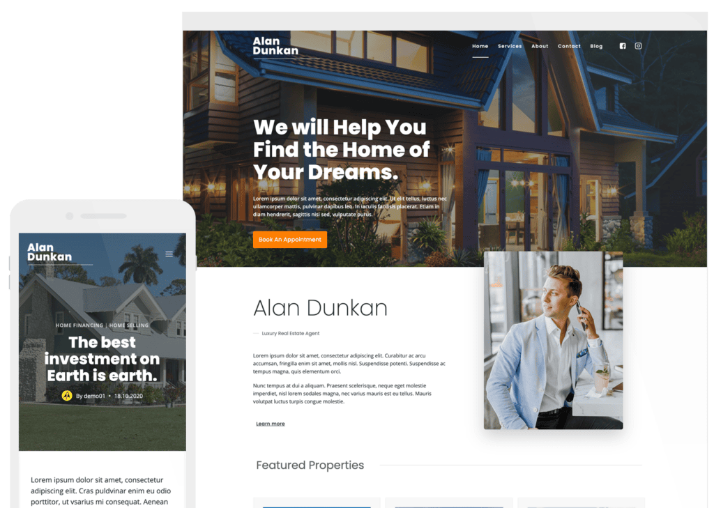
Some of these menus may be part of or act as your website’s primary navigation menu. Your main menu refers to the primary list or menu. It’s usually located at the very top of your website as part of your website header.
Your header may also feature your logo. Take ours, for example:
Now, let’s check out the types of website navigation.
Horizontal navigation bar
A horizontal navigation bar is typically a thin bar or block that runs the entire width of your website. It lives on the top level of your website, above any images, graphics, or other web elements.
A horizontal bar can either be a solid color, like black or white, or transparent (it will have no color and use the header image as the background, like the website pictured above).
We recommend always including a horizontal navigation bar on your website. It’s the best way to show users (and search engines) what’s important. Plus, it’s easy to make and edit your navigation with Kadence Blocks!
Dropdown menu
A dropdown menu is pretty similar to other menus in terms of looks, but where it differs is by interaction. To see the menu, users must hover over it or click it.
Dropdown menus come in all different sizes. Most often, they are used to change options on a website that doesn’t need a full, large menu. For example, if your ecommerce website features different languages or currencies, you can include a small dropdown menu so users can change those options if needed.
Dropdowns are also a great solution for when you want to maximize screen space and minimize clicks. For instance, if you have a lot of pages and navigation items, you shouldn’t display all of them in your horizontal navigation bar.
Instead, group options together or create a hierarchy. Doing so with a dropdown menu will help visitors find things more easily. Check out this example:
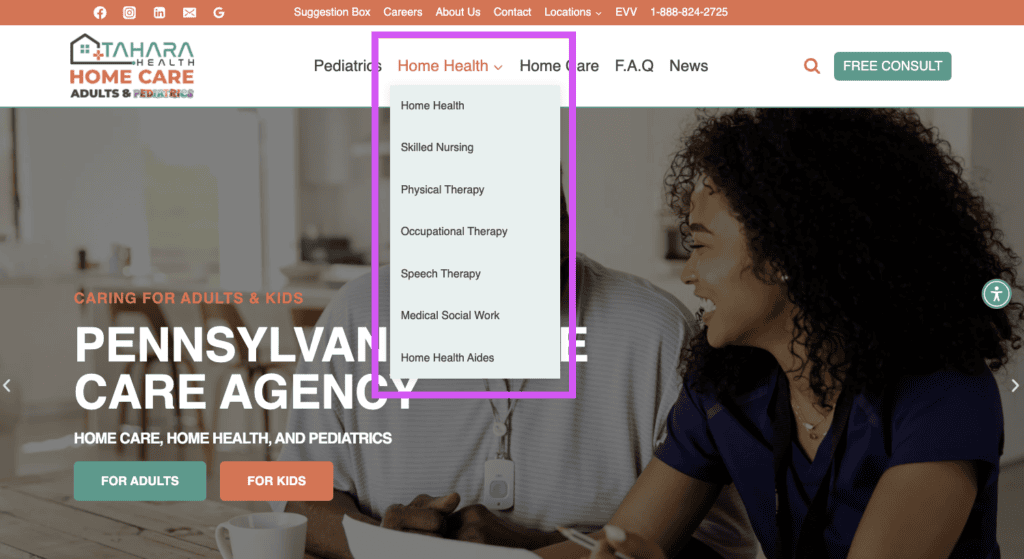
We can see that this website is prioritizing Home Health as a menu option, but there are more pages that users might want to access from the main nav menu. However, these don’t need to be prominently displayed like the other more important pages.
Hamburger menu
Who would’ve thought we would start talking about hamburgers? Well, in this case, we’re talking about the hamburger that goes on your website, not on your plate.
The hamburger menu is a lot like the dropdown menu, and it’s actually the most minimalistic menu on this list.
This type of website navigation menu hides all navigation options behind three small horizontal lines (hence the name). After clicking the hamburger icon, users will see the navigation options. This type is most common for the mobile view of websites where space is limited.
Vertical menu (sidebars)
Sidebar menus, also known as vertical menus, are navigation menus that live on the left or right side of a website. Like other types of menus, vertical navigation menus usually feature a logo and clickable links.
These types of menus are usually more colorful to catch your eye. They may also be collapsible with a simple click.
Sidebar menus are great for websites with more than a few navigation options. This type of menu also pairs well with the hamburger and dropdown menus. Check out this vertical main menu from A24:

Footer navigation menu
Unlike all of the other navigation menus we’ve touched on, footers are a little different.
Your footer navigation menu is more hidden since users must scroll to the bottom of the page in order to see it.
These menus also house more links and information than their counterparts. For example, you probably don’t want to put your social links in your horizontal main menu – that could distract users from your main pages or call-to-action buttons. But the footer is a great place to put those social links on display. Salesforce does this well:
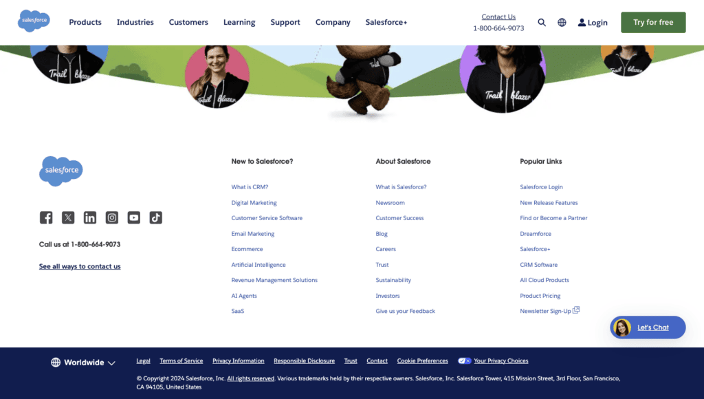
Think of your footer as a kitchen cabinet. You can put a lot of your kitchen items in there since they don’t need to be on the counter, but you still want to be able to access them. The same goes for your website. You want people to be able to see other pages, but they probably don’t need to be front and center in your main menu.
The footer is also a good place to include legal information and privacy policy.
12 Website navigation best practices
So far, we’ve covered all of the essential information you should know about website navigation. Now, we’ll explore best practices so your navigation menus are as effective as possible – all while looking awesome!
1. Set your logo to a modest size
Navigation menus are meant to guide and show users what the main pages are. Besides those options, logos are present.
Logos typically act as a link to your website’s home page or as a reminder of what website the user is on. They are not meant to be the focus of your navigation menu, and logos that are too large may even distract the user from taking a certain action.
However, we often see site logos that are too large for the menu.
As a best practice, be sure to set your logo to a modest size. It should not overpower your website or nav menus.
It’s also important to note that your logo should always be readable. Don’t make it too small, and make sure it’s visible in front of your background or header color. We recommend sticking to a vector graphic (SVG format) for the most clarity.
Example: Apple
A great example of this best practice comes from Apple:
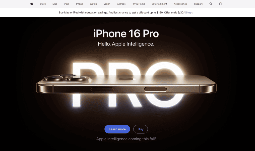
As pictured, the Apple logo is there, but it’s not the main focus on the menu.
Pitfalls to avoid
- Logos that are too small or large
- Blurry logos
2. Simplified and intuitive menus
Besides a logo, your navigation menu will have some sort of list of options to choose from. If you’re including too many options, it can get overwhelming for your website users, especially if you do it for your top or main menu.
We recommend including enough options to provide an intuitive, smooth user experience.
You should also simplify the menu where possible. For example, if you have a physical location, you don’t need two menu options like “Contact Us” and “Find Us.” Instead, choose one or the other.
You can also eliminate the “Home” tab in your nav menu. Your logo can act as a link back to your home page.
Not only does a simplified menu avoid clutter, but it also can help increase your conversions. As mentioned, too many links and options may confuse users and cause them to not find what they’re looking for or bounce off of your website.
Offering fewer options makes the conversion process much easier.
Another aspect to consider is the layout of your navigation menu. An intuitive and user-friendly layout usually follows a simple formula: Your logo stays on the left side and your navigation options go on the right side or middle with a call to action, like this:

We recommend following the same layout for your horizontal navigation menu. Many websites do the same, so your users already know how to navigate it.
Example: Start Blogging 101

This great example comes from Start Blogging 101. As you can see, the site’s menu is condensed into just three options. They also use dropdown menus to organize the menu.
Pitfalls to avoid
- Cluttered and overwhelming menus
- Repetitive pages and options
- Odd menu layouts
3. Use clear and descriptive labels
We’ve covered how your menu should be simplified and intuitive in its design, but how you label menu options also matters.
In her book Dare to Lead, Brene Brown says:
Clarity is kind.
Brene Brown
This principle applies in your website’s navigation too. As a best practice, you should be as clear and descriptive as possible. Avoid using terms with vague interpretations. For instance, for your blog, don’t call it “Journal,” just name it “Blog.”
When possible, use common terms for pages and links. For example, when showcasing your work on your photography website, name that page “Portfolio” in your navigation menu. It’s a common name that your website visitors will recognize and resonate with.
Using clear and descriptive labels isn’t just great for user experience. It’s also an important part of SEO and how you let search engines know what your website is all about.
Example: Polly Jane Photography
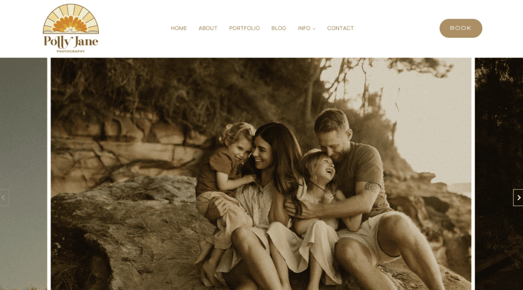
This photography website uses this best practice with a clear and concise menu. When you go to the site, you can see what each page is about just from the label.
Pitfalls to avoid
- Ambiguous or confusing link labels
- Using unique terms or phrases in your navigation menu
4. Prioritize important pages
When you make a list, you probably put the most important things first. And as we’ve said, your website navigation menu is like a list. The most important pages should be prioritized.
If you’re doing a dropdown or vertical navigation menu, this is pretty straightforward. Simply put pages in a normal list order from top to bottom.
If you’re using a horizontal navigation bar, the most important pages should be either on the left (starting) side or at the very end on the right side. When creating your list, remember that people read left to right.
Example: Beth Whitney Studio
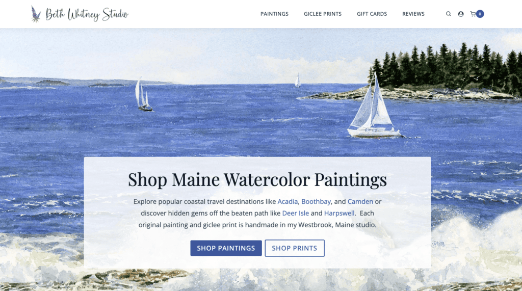
In this example, we can see that the most important goal of this website is to sell paintings and prints. Based on their position in the menu, gift cards and reviews are not as important for conversion in this case.
Pitfalls to avoid
- Prioritizing pages that don’t lead to conversions or actions
- Including pages in your nav menu that aren’t important to your users
5. Include relevant calls to action (CTAs)
Here’s a question for you: What is the one action you want someone to take when they’re visiting your website for the first time?
Website navigation is meant to help your website visitors find what they’re looking for. But that doesn’t mean you can’t encourage a certain action or lead them to a page. The best way to do this is through a call to action (CTA).
A CTA in your nav menu is a best practice for a few reasons. On average, people spend about six seconds viewing a website menu. A good CTA offers a clear next step to keep them on the site longer and engage.
Here are some ways to create a great CTA:
- Adding a badge, like “new,” next to a menu item.
- Making a unique button for your CTA. Use a different color from the rest of your menu to make the CTA button stand out.
- Linking to an important page and using clear text. Add strong, descriptive text for your CTA, like “Contact Me,” “Book a Demo,” or “Get a Quote.”
You should include a CTA in your main menu and header. People typically scan pages in a Z pattern, so the top-right corner is prime real estate in your header navigation. Adding a CTA in that area is a great way to generate more conversions on your site.
Example: Dr. Donna Lamar
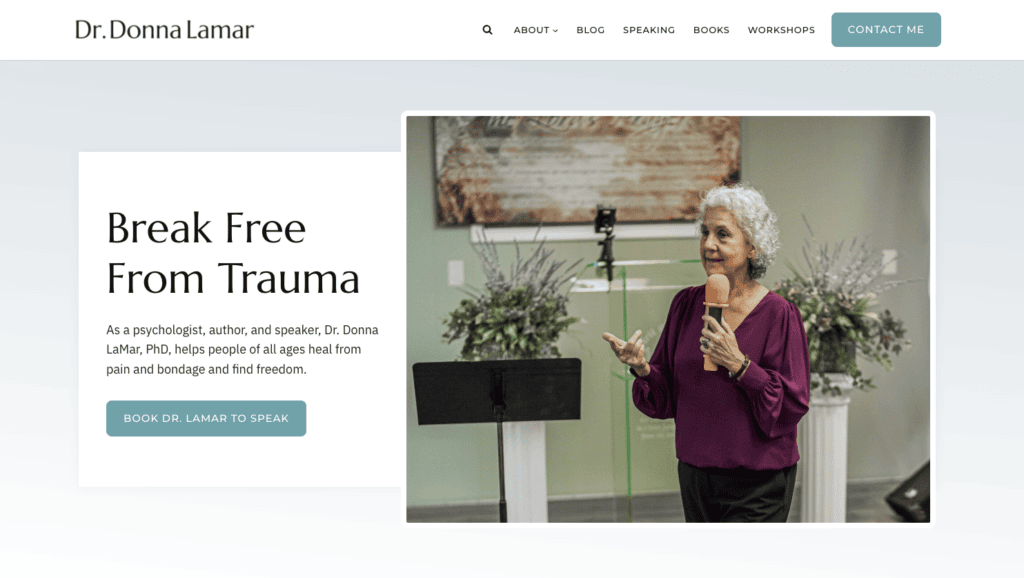
As shown in this example, Dr. Donna LaMar wants folks to contact her, so that’s what her CTA drives users towards. Her website is using this best practice to its full potential!
Pitfalls to avoid
- Not including a CTA in your nav menu
- Making the CTA blend in with your menu
- Using the CTA for irrelevant pages
6. Make your header visible
This best practice may seem like a given, but sometimes we see websites with missing, hard to read, or disappearing navigation menus.
As a rule of thumb, your nav menu should be visible on most pages and as users scroll through. The exception here would be conversion-focused landing pages. Those don’t need a full nav menu since you’re driving the user towards the page’s CTA.
We recommend making your website header sticky. This means that the header never goes away and “sticks” to the top of the page. Enabling a sticky top nav menu will keep it visible at all times when users are browsing in desktop view.
You can further customize and improve visibility of your header by using conditional headers. For example, you can have a fuller menu for new or logged out users and a more targeted, concise menu for logged in users if you have a membership website.
Example: Liquid Web
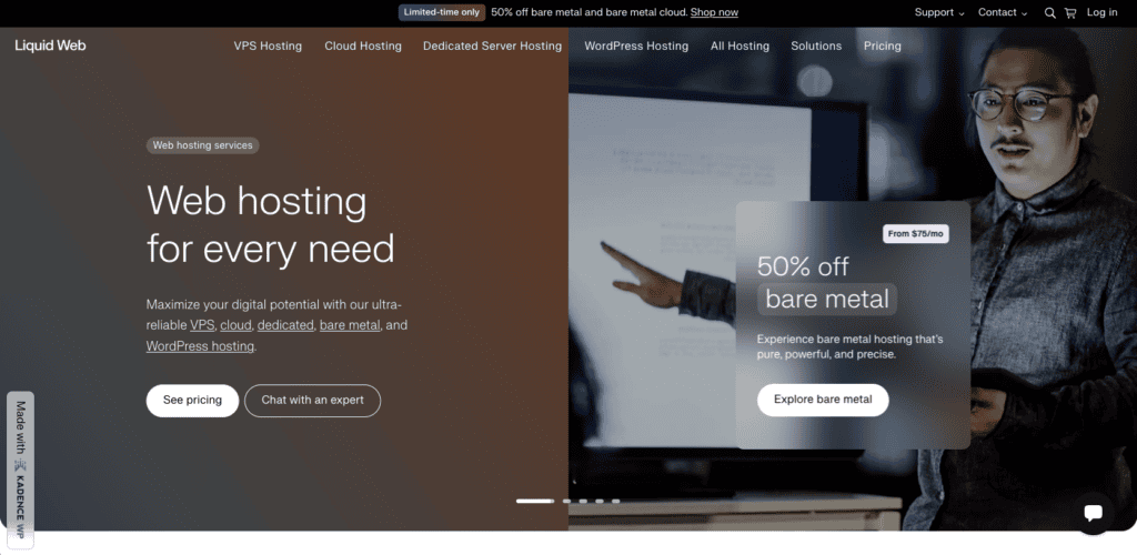
This website features a slider and collage as its header, but it keeps the menu centered with bright text so it’s easy to read. Plus, it’s visible on every page!
Pitfalls to avoid
- Not using a sticky header
- Not including a menu on most pages besides landing pages
- Making the menu hard to read or see
7. Implement search functionality
We all want users to come to our websites with intention and then find what they’re looking for. What better way to help them than with a search function?
Adding search functionality to your nav menu has several benefits, including:
- A better user experience. People won’t go clicking and scrolling around aimlessly. They can simply use the search box to find exactly what they need.
- Quicker searches and conversions. A search bar in your navigation keeps it visible and accessible at all times, allowing users to easily search when needed. This process gets them to pages quicker and reduces friction to increase conversions. We highly recommend a search bar for ecommerce websites for this reason!
Search functionality doesn’t have to be a long or large search bar as we see on some websites. Instead, you could simply add a button with a magnifying glass or a link that says “Search.”
Example: DIY Dream Site
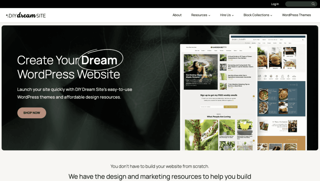
This beautiful website doesn’t just have a great menu, but it also uses search functionality in the top right corner. This clear search bar with a magnifying glass indicates that users can search for what they need quickly.
Pitfalls to avoid
- Not using a search bar on a large website
- Making a distracting or large search bar
8. Avoid displaying social media icons in your header
Social icons are great additions to your website. It can help people stay in touch with you and grow your following. But, there is a best practice to keep in mind when it comes to website navigation and social icons: Avoid putting them in your header.
Social media icons can be distracting. After all, it leads users away from your website and your ultimate goal of converting them into a subscriber or customer. This leads to higher bounce rates, lower conversions, and less engagement.
And trust us; getting someone back on your website after taking them to social media is a tall order!
If you want to include social media links on your website, try putting them on your contact page or even in your website footer.
Example: Ruben Venturo
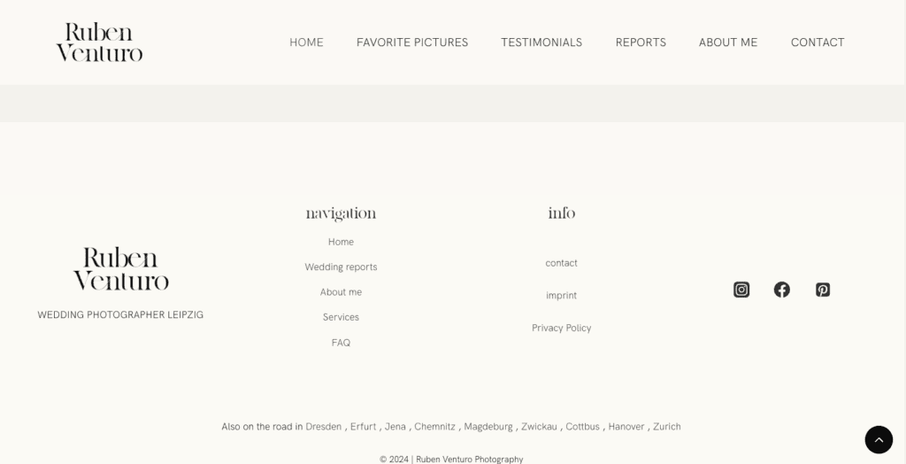
This website uses a large footer to display additional information not found in the main menu, including social media links.
Pitfalls to avoid
- Putting social media icons in your top navigation menu
- Making your social media icons too prominent
9. Optimize for mobile
Did you know over 93% of people access the internet through their mobile devices? That’s a lot of people!
Nowadays, it’s essential to have a mobile-friendly website. In fact, Google even takes a mobile-first approach to indexing and ranking:
“Google predominantly uses the mobile version of a site’s content, crawled with the smartphone agent, for indexing and ranking. This is called mobile-first indexing. While it’s not required to have a mobile version of your pages to have your content included in Google’s Search results, it is very strongly recommended.”
This best practice may be the most important one on this list. If your site and its navigation isn’t optimized for mobile, you’re excluding a lot of potential customers and hindering your SEO.
Here are some tips for making a mobile-first site when it comes to navigation:
- Make sure your menu is accessible. Sometimes, mobile menus may be too small and hard for users to click or navigate, or they may be too big and cut off words. Ensure your menu is visible and has enough space around it for options to be clicked easily.
- Use a hamburger menu. As we’ve previously discussed, the hamburger menu is your best bet for mobile-friendly navigation. It’s a clear way to indicate where your menu is.
- Simplify your nav menu. This point was one of the first best practices we’ve covered in this list, but it plays a huge role in optimizing your header for mobile devices. You’re working with a much smaller screen so make your menus clear and concise.
Optimizing for mobile also goes hand-in-hand with other best practices, like using clear and descriptive labels, setting your logo to a modest size, and some more we’ll discuss soon.
Example: Milestone Mom
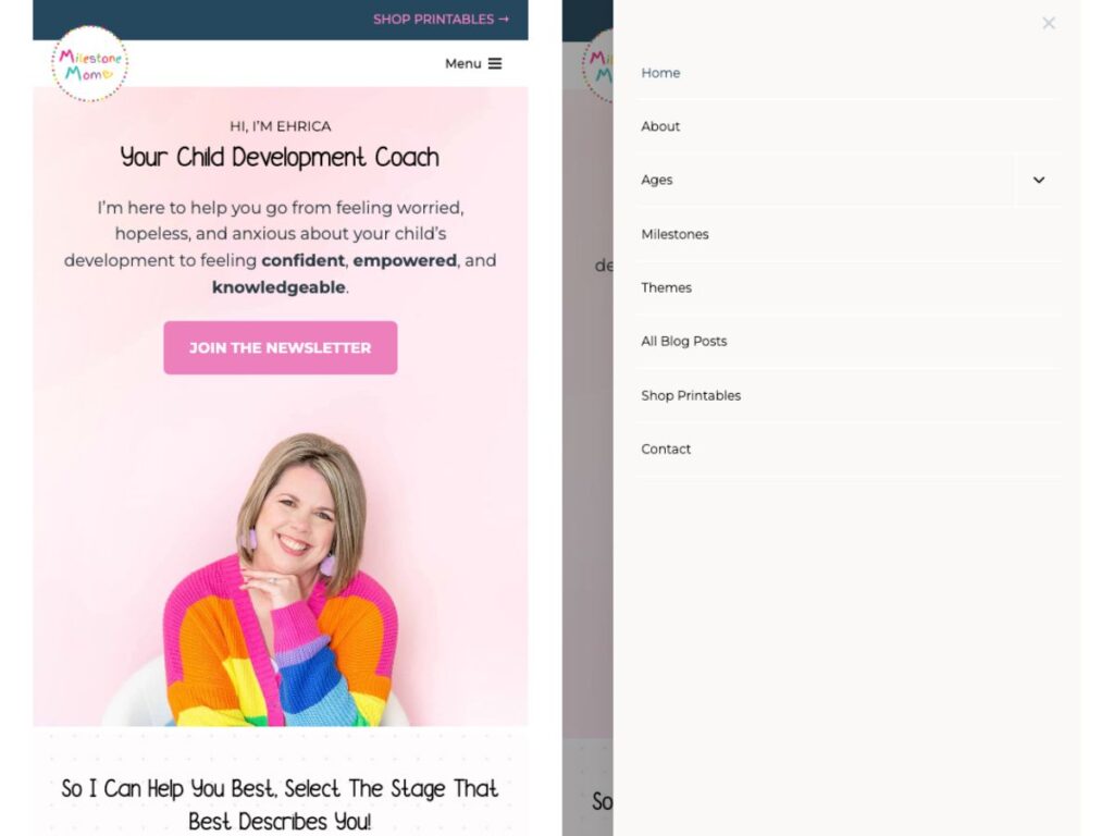
The mobile version of this website uses a clear hamburger menu that’s easy to get to. Once you click it, it pops out and gives you all of the menu options you need, with plenty of space in between each one.
Pitfalls to avoid
- Not using a condensed hamburger menu
- Having no mobile menu (yes, we’ve seen this before!)
- Giving too many options in your mobile menu
10. Consistency across the website
When it comes to web design, a lot of things need to be consistent. Your buttons, typography, color palette… we could go on, but one element that also needs consistency is your navigation.
People like repetition. We’ve already mentioned that using common words and phrases in your nav menu will help users recognize what that page is. The design and the overall look are no different.
No matter what menu style you’re using, you need to make sure it looks the same or similar on every page. If you’re using a vertical menu, keep it vertical. If you have a horizontal nav bar, provide the same menu options on every page.
Here are some more tips for promoting consistency in navigation:
- Use the same colors
- Keep the same font size
- Don’t change the label wording or order
- Set the menu to a certain size and keep it the same across the website
- Keep the menu in the same place
- Use a template
Consistency will not only help support a consistent look and feel across your website, but it’ll also give users a better experience.
Example: Speak Up Conference
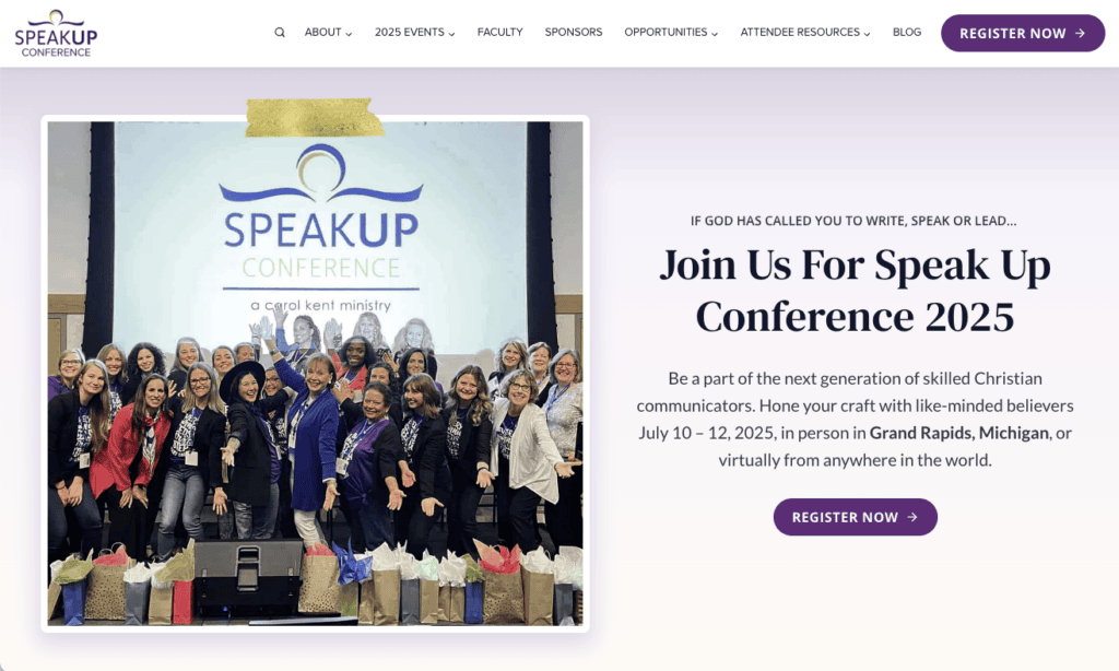
In this example, we can see just how the menu is a seamless part of the website. It uses the same text and button colors and provides the same options on every single page.
Pitfalls to avoid
- Using inconsistent style elements
- Changing the position of the menu
- Changing up the size, style, or location
11. Save less important pages for your footer
We haven’t talked too much about footers yet, but this best practice is all about this type of menu.
The footer menu is a lot more flexible in terms of website navigation. It can and should contain more information and links than other types of menus.
As stated by the CEO of StoryBrand and New York Times bestselling author Donald Miller, your footer is like your junk drawer.
That sounds a bit strange, but it works! To help make your footer an organized junk drawer, we recommend making your footer mega menu-style.
This just means that all options in your footer should fall under a category and heading for more organization. Without these, your footer may be too overwhelming.
Your footer is also the best place for those social media icons we mentioned. If you have a signup form or CTA for your email newsletter, this is also a great place for it to go.
Example: The Stinky Pet Co.
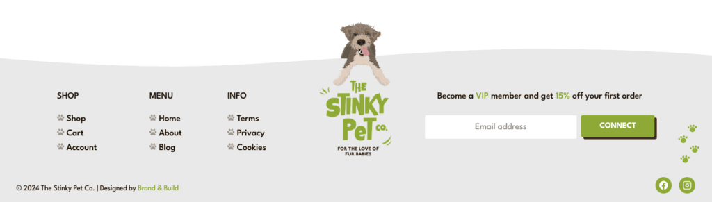
This ecommerce website has a great footer. The menu options are organized neatly on the left side, contrasting the main menu, which only has four options.
By using this best practice, this website can help users find additional information without drawing attention to those pages in the main nav menu.
Pitfalls to avoid
- Not putting enough links in your footer
- Not using a mega menu in your footer
Bonus: Use data to inform your website navigation structure
If you’re ready to take your website header and navigation to the next level, this best practice is for you.
You probably created your website’s navigation menu based on what pages you wanted to highlight. But it doesn’t need to be a guessing game. Whether you just want to see how it’s performing or enhance your website’s metrics, you should use data to inform your navigation structure.
There are multiple ways to start collecting and analyzing this type of data:
- Website metrics: Leverage Google Analytics (it’s free!) to see important metrics like engagement time, most popular pages, and conversions. You may find a good opportunity to prioritize a high-performing page in your nav menu, change up your CTA text, or move some links to the footer.
- Heatmaps: Heatmaps are used for seeing just how your users interact with your website. They visually show where someone might click, how far they scroll, and how they move their mouse around the page. Heatmaps can provide valuable insight on how people use your nav menus and what could be improved.
- A/B testing: You don’t have to change things constantly to test them. Instead, use a tool for A/B testing. These tools set up a control (which can be your current top menu, for example) with an experimental menu. This could include a whole new menu, different CTA, or various labels. You can then see what performs best and implement those changes.
Data is a great resource for optimizing your website and its navigation, and some tools like Google Analytics are even free.
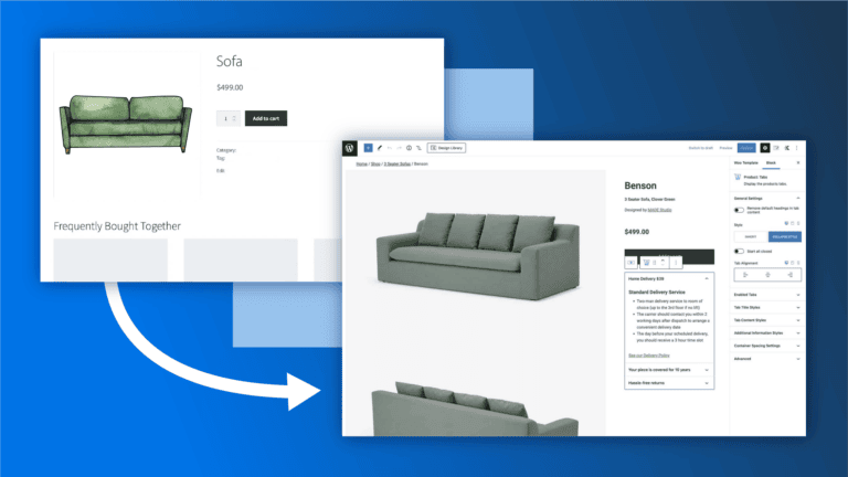
Build your website’s navigation with Kadence Blocks
As we’ve learned, one of the most important aspects of your WordPress website (and any website) is its navigation. It helps people find what they need, gets you the conversions you need, and gives a boost to your SEO efforts.
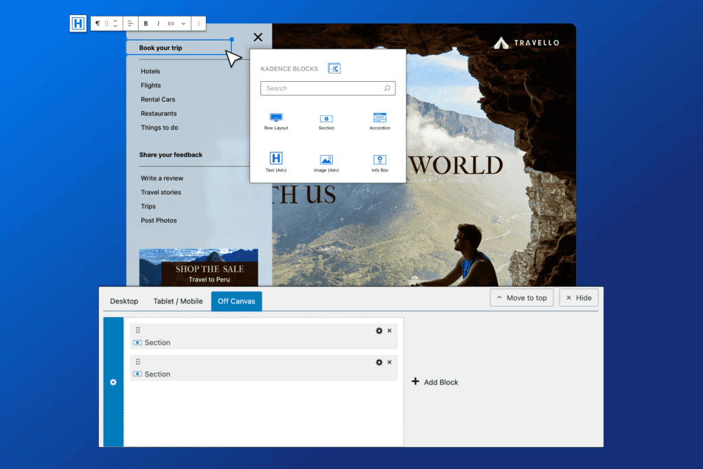
With all of that said, this feels like the perfect time to tell you that we recently launched the Kadence Advanced Header/ Navigation Blocks, the only set of Gutenberg blocks that lets you build fully customizable headers directly in the native WordPress block editor. This release contains 5 brand new blocks, each one carefully crafted to empower you to create a fully customizable header and navigation.
You might be wondering how to go about implementing all of these great best practices. We have you covered.
The Kadence Advanced Header/ Navigation Blocks gives you everything you need to build beautiful headers exactly the way you want them. Check out the documentation below to get started with these powerful new blocks:
-Header (Adv) Block Documentation
-Navigation (Adv) Block Documentation
-Navigation Link Block Documentation
-Search (Adv) Block Documentation
-Site Identity Block Documentation
Wrapping Up
In conclusion, implementing best practices for website navigation is crucial to ensuring an intuitive and seamless user experience. Whether you’re designing for desktop or mobile, remember to prioritize clarity, simplicity, and accessibility. By optimizing your site’s navigation, you not only improve usability but also boost engagement and conversions.
Ready to revamp your navigation? Try out Kadence’s powerful Advanced Navigation Block and bring your design to life. Explore the full potential of Kadence Blocks today and create a site that truly stands out!
Create Your Website With KadenceWP Today!

Written by Alexis Bryan
Alexis Bryan is a content marketing specialist at StellarWP with over five years of experience in the marketing industry. She loves writing and creating content for all kinds of audiences, from blog articles and website copy to videos and guides. Alexis enjoys crafting engaging and informative content that helps businesses and people thrive.
By Alexis Bryan
Alexis Bryan is a content marketing specialist at StellarWP with over five years of experience in the marketing industry. She loves writing and creating content for all kinds of audiences, from blog articles and website copy to videos and guides. Alexis enjoys crafting engaging and informative content that helps businesses and people thrive.
Updated October 7, 2024
Create Your Website With Kadence
