
With Kadence Shop Kit, you can easily display custom Product Badges to highlight key details about your WooCommerce products. Whether you’re marking items as low stock, on sale, or promoting special attributes, these badges allow you to draw attention to important product information. The feature gives you full control over the appearance and placement of these badges, helping you enhance the shopping experience and improve product visibility in your store.
Getting Started
To get started with Product Badges, first, ensure that the Kadence Shop Kit plugin is activated on your website. Once activated, navigate to the Dashboard and go to the Shop Kit page. From there, click on the Product Badges tab. Within this section, you’ll find the option to enable Product Badges. Simply toggle the setting to activate this feature, allowing you to display custom badges on your WooCommerce products.
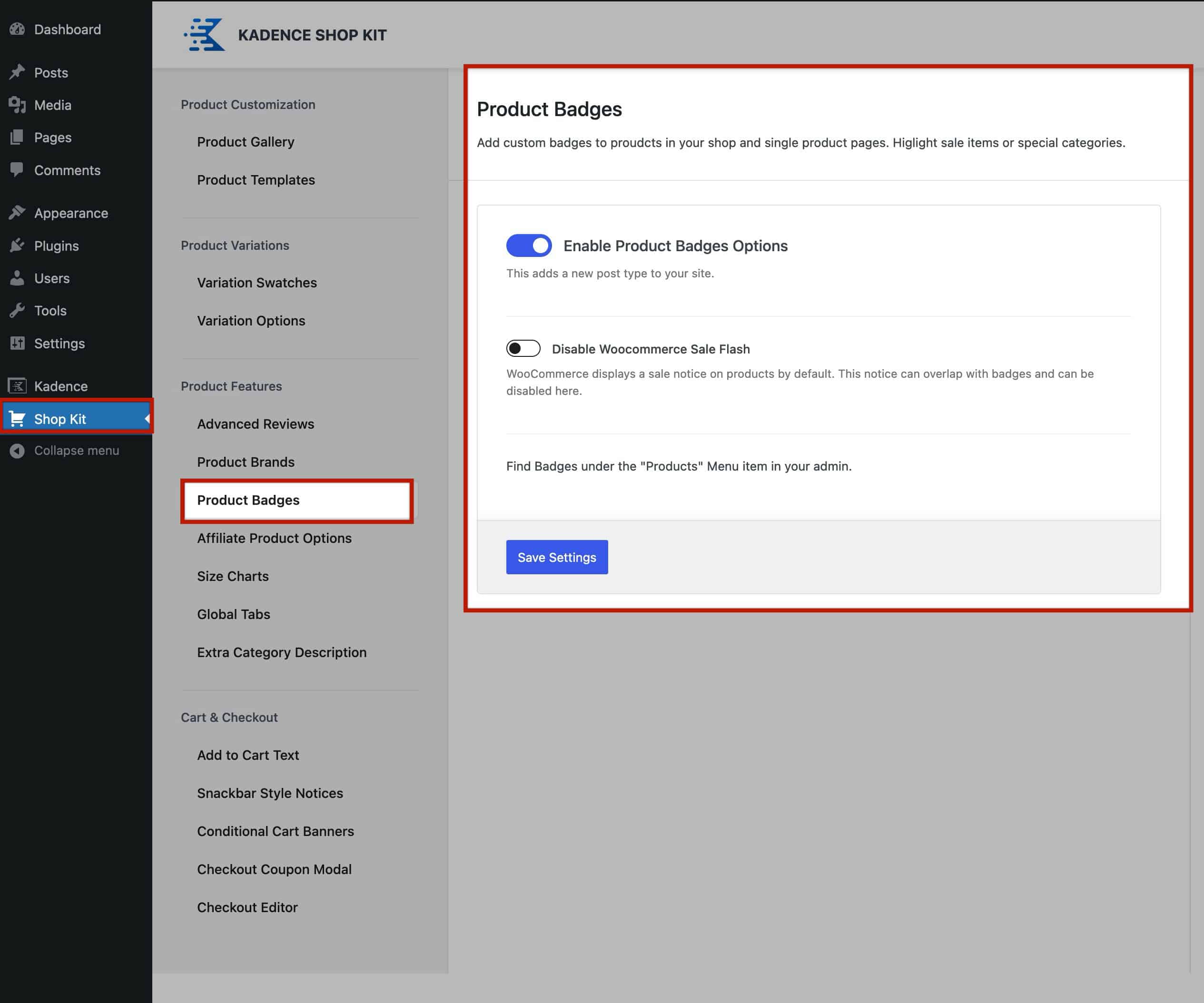
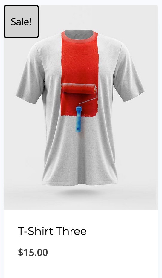
Below the Enable Product Badges option, you’ll find the Disable WooCommerce Sale Flash setting. This option allows you to either enable or disable the default WooCommerce sales badge. The sales badge is automatically added by WooCommerce to products that are marked as on sale. By disabling it, you can fully customize how sales badges are displayed using the Kadence Shop Kit’s Product Badges feature.

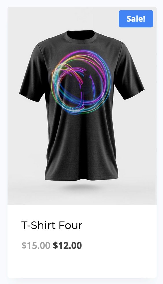
This is what the default WooCommerce Sale Flash badge looks like when it is not disabled.
If you prefer not to display the default WooCommerce Sales Badge, make sure the Disable WooCommerce Sale Flash option is enabled. Once you’ve made your changes, scroll to the bottom of the Shop Kit Product Badges page and click Save Changes to apply them.
Adding New Badges
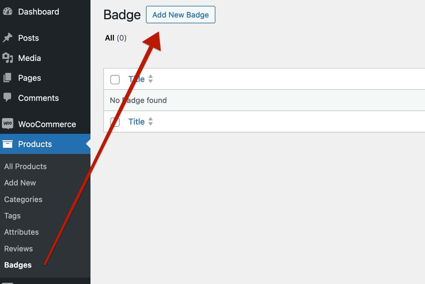
Once Product Badges are enabled, you can add new badges by navigating to the Dashboard and going to Products > Badges. From there, click on the Add New Badge button at the top of the page to create a new badge.
When creating a new badge, you’ll have several options to customize it. The first step is to select the Badge Type, which determines the style and appearance of the badge. Refer to the sections below for information on each Badge Type.
Badge Types
The Shop Kit Badges feature four main badge types: Image, Custom Image, Text, or Custom HTML. Each badge type serves different purposes, allowing you to customize your product badges fully and giving you complete control over how they appear on your WooCommerce store.
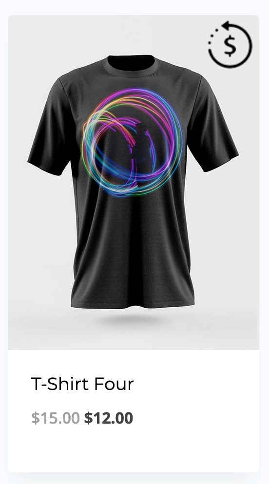
Image Badge Type: This badge type allows you to select a pre-made Kadence image to use as a product badge.
Custom Image Badge Type: This badge type allows you to upload and use a custom image as a product badge.
Custom Text Badge Type: This badge type allows you to input and style Custom Text to use as a product badge. (Dynamic options available)
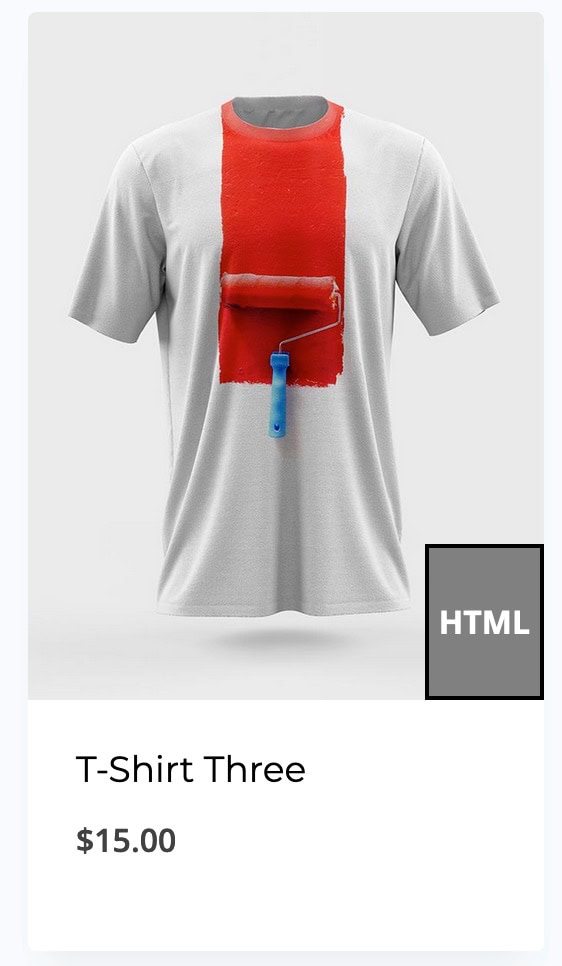
Custom HTML Badge Type: This badge type allows you to input custom HTML or use the WYSIWYG Editor to display the product badge. (Includes options for Texts and Images.)
Learn more about each Shop Kit Badge Type below.
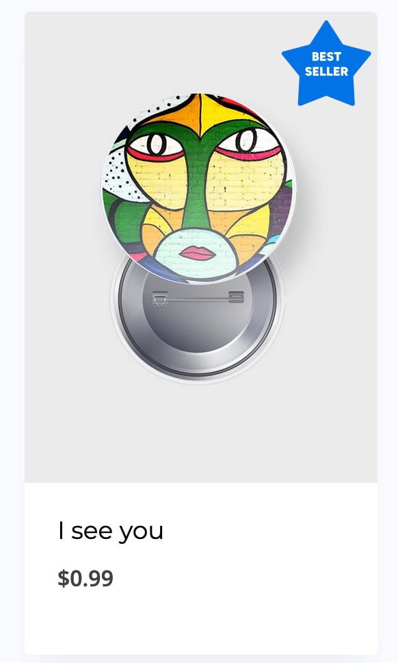
Image Badges
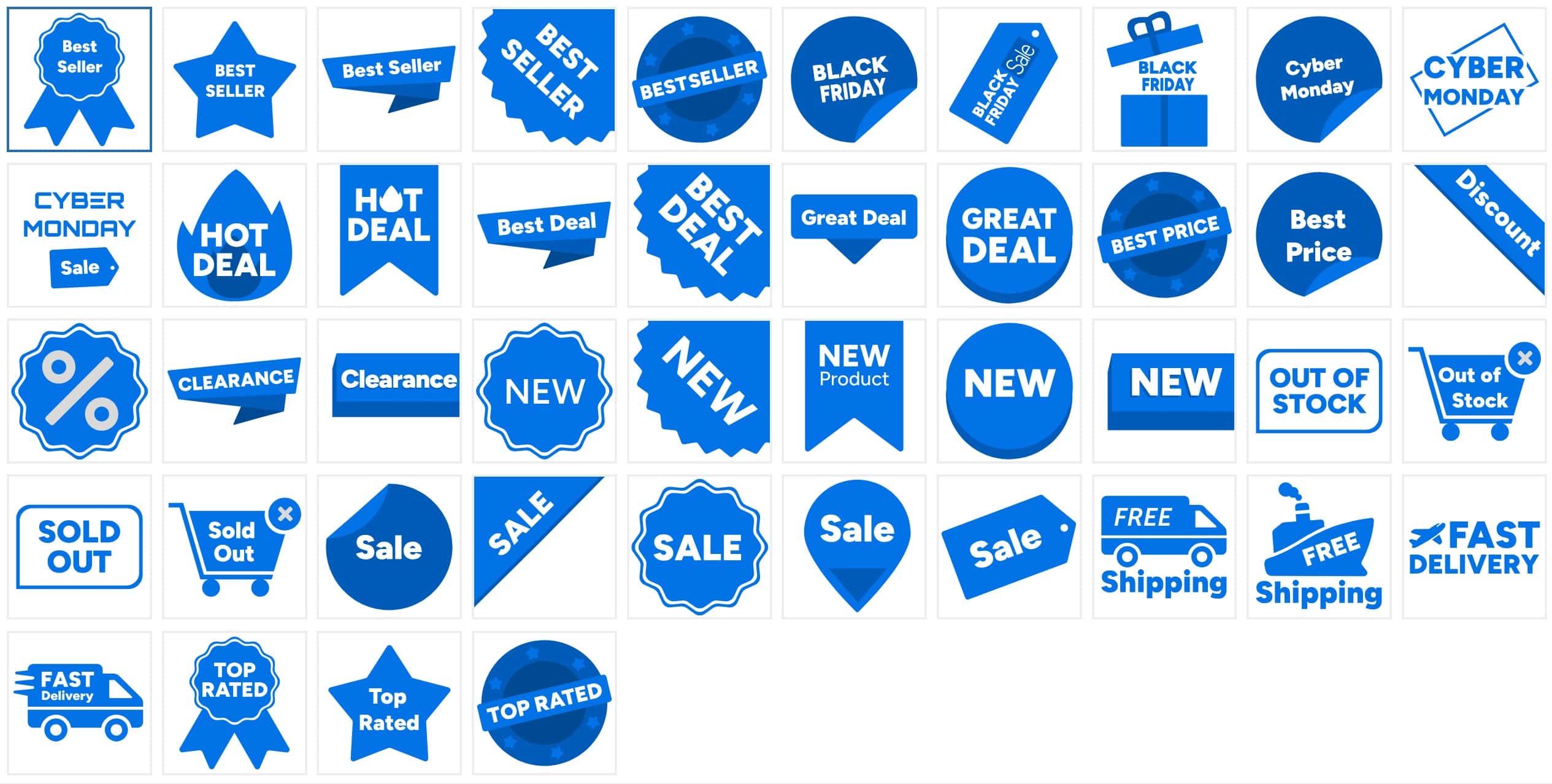
Image Badges are the standard product badges that consist of a collection of images available for use. When creating a new Image Product Badge, you will notice various selectable images provided by Kadence. This collection allows you to choose visually appealing badges that enhance your product listings and attract customer attention.
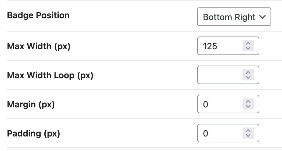
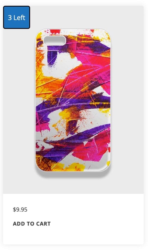
Badge Position: Use the Badge Position setting to determine the placement of your badge on the product. Available options include Bottom Right, Bottom Left, Center, Top Right, and Top Left.
Max Width: Set a Maximum Width for Single Product displays to control the size of the badge and prevent it from becoming too large.
Max Width Loop: Set a different Maximum Width for loop items, such as archive loop products and other WooCommerce-related product loops.
Margin: Add a Margin in pixels around the product badge to create space around the Badge.
Padding: Add Padding in pixels around the product badge for additional spacing within the badge itself.
Adjusting the padding and margin values can further refine the positioning of your product badge, ensuring it looks great on your product display.
Use the Badge Visibility Settings to customize where the Badge will appear.
Image Design Settings
Color: When using a Kadence Image, you can change the Color of the Image to meet your needs.
Background Color: Add a Background Color behind the product badge to enhance visibility and aesthetics.
Border Radius: Apply a Border Radius to the product badge to create rounded edges.
Border Width: Set a Border Width for the product badge. If this field is left empty, no border will be applied. Specify the border width in pixels if you wish to include a border.
Border Color: If you choose to use a border width, you can adjust the Border Color to customize the appearance of your product badge’s border, providing more control over its overall look.
Custom Image Badges
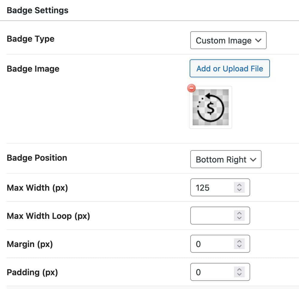
Badge Image: When selecting a Custom Image Badge, use this setting to add or upload a media file to serve as the badge image.
Badge Position: Set the position for the badge using options such as Bottom Right, Bottom Left, Center, Top Right, or Top Left.
Max Width: Utilize the Max Width setting to control the size of the image by restricting it from exceeding a specified value in pixels. This applies to Product Badges on Single Product Pages.
Max Width Loop: Set a different Maximum Width for loop items, such as archive loop products and other WooCommerce-related product loops.
Margin and Padding: Adjust the Margin and Padding values in pixels to further refine the positioning of your product badge.
Use the Badge Visibility Settings to customize where the Badge will appear.
Custom Image Design Settings
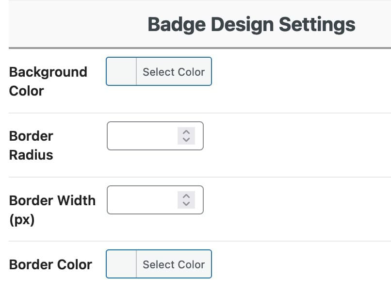
Background Color: Add a Background Color behind the product badge to enhance visibility and aesthetics.
Border Radius: Apply a Border Radius to the product badge to create rounded edges.
Border Width: Set a Border Width for the product badge. If this field is left empty, no border will be applied. Specify the border width in pixels if you wish to include a border.
Border Color: If you choose to use a border width, you can adjust the Border Color to customize the appearance of your product badge’s border, providing more control over its overall look.
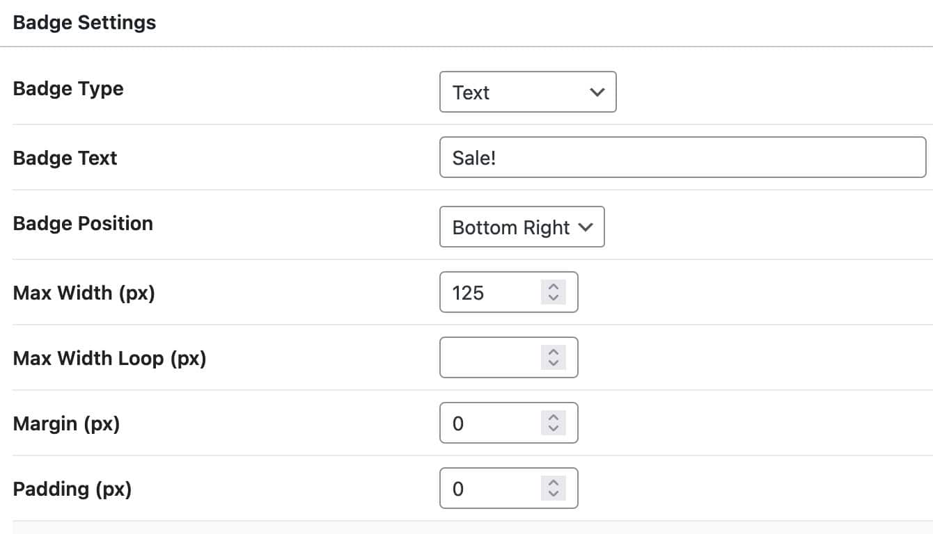
Custom Text Badges
Badge Text: When using a Custom Text Badge, utilize the Badge Text setting to specify the text that will appear on the product badge.
Badge Position: Position your text badge to appear in one of the following locations: Bottom Right, Bottom Left, Center, Top Left, or Top Right.
Max Width: Adjust the Max Width setting to define the maximum width of the product badge on Single Product Pages, ensuring it doesn’t become too large.
Max Width Loop: Set a different Maximum Width for loop items, such as archive loop products and other WooCommerce-related product loops.
Margin and Padding: You can add Margin and/or Padding values to the product badge for enhanced positioning control.
Use the Badge Visibility Settings to customize where the Badge will appear.
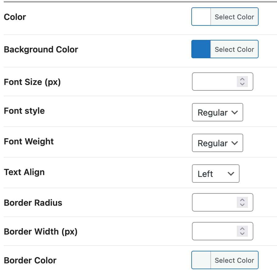
Custom Text Design Settings
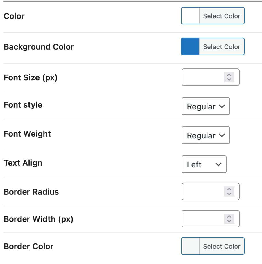
Color: Set a Primary Color for the Text.
Background Color: Add a Background Color behind the product badge.
Font Size: Specify a Font Size for the Badge
Text.
Font Style: Set a Font Style for the Badge Text. (For example, Bold)
Text Align: Set the Text Alignment to either Left, Center, or Right.
Border Radius: Apply a Border Radius to the product badge to create rounded edges.
Border Width: Set a Border Width for the product badge. If this field is left empty, no border will be applied. Specify the border width in pixels if you wish to include a border.
Border Color: If you choose to use a border width, you can adjust the Border Color to customize the appearance of your product badge’s border, providing more control over its overall look.
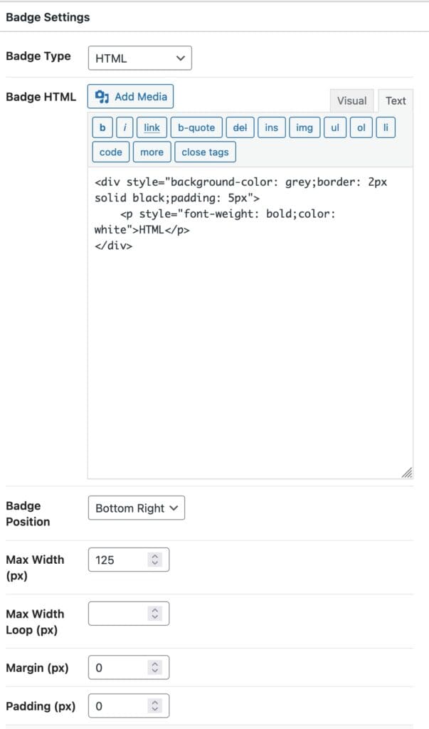
Custom HTML Badges
Badge HTML: When using a Custom HTML Badge, the Badge HTML setting allows you to add text, HTML, and media images to the badge.
- Use the Add Media button to insert media files into the HTML badge.
- Utilize the Visual Tab to edit the HTML visually using the WYSIWYG editor.
- Switch to the Text Tab to specify HTML code directly instead of using the visual WYSIWYG editor.
Badge Position: Position your Custom HTML badge to either the Bottom Right, Bottom Left, Center, Top Left, or Top Right of the Product Image.
Max Width: Adjust the Max Width setting to define the maximum width of the product badge on Single Product Pages, ensuring it doesn’t become too large.
Max Width Loop: Set a different Maximum Width for loop items, such as archive loop products and other WooCommerce-related product loops.
Margin and Padding: You can add Margin and/or Padding values to the product badge for enhanced positioning control.
Use the Badge Visibility Settings to customize where the Badge will appear.
Custom HTML Design Settings
Background Color: Add a Background Color behind the product badge.
Border Radius: Apply a Border Radius to the product badge to create rounded edges.
Border Width: Set a Border Width for the product badge. If this field is left empty, no border will be applied. Specify the border width in pixels if you wish to include a border.
Border Color: If you choose to use a border width, you can adjust the Border Color to customize the appearance of your product badge’s border, providing more control over its overall look.
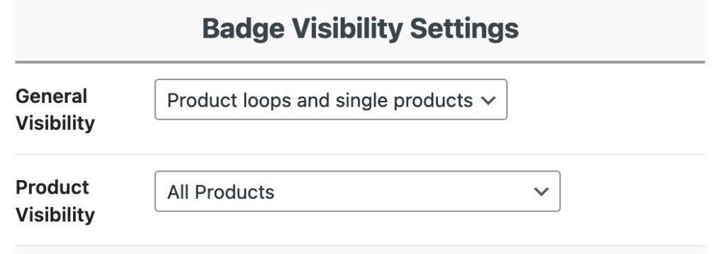
Badge Visibility Settings
The Badge Visibility Settings appear after the Design Settings and allow you to control the visibility of your Product Badges.
General Visibility: This setting determines the General Visibility of the current Product Badge. This can be set to be shown on the following:
- Product Loops Only
- Product Loops and Single Products
- Single Products Only.
Product Visibility: Use this setting to determine which products the Product Badge will be visible on even further. This can be set to one of the following:
- All Products
- Show on Certain Products
- Show on Products that are on Sale
- Show on Products that are NOT on Sale
- Show on Products that are out of stock
- Show on Products that are low on stock
- Show on Products that are on Back Order
- Show on Featured Products
- Show on Products with certain Categories
- Show on Products with certain Tags.
Product Badge Post Settings
When creating a Product Badge, on the right-hand side of the Badge Editor, you will notice some additional options available for use.
Status: This indicates the status of the product badge. The product badge can be saved as Published, as a Draft, or as a Pending Review post.
Visibility: Specify the Visibility of the product badge, which can be set to Public, Password Protected, or Private. Note that password-protected and private badges will not be displayed on the front end.
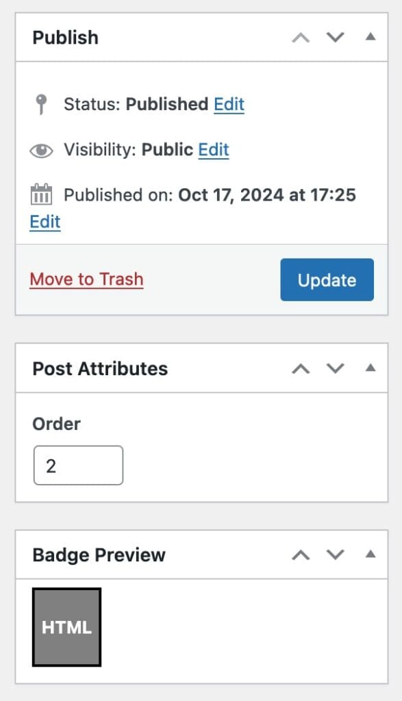
Setting a Badge Order (Priority)
Order: In the Post Attributes section, you will find the Order setting. This allows you to establish a priority for the product badge. For instance, if you have two product badges targeting the same product, the badge with the higher order will take precedence over the one with a lower order. This feature enables you to use multiple badges simultaneously while preventing conflicts.
Dynamic Custom HTML Placeholders
When using a Custom HTML Badge or a Text Badge, there are two Placeholders available to be used that work Dynamically.
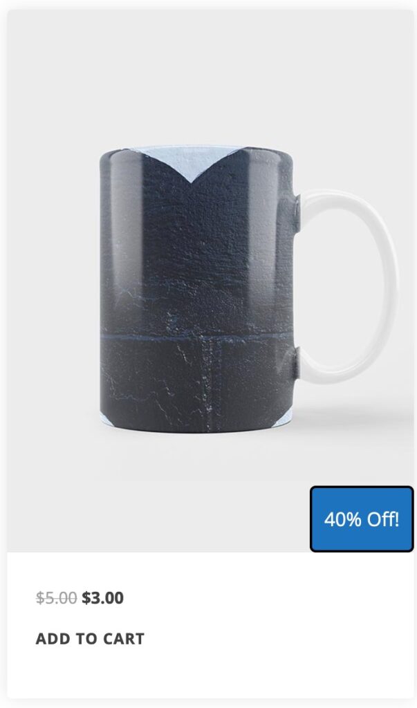
- {quantity} – Use this call to display the product quantity dynamically.
- {sale-percentage} – Use this call to display the sale percentage. This text includes the % symbol.
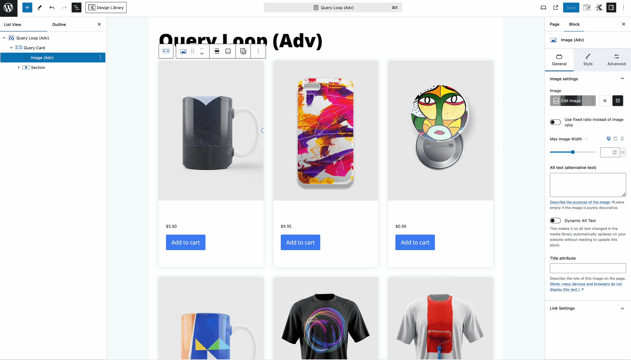
Using Product Badges in Query Cards
To use a Product Badge inside of a Query Card, you must use the Shop Kit Product: Image Block to display the Query Card Loop Image. If this is using an Advanced Image Block + Dynamic Content, the Product Badges will not show properly.
